Iconography
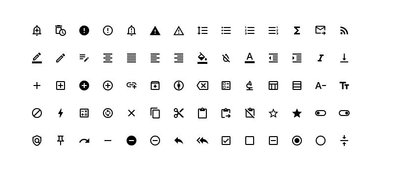
Icons are used to visually represent commands, common actions, and locations. To facilitate providing users with a standardized and more widely adopted icon library, the Halstack Design System leverages the Material Symbols library. This library contains over three thousand open source symbols implemented as an icon font that is maintained by Google as part of the Material Design System.
Icon sizes may vary depending on the specific use case and the context of the application. Within Halstack components, most icons adhere to a 24x24px size, inclusive of any surrounding background or space. However, there are instances where 20x20 or 16x16 icon sizes are employed to better align with the visual context of the element.
At present, the default color of icons is consistently inherited from the parent during implementation. In cases where no color is specified, icons default to black, though there are exceptions where the default color is purple.
Icons are available in both outlined and filled variants, with the current implementation utilizing base colors of black or white to maintain visual coherence.
While an extensive library of over three thousand icons is available, there may arise situations necessitating custom icons—particularly those representing brands, companies, or organizations. In such cases, an SVG implementation option is provided. However, it's recommended to limit the use of custom icons to these specific scenarios, as adherence to the existing icon set is strongly encouraged for design consistency.
- Use icons within the context of commonly used components such as buttons, links, navigation items or status indicators.
- Do not use icons that fill the entire space allotted for the icon. All icons currently implemented maintain a minimum of 1px of space each side (the largest solid icon occupies a maximum of 22px width or height).
- Make sure to maintain scaling proportions and aspect ratios when resizing icons.
- When using colors, make sure to consider the context of the icon being used as well as the consistency of visual information being presented.
- Limit the usage of colors green, red, and blue to common notifications such as success, error, or information.
- Halstack Users are encouraged to share their own variations of icon usage with the Halstack team so that these can be added as references.