
Layout
Halstack provides multiple components to achieve layout consistency and an easy way to arrange elements in the UI. The application layout is the base that wraps any application built with Halstack. In addition, all of the components listed below can be used within each other to create a wide variety of standard layouts:
- Bleed
- Flex
- Grid
- Inset
The grid provides the foundation for consistently positioning elements onscreen. The 8x Grid is the geometric foundation of all the visual elements of Halstack Design System components and spacing. It provides structure and guidance for all creative decision-making.

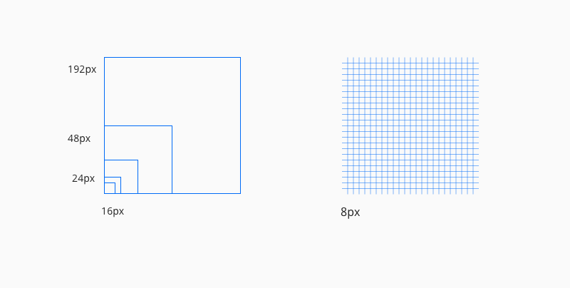
- Use multiples of 8px when defining measurements, spacing, and positioning elements.
- When necessary use 4px to make more fine tuned adjustments.
- Whenever possible, make sure that objects line up, both vertically and horizontally.
- Align your bounding box to the grid, not the baseline of your text.
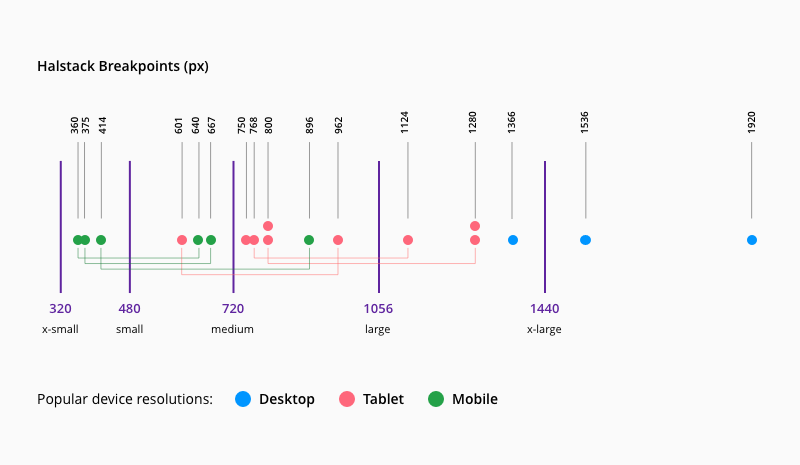
Breakpoints define resolutions at which screen components adjust to offer an optimal user experience across screen sizes and devices. We've defined five different breakpoints to accommodate multiple web, tablet, and mobile screen resolutions:
| Breakpoint | px | rem |
|---|---|---|
xsmall | 320 | 20 |
small | 480 | 30 |
medium | 720 | 45 |
large | 1056 | 66 |
x-large | 1440 | 90 |
The image below illustrates how we've used data on the most popular screen resolutions by device over the past few years to help define each breakpoint.


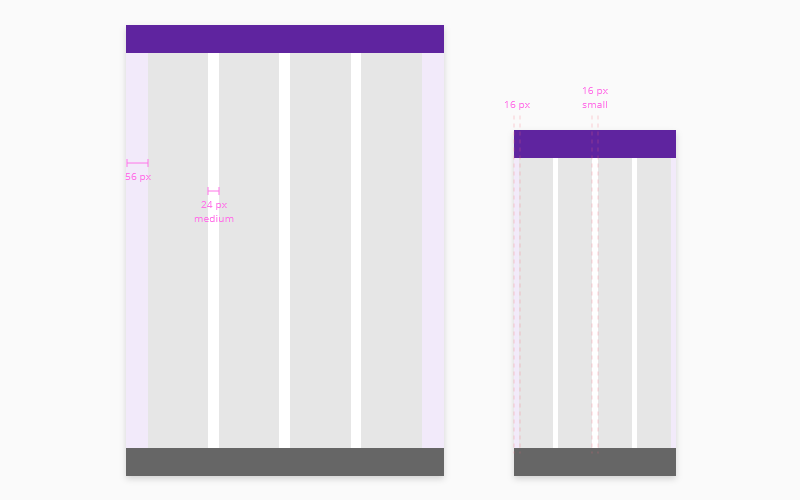
Columns, gutters, and margins make up the responsive layout grid following these breakpoints. Depending on resolution and screen size of a device, column numbers and the values of the margins and gutters adjust to accommodate all screen elements in the most optimal manner.
- Columns are the areas of the screen where content is placed.
- A gutter is the space between columns used to separate content.
- Margins are the space between the edges of the screen and content.
The following table describes the columns, margins, and gutter at each of the different breakpoints:
| Breakpoint | Columns | Gutter (recommended) 1 | Margin (min)2 |
|---|---|---|---|
xsmall | 4 | 16 / small | 24 |
small | 4 | 16 / small | 24 |
medium | 4 | 24 / medium | 48 |
large | 8 | 16 / small | 56 |
x-large | 8 | 24 / medium | 56 |
- 1.Any value provided by the
gutterprop in the layout components can be used (ideally multiples of 8) although we recommend to stick to the values provided. - 2.The margin value provided are the minimun recommended, any value from our spacing scale can be used or even an
autovalue.