
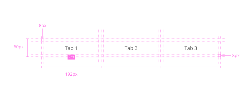
Nav Tabs
Nav tabs function in the same way as the tab component but are more focused on navigation across pages or links.

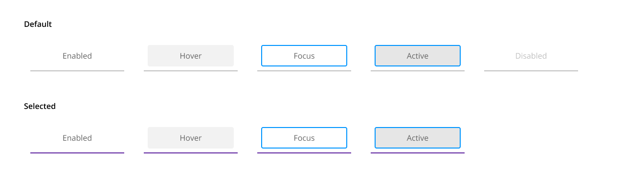
Tabs can get different states based on user interaction. These states are: enabled, hover, focus, active and disabled.

| Component token | Element | Core token | Value |
|---|---|---|---|
selectedBackgroundColor | Tab item background:selected | color-white | #ffffff |
unselectedBackgroundColor | Tab item background:enabled | color-white | #ffffff |
hoverBackgroundColor | Tab item background:hover | color-grey-100 | #f2f2f2 |
pressedBackgroundColor | Tab item background:active | color-grey-200 | #e6e6e6 |
selectedFontColor | Label | color-grey-700 | #666666 |
unselectedFontColor | Label | color-grey-700 | #666666 |
disabledFontColor | Label:disabled | color-grey-500 | #999999 |
selectedIconColor | Icon | color-grey-700 | #666666 |
unselectedIconColor | Icon | color-grey-700 | #666666 |
disabledIconColor | Icon:disabled | color-grey-500 | #999999 |
focusOutline | Tab item outline | color-blue-600 | #0095ff |
selectedUnderlineColor | Tab item border botton | color-purple-700 | #5f249f |
dividerColor | Separator | color-grey-400 | #bfbfbf |