The Application Layout is the base scaffolding of any application built in Halstack, serving as the structural and organizational framework for all UI components.
The following layout components are designed to work together, enabling flexible and consistent UI structures:
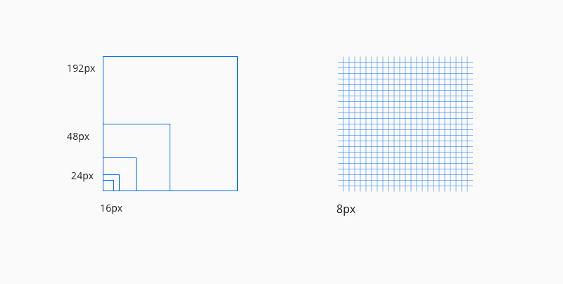
The Halstack layout system is built on a rigorous 8px grid, which serves as the foundational framework for all component placement and spacing. This geometric backbone ensures visual harmony by standardizing measurements, alignments, and spatial relationships across every interface.
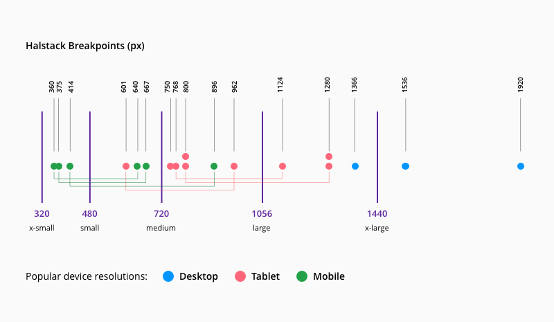
Breakpoints are specific screen widths where a layout adapts to deliver an optimal experience across devices.
The Halstack system uses five carefully calibrated breakpoints based on:
- Analysis of current device resolution trends
- Overview patterns across mobile, tablet, and desktop
| Breakpoint | px | rem |
|---|---|---|
xsmall | 320 | 20 |
small | 480 | 30 |
medium | 720 | 45 |
large | 1056 | 66 |
xlarge | 1440 | 90 |
Columns, gutters, and margins make up the responsive layout grid following these breakpoints. Depending on resolution and screen size of a device, column numbers and the values of the margins and gutters adjust to accommodate all screen elements in the most optimal manner.
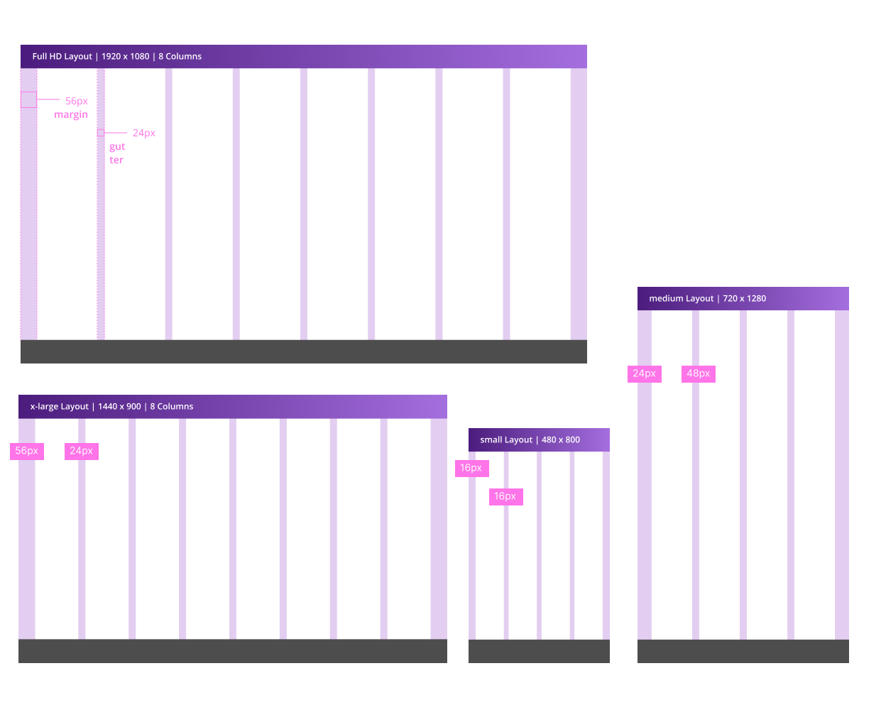
- Columns: Content containers (increase with screen size)
- Gutters: Spacing between columns (scale responsively)
- Margins: Padding between content and viewport edges
All three elements should be recalibrated at each breakpoint to:
- Maximize content legibility
- Maintain proportional spacing
- Ensure touch target accessibility
| Breakpoint | Columns | Gutter (recomended) ¹ | Margin (min) ² |
|---|---|---|---|
xsmall | 4 | 16 / small | 24 |
small | 4 | 16 / small | 24 |
medium | 4 | 24 / medium | 48 |
large | 8 | 16 / small | 56 |
xlarge | 8 | 24 / medium | 56 |
- 1.Any value provided by the gutter prop in the layout components can be used (ideally multiples of 8) although we recommend to stick to the values provided.
- 2.The margin value provided are the minimun recommended, any value from our spacing scale can be used or even an auto value.
- Enforce the 8px baseline grid: Align all measurements (spacing, sizing, positioning) to multiples of 8px for visual harmony.
- imit 4px adjustments: Reserve finer increments only for edge cases like icon alignment or typography.
- Test across all five breakpoints: Verify layouts adapt seamlessly from mobile (320px) to desktop (1200px+).
- Default to recommended values: Use predefined gutter/margin sizes unless justified by specific use cases.
- Scale columns proportionally: Increase column count with screen size while preserving gutter/margin ratios.