Being a non-clickable UI element, the badge serves the purpose of highlighting status, categories or key information within an interface. Designed for clarity and flexibility, the badge seamlessly integrates with different layouts while maintaining consistency. It supports various styles to adapt to diverse use cases without overwhelming the interface and it can be found in combination with other components, such as navtabs.
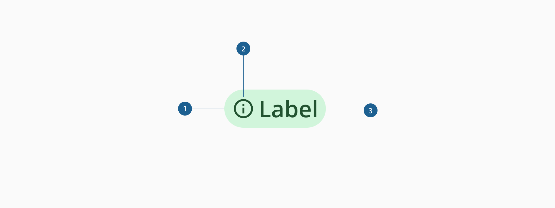
- 1.Container: it's the area that holds the badge's content, defining its shape, size and background while ensuring proper visibility within the interface.
- 2.Semantic categorization: a visual element that complements the label, providing additional meaning or enhancing recognition.
- 3.Label: displays the textual content of the badge, conveying status, category or key information.
The Badge component has two distinct variants, each serving specific purposes within our interface.
The notification badge is a non-interactive component that serves as an informative indicator, typically used to display counts or alerts, such as the number of unread messages or missed notifications.
This notification badge allows label, though it is not not mandatory to use it. You may want to use the label to display the number of notifications missed, or just the empty badge to show that some changes have been made to a certain section of the interface.
Only one color is allowed for this badge, which is red, and cannot be changed by any means.
Designed mainly for data visualization interfaces, the contextual variant of the Badge component’s main advantage lies in its ability to categorize content and represent specific information. It is intentionally non-interactive and may contain icons strategically chosen to enhance the conveyed information.
The contextual badge is available in 8 different colors from the Halstack palette. This flexibility allows the user to adapt the tag smoothly to diverse contexts:
- Non-semantic categorization: used in instances where the badge does not carry semantic meaning, it can be employed in any color from the available palette.
- Semantic categorization: when the badge conveys semantic information, specific semantic colors are available:
- Green: positive actions, such as approved, completed, success…
- Blue: informative actions, such as published, in use...
- Red: negative actions, such as error, rejection, incomplete...
- Orange: alert actions, such as pending or paused actions...
- Use badges to convey key information: notification badges are ideal for displaying counts, such as unread messages or missed notifications, while contextual badges help indicate task statuses or progress.
- Leverage color for clarity: contextual badge colors can improve recognition and enhance the user experience, especially in data-heavy interfaces with high cognitive load.
- Keep labels short and meaningful: badge labels should be concise, ideally no more than three words, to ensure quick comprehension.
- Use badges to categorize content: contextual badges can help group-related elements, such as team names, repositories, or file types, providing additional context.
- Ensure consistent placement: establish clear guidelines for where badges appear in the interface to maintain visual coherence and usability.
- Avoid overuse: excessive badges can clutter the interface and reduce their effectiveness in communicating key information.
- Ensure clarity in data visualization: avoid mixing semantic and non-semantic contextual badges within the same format to prevent confusion.
- Avoid obstructing key content: badges should be placed thoughtfully to ensure they do not interfere with essential information or interactions.
- Use positive or neutral indicators: notification badges should typically display counts or statuses without negative symbols to ensure clarity.