Tabs are interactive UI components that allow users to navigate between different sections of content within the same page. They help organize related information efficiently, improving usability by reducing clutter and enabling seamless content switching. Tabs are commonly used in dashboards, settings panels, and content-heavy applications to enhance user experience.
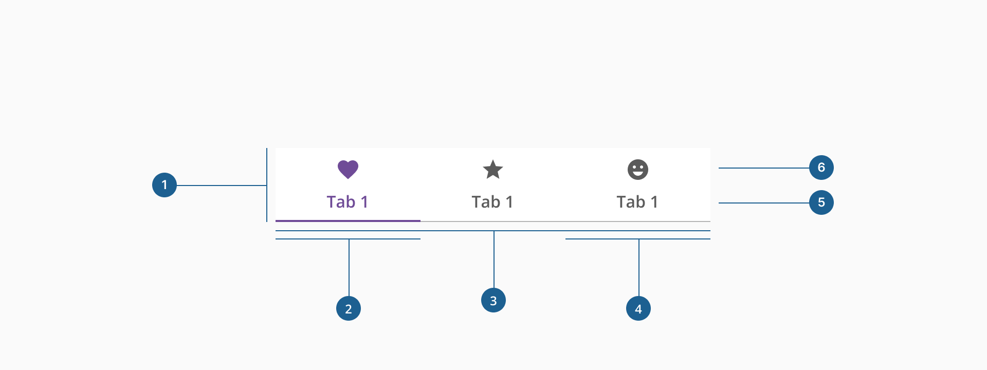
- 1.Container: the wrapper that holds all the tabs together in a row.
- 2.Active tab indicator: a colored line that visually marks the selected tab.
- 3.Divider: a subtle line separating tabs to improve readability.
- 4.Tab item: the clickable area that triggers a content change when selected.
- 5.Label (Optional if there's an icon): The text that identifies the tab's purpose or section.
- 6.Icon: (Optional if there's a label): A small graphical element that enhances visual recognition of the tab.
Tabs are an effective way to organize content within a user interface by keeping related sections grouped together while minimizing clutter. They improve usability by allowing users to quickly switch between different views without navigating away from the page. When designed and implemented correctly, tabs enhance the user experience by making content more accessible and easier to interact with.
There are two types of tabs: Default and Container. Both types share the same hierarchy and should never be nested within each other. Tabs are typically positioned above the content, under the header or general navigation.
- Default tabs: used for main navigation, placed above the header, spanning 100% of the screen width.
- Container tabs: Used for panel navigation, placed at the top of the panel, using the full available width. Scrollable tabs are allowed when space is limited.
Both tabs and nav tabs are used for navigation, but they serve different purposes and function in distinct ways.
- Used to switch between different content sections within the same page or container.
- Typically do not trigger a full page reload but update content dynamically.
- Act as primary navigation elements, often leading to different pages or sections of an application.
- Clicking on a nav tab may trigger a full page reload or route change.
Both components improve usability, but tabs are best for grouping related content within a page, while nav tabs help users move across different sections or pages of an application.
- Maintain logical order: arrange tabs in a meaningful sequence based on user needs and place frequently used or primary tabs first.
- Keep tab labels short & clear: use concise, descriptive labels (1-2 words) that clearly indicate the content. Avoid using generic or ambiguous labels like "Info" or "More." Instead, choose specific terms that reflect the content, such as "Account Details" for user-related settings or "Billing" for payment information and prioritize readability—avoid using all caps unless necessary.
- Managing the number of tabs effectively: while not a strict rule, keeping the number of tabs manageable (ideally 5-7) helps maintain clarity and usability. If additional tabs are necessary, assess the information architecture carefully and consider grouping related items.
- Use icons thoughtfully: ensure the icon is intuitive and clearly represents the content of the tab. While they are generally used alongside labels, they can also be used independently. In such cases, it is crucial to choose highly recognizable icons that clearly convey meaning without additional text. When used together, the icon and label must work harmoniously to reinforce their meaning and avoid any conflicting interpretations. Avoid using overly decorative or generic icons that do not provide clear meaning, such as an abstract shape with no context.
- Keep design consistent: while the component is flexible enough to support a mix of label-only and label-with-icon tabs, it's best to choose one style per set. Mixing both can reduce scannability and create visual imbalance, impacting the overall usability.