The spinner component is a visual indicator that communicates to users that a process is in progress. It is commonly used for loading states, where content or data retrieval takes time, indicating that an action is being executed. Spinners help maintain a smooth user experience by reducing uncertainty and providing feedback while waiting. They can be adapted in size and color to fit different contexts, making them a versatile choice for various loading scenarios.
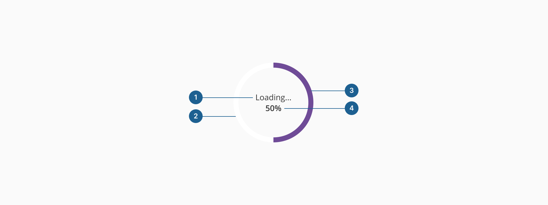
- 1.Label: provides a textual description of the loading process, enhancing accessibility and helping users understand what is being loaded.
- 2.Total circle: represents the full circumference of the spinner, serving as the stating background that defines the complete loading cycle.
- 3.Track circle: the dynamic element that visually indicates progress by filling up according to the percentage of completion.
- 4.Percentage (Optional): displays a numerical value, typically in the center of the spinner, showing the exact progress of the loading process.
Depending on the size or position, there are three different variants for the spinner component: defaultdefault, small and overlay.
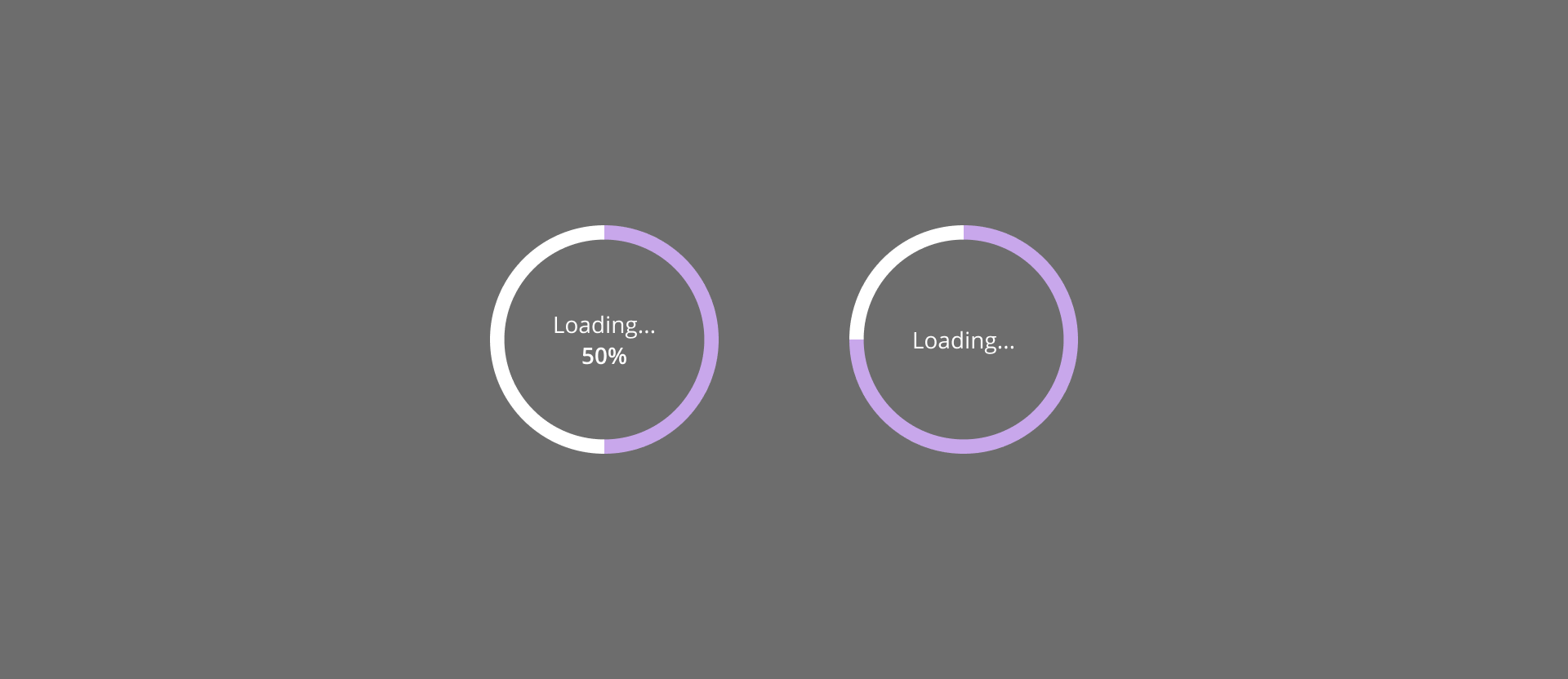
The default variant of the spinner is the standard option, offering a clear visual indication that a process is in progress. It is designed to be noticeable, making it ideal for situations where users must wait for content or system responses. As well as the overlay variant, the default version of our spinner can be determinate (it shows the percentage related to the progress of the process) or indeterminate.
The overlay variant of the spinner is designed for scenarios where the entire interface is temporarily blocked while a process is running. It appears centered on the screen with a semi-transparent background, preventing user interactions until the task is completed. This variant ensures users are aware that the system is actively processing their requests and helps prevent unintended actions during critical operations.
- System-wide loading states: when an entire page or app is waiting for a response.
- Blocking UI interactions: preventing user input while a critical process is being executed.
- Authentication processing: indicating login or security verification in progress.
- Payment processing: ensuring transactions are completed before allowing further actions.
The small variant of the spinner is a compact loading indicator designed for inline or localized loading states. It is ideal for non-blocking scenarios where users can continue interacting with other elements while waiting for specific content or data to load. This variant seamlessly integrates within UI components without overwhelming the interface.
- Use spinners for real-time feedback: implement the spinner only when there is a delay in content loading or an ongoing process that requires user awareness. Avoid unnecessary use that may lead to confusion.
- Choose the right variant:
- The default (large) spinner is ideal for full-page or major loading states that require user attention.
- The overlay spinner works well for modal or section-based loading, preventing interaction with specific content while keeping the rest of the UI accessible.
- The small spinner is best for inline feedback, such as button actions, table updates, or background data processing.
- Prevent indefinite loading states: always ensure the spinner disappears once the process is complete. If an operation takes too long, consider displaying a message or progress indicator with more details.
- Avoid blocking critical interactions: if possible, allow users to navigate or interact with other elements while waiting. Overlay spinners should be used cautiously to prevent unnecessary disruption.
- Combine with descriptive labels when necessary: if the loading state might be unclear, include a short label (e.g., "Loading data…" or "Processing request…") to provide context.
- Optimize performance: if an operation takes longer than expected, consider showing an estimated time or an alternative UI state to maintain user engagement.