Number inputs are essential UI elements for collecting quantitative data from users. They are designed to handle numerical values such as quantities, prices, percentages, or any input that requires mathematical validation or calculations. Common use cases include forms involving payment amounts, product quantities, ages, measurements, or ratings.
Unlike text inputs, number inputs offer built-in constraints like minimum and maximum values, step intervals, and automatic validation of non-numeric entries. These features help reduce errors, guide users toward valid entries, and ensure consistent data formatting.
Proper labeling, error messaging, and the use of increment/decrement controls can further enhance usability and accessibility, leading to a more efficient and user-friendly experience.

- 1.Label (Optional): a descriptive text that helps users understand what information is expected in the input field. It should be clear, concise, and placed near the input for better readability.
- 2.Optional indicator (Optional): a small indicator that signals the input field is not mandatory. It helps users know they can leave the field empty without causing validation errors.
- 3.Spin buttons increase/decrease (Optional): small interactive controls, displayed as plus (+) and minus (-) icons, that allow users to increment or decrement the numeric value using mouse clicks or keyboard input. These buttons improve usability by offering an alternative to manual typing, help prevent entry errors, and support accessibility for users who may prefer step-based adjustments.
- 4.Helper text (Optional): additional text placed below the input label that provides guidance, examples, or explanations to assist users in filling out the field correctly.
- 5.Container: the visual wrapper around the input field that provides structure, ensures accessibility, and helps differentiate the input from other UI elements.
- 6.Placeholder/Value: a short hint displayed inside the input field before any text is entered, offering a brief example or instruction on what type of data is expected. It disappears when the user starts typing. The value represents the actual content entered by the user. Unlike the placeholder, the value persists during interaction and is what gets submitted with the form.
- 7.Prefix (Optional): a visual element placed before or after the user input, like currency symbols or units, to help clarify the expected data.
Form inputs are essential UI elements that allow users to interact with digital products by entering or selecting data. Choosing the right input type and structure is key to designing efficient, user-friendly forms that support task completion and data accuracy.
A form input (also known as a form field) is used to capture user data. Common input types include text fields, date pickers, number fields, radio buttons, checkboxes, toggles, and dropdowns. Forms should always include a submission method, such as a submit button, link, or keyboard trigger, to complete the interaction.
Although input fields vary in type and purpose, they often share a common set of features:
- Placeholder: a short hint displayed inside the input field that describes its expected value or purpose.
- Size and max length: inputs can have both a visual size (width of the field) and a character limit that defines how much text can be entered.
- Prefix or suffix: some inputs include a visual element before or after the user input, like currency symbols or units, to help clarify the expected data.
- Helper text: additional information displayed below the field to guide the user in providing the correct input.
- Optional label: inputs that are not mandatory can be marked with an "Optional" tag to set clear expectations.
Most inputs can also present standard interactive or informative states:
- Disabled: this state prevents users from interacting with the field. It's typically used when a value is not applicable or editable under certain conditions or roles.
- Error: when a user enters invalid or incomplete data, the input shows an error state, often accompanied by a helpful message to guide corrections.
- Read-only: the input is visible, focusable, and hoverable, but not editable. This is ideal for fields with auto-calculated values. Unlike disabled fields, read-only inputs can still be submitted with the form and are part of the form data.
Number inputs are commonly used in forms and interfaces where users are required to provide numeric values such as quantities, prices, percentages, or other measurable data. Our number input component is highly configurable, allowing designers and developers to tailor it to a wide range of use cases while ensuring consistency, usability, and accessibility. In this section, we will highlight the key characteristics and behaviors of our number input, helping you understand how and when to use it effectively.
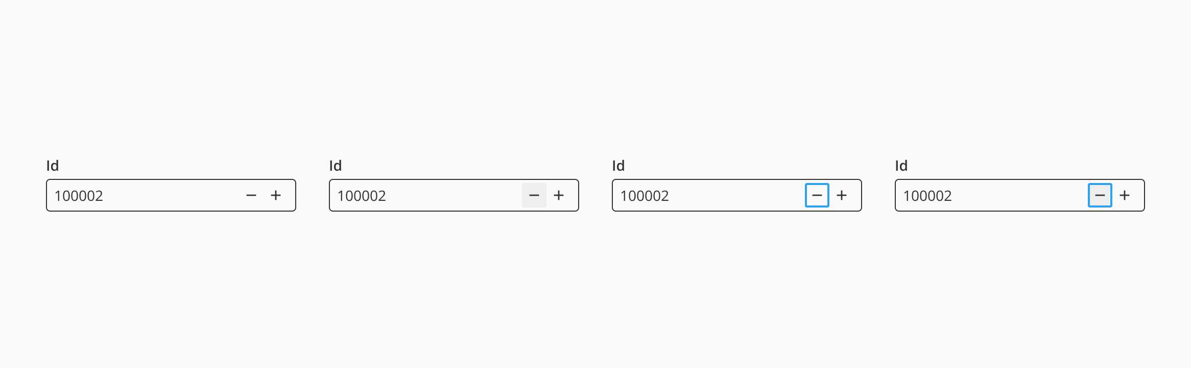
Spin buttons are one of the key interaction features of the number input. They allow users to increment or decrement the value using simple clicks, rather than typing manually. This is especially useful when working with step-based inputs, such as quantities or percentages, as it ensures more accurate entries and improves overall efficiency for both keyboard and mouse users.
Halstack number inputs also support the use of prefixes and suffixes, which are visual elements that help users quickly understand the format or context of the numeric value being entered. These elements clarify what type of number is expected, such as currency, units, or percentages, and ensure greater consistency in data entry.
This added context is especially helpful in forms with multiple numeric fields, allowing users to scan and comprehend each field's purpose at a glance, ultimately improving the overall experience and reducing entry errors.
- Always use clear labels: provide a clear and concise label to describe the expected numeric input. Avoid relying solely on the placeholder to communicate the field's purpose.
- Use helper text for additional guidance: if the expected input range, format, or units might be unclear, add helper text to avoid confusion and input errors.
- Indicate when the field is optional: use an "Optional" label when applicable to reduce user hesitation or over-input.
- Ensure consistent visual states: clearly differentiate between focus, error, disabled, and read-only states using accessible visual cues and messages.
- Set valid constraints: always define
min,max, orstepvalues when the input must fall within a numeric range to improve accuracy and prevent invalid entries.
- Enable keyboard and button control: users should be able to input values manually or use the spin buttons to increment/decrement the value.
- Avoid aggressive auto-corrections: do not override user input instantly or without warning; let users control their interaction unless invalid input requires immediate correction.
- Validate on interaction: validate values when the user finishes interacting with the field, not while they're typing, to prevent frustration.
- Allow incremental control: use appropriate
stepvalues to help users input valid values more efficiently when using spin buttons.
- Use prefixes and suffixes for context: clearly indicate units (e.g., kg, cm), currency (e.g., USD, EUR), or domain-specific values to help users understand what's expected.
- Avoid clutter: only use prefixes or suffixes when they add value and improve clarity. Don't overload the field with unnecessary UI elements.