Progress bars are used to show the progression of a task over time. They provide users with immediate visual feedback about the current state of an operation, such as loading content, uploading a file, or completing a form.
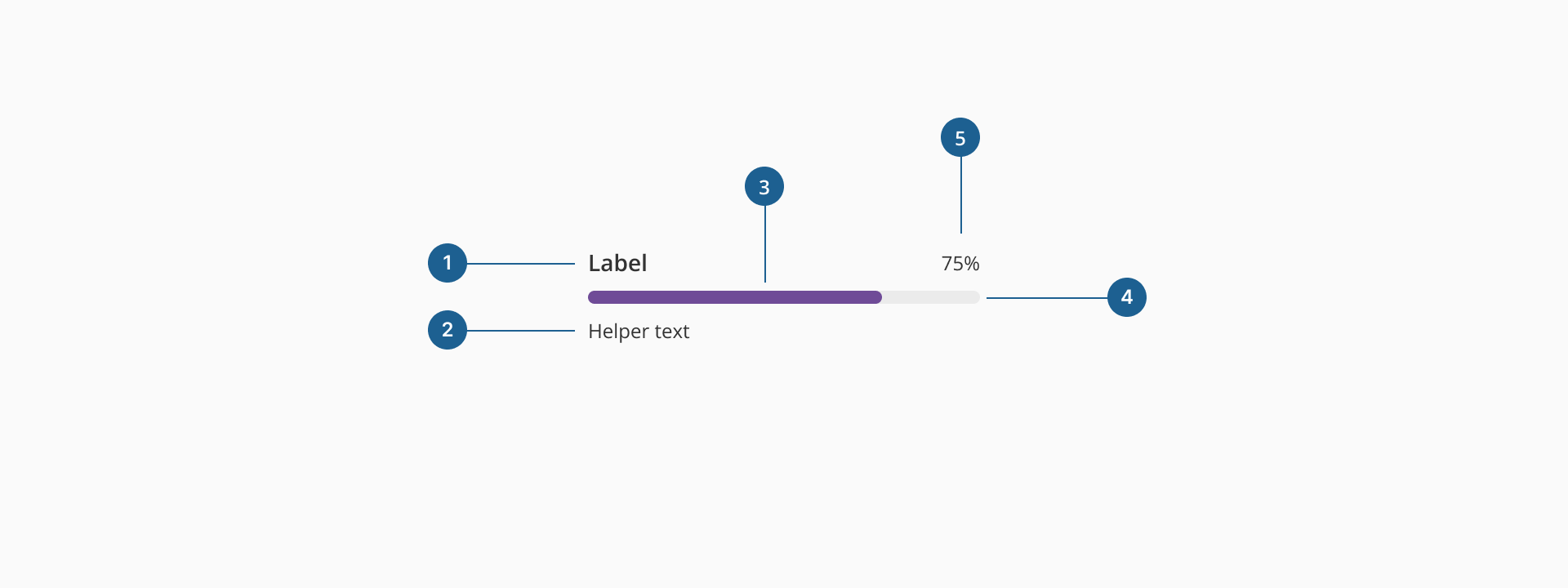
- 1.Label (Optional): text element that describes the purpose or context of the progress bar (e.g., "Uploading file…").
- 2.Helper text (Optional): provides additional information or clarification related to the progress, such as status messages or expected duration.
- 3.Progress track line: the filled portion of the bar showing completed progress.
- 4.Progress total line: the background bar representing the total task to be completed.
- 5.Progress indicator (Optional): highlights the current progress value within the bar.
Progress bars come in different styles based on task nature and UI context.
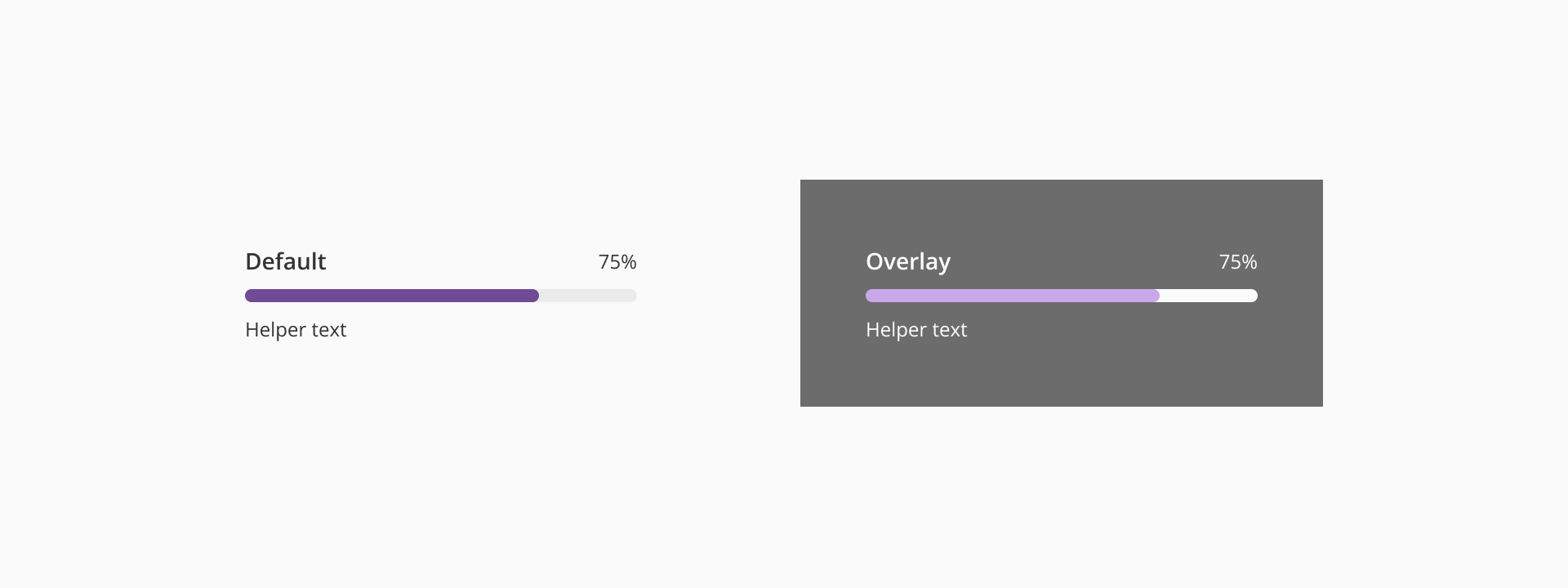
- Default: displays the progress bar inline, directly within the page or component layout. This is the most commonly used style, suitable for non-blocking tasks that allow the user to continue interacting with the UI.
- Overlay: displays the progress with a background overlay, temporarily blocking interaction with the UI. It's used for tasks that require user attention or when interaction must be paused until the task is complete.
- Provide clear feedback: always display a progress bar when the task takes longer than a few seconds. This reassures users that the system is processing and gives them a sense of control. If possible, include a label or percentage to indicate how much of the task is completed.
- Avoid overuse: don't show a progress bar for tasks shorter than 1 second — use a spinner or no feedback instead. Don't use a progress bar just for decoration; it should always reflect a real process.
- Provide contextual information: whenever possible, provide additional information like "Starting," "Halfway," or "Almost Done" to help users gauge the task status. If applicable, show what the task involves, especially when the user is waiting for something critical (e.g., "Updating to the latest version...").
- Use the right variant: use determinate when the completion percentage is known (e.g., file uploads, task completion). Use indeterminate when the system can’t predict the time or progress (e.g., loading content, waiting for server responses).
- Avoid blocking the UI: when progress is happening in the background, place the progress bar in a non-intrusive area, like near the top of the page or inside a specific section. Use overlay variant only when necessary, as it blocks user interaction. Make sure to include a clear indication of what the user is waiting for and an estimated time if possible.
- Combine with other feedback: pair with success, warning, or info toasts or alerts when appropriate to give users closure after completion.