The radio group component allows users to select a single option from a predefined set of choices. Each option is represented by a radio button, ensuring clear and mutually exclusive selection within the group. This component is commonly used in forms, surveys, and settings where users need to make a definitive choice. By organizing options in a structured manner, the radio group enhances usability and readability, guiding users toward a straightforward decision-making process.
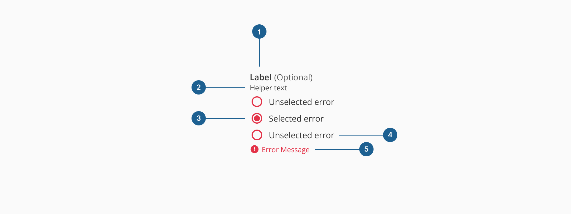
- 1.Label (Optional): the main heading for the radio group. It clearly communicates what decision the user is being asked to make.
- 2.Helper text (Optional): optional supporting text that provides additional context or instructions to guide the user's choice.
- 3.Radio input: the circular selection control representing each option. Only one radio input can be selected within the group at a time.
- 4.Radio input label: the descriptive text placed next to each radio input. It communicates the meaning of the option and is always visible for clarity.
- 5.Error message: displayed below the group when validation fails. It explains what went wrong and helps users correct their input.
Radio buttons can be arranged vertically or horizontally depending on the context, layout constraints, and user experience considerations.
Vertical stacking is the preferred layout for radio groups, especially in forms or when presenting more than two options. It enhances readability by allowing users to scan and compare choices with minimal cognitive load. This format supports accessibility and scales well with longer option labels.
Horizontal stacking is suitable when screen space is limited or when options are short and easily distinguishable. This layout can reduce vertical scroll but should only be used when it doesn't compromise readability. Always maintain visual grouping and alignment, and ensure that labels remain clear and unambiguous.
Although radio groups, checkboxes, and switches may appear as selection controls, they serve distinct purposes in a user interface:
| Component | Use case |
|---|---|
| Radio group | Use when the user must select only one option from a list of predefined, mutually exclusive choices. Ideal for short, static lists where all options should be visible at once to support decision-making. |
| Checkbox | Use when users can select multiple options independently. Each checkbox represents an on/off decision, making them suitable for filters, preference settings, or multi-select tasks. A group may allow none, some, or all options to be selected. |
| Switch | Use for a single, immediate toggle between two states, like on/off or enabled/disabled. Switches should act instantly and are best for system or UI-level settings. |
- Use for mutually exclusive choices: radio groups are best suited when users need to select only one option from a predefined list. Avoid using them for multiple selections — checkboxes are more appropriate in that case.
- Keep option labels short and clear: use concise, descriptive labels so users can quickly understand each choice. Avoid using long sentences or technical jargon, which can overwhelm the layout and slow down decision-making.
- Default to vertical layout for clarity: stacking options vertically improves readability and makes scanning easier, especially when there are more than two options. Use horizontal layout only when space is limited or options are very short and simple.
- Group related options together: ensure all radio buttons in a group are logically related and fall under the same question or decision point. Never separate radio buttons from their group label or helper text — they should feel like a cohesive unit.
- Handle errors gracefully: use validation to prevent submission without a selection if required, and display clear, specific error messages.