The paginator component allows users to navigate through large sets of data by breaking content into multiple pages. It provides controls to move between pages efficiently, ensuring a seamless browsing experience. Ideal for tables, lists and search results, the paginator improves usability by reducing load times and making content more manageable.
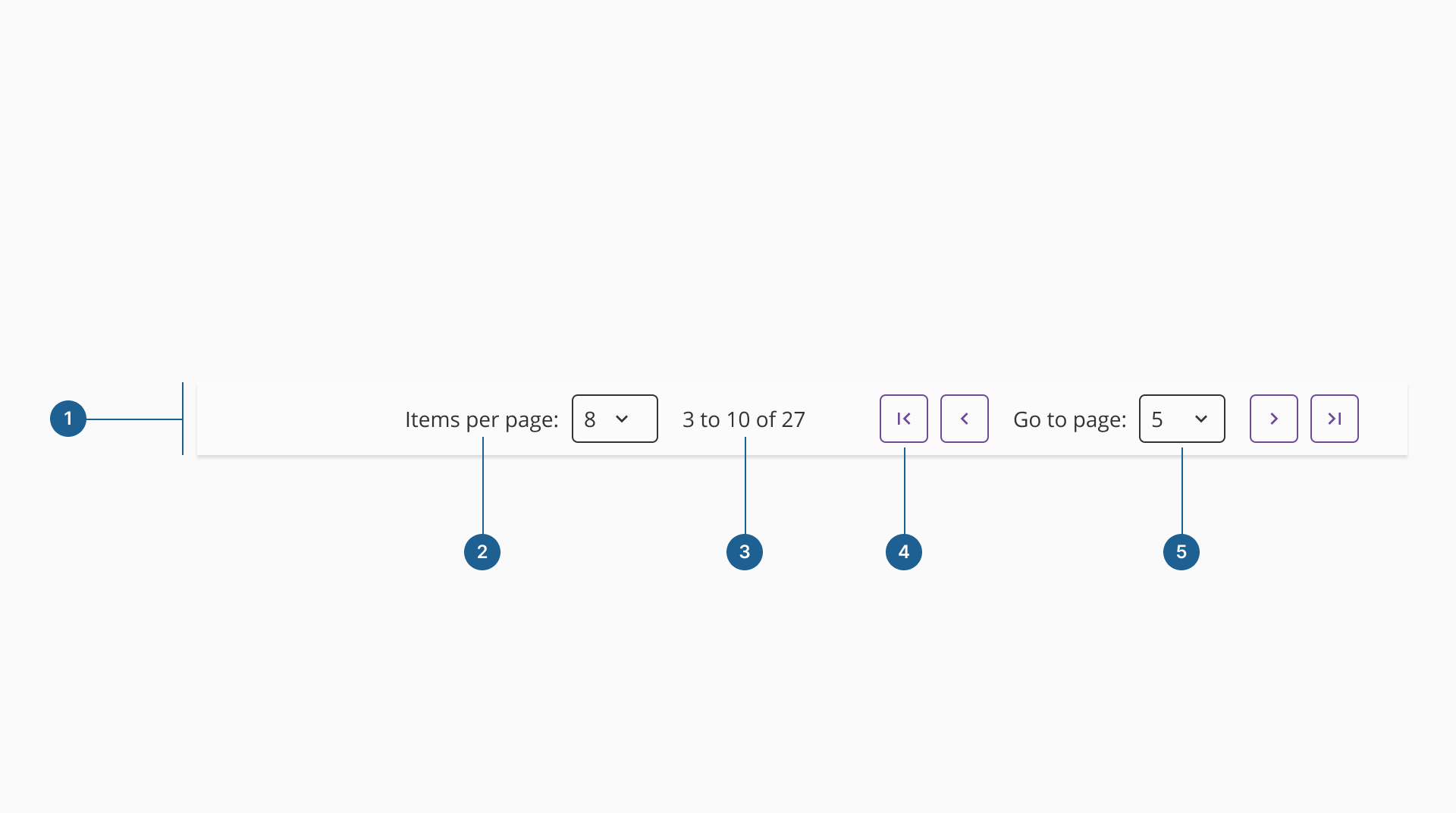
- 1.Container: the structural wrapper that holds all the elements of the paginator, ensuring proper spacing, alignment and responsiveness within the interface.
- 2.Items per page: a control that allows users to adjust the number of items displayed per page, providing flexibility in data viewing.
- 3.Items indicator: displays the current range of items being viewed and the total number of items, helping users understand their position within the dataset.
- 4.Page actions: navigation buttons that let users move between pages, typically including "Next", "Previous", "First" and "Last" controls.
- 5.Page selector: a dropdown or input that enables users to jump directly to a specific page, improving efficiency when navigating large datasets.
Paginators are essential for managing large amounts of content by dividing it into smaller, more digestible sections. They help maintain a clean and organized interface, ensuring that users can navigate through information efficiently without feeling overwhelmed. By breaking content into separate views, paginators reduce cognitive load, improve readability, and enhance the overall user experience. This approach is particularly useful in data-heavy applications, tables, or multi-page lists where presenting all information simultaneously would be impractical.
Our paginator component offers different configurations to accommodate various use cases. Take the time to explore these options and identify the best fit for your specific needs—whether it’s simple navigation, dynamic content loading, or more advanced pagination controls. Choosing the right configuration ensures a seamless experience for users.
Pagination does not eliminate the need for scrolling; in fact, both can work together to improve usability. For instance, a table with many rows might require vertical scrolling to display more content within a single page while still using pagination to divide data into manageable sections. This approach provides a more intuitive way to navigate large datasets without losing context.
- 1.Use pagination when necessary
Implement a paginator when the number of elements affects system performance or when displaying all content at once would significantly impact usability, especially on larger screens.
- 2.Positioning matters
Always place the paginator at the bottom of the content it divides. This ensures users encounter all relevant information before deciding to navigate to another page.
- 3.Clearly indicate current status
Display the current page number and the total number of items being shown. This helps users understand their position within the dataset and manage expectations when navigating.
- 4.Ensure intuitive navigation
Provide clear, accessible controls for moving between pages, including next/previous buttons and, when applicable, direct page selection for quicker access to specific sections.
- 5.Consider different configurations
Adapt the paginator's design to fit different scenarios, such as adding an option to adjust the number of items displayed per page or offering compact versions for space-constrained layouts.
- 6.Combine with scrolling when needed
In some cases, pagination and scrolling can work together. For example, tables with many rows may use a paginator to divide content into sections while allowing vertical scrolling within each page.