This powerful component improves user experience by allowing users to navigate through page-level content or choose from a list of actions while complementing the general disposition of the main content within the interface. It also allows a wide range of possibilities when it comes to placing content cohesively and comprehensively. To achieve this, it's important to understand how the items in our contextual menu behave and interact with each other.
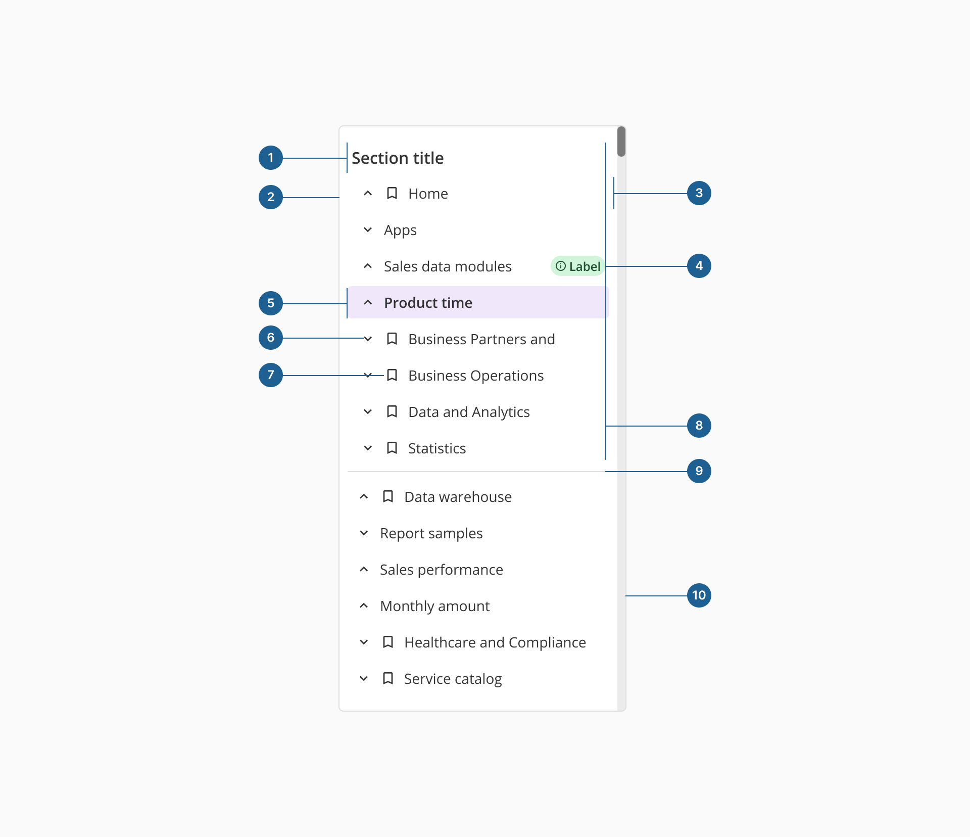
- 1.Section title: a label that groups related menu items within a contextual menu, enhancing organization and readability.
- 2.Container: the structural wrapper that holds all menu elements, ensuring proper alignment, spacing, and visual consistency.
- 3.Group item: they are nests of other group items or individual items that are related to each other and show indentation as they are unfolded.
- 4.Badge: a small visual indicator, often used to display counts, status updates or categories within a menu item.
- 5.Single item: an actionable element within the menu that triggers navigation or an operation when selected.
- 6.Expand/collapse Icon: a visual indicator for nested menus, allowing users to reveal or hide subitems.
- 7.Icon: a graphical representation within a menu item that aids recognition and reinforces meaning.
- 8.Section: they are a collection of group and single items within the menu that share a certain relationship and have a title that describes them.
- 9.Divider: a subtle separator that groups related menu items and improves menu structure.
- 10.Scrollbar: appears when the menu content exceeds the container's height, enabling vertical navigation.
Although visually similar, the sidenav component and the contextual menu differ significantly in functionality. Our sidenav is designed to provide a consistent and persistent navigation structure throughout the application, allowing users to easily switch between different sections or pages within the app.
On the other hand, the contextual menu is more context-sensitive, and appears in response to specific user actions, offering a set of relevant options or actions that can be performed on the current page. This means that it operates on a page level, so the component may appear or not depending on the specific needs and requirements for each screen or interaction.
- 1.Use meaningful icons: select icons that accurately represent menu items, ensuring clarity and intuitive navigation.
- 2.Align properly: position the contextual menu to the left or right, avoiding placement in the center to prevent obstruction of main content.
- 3.Enhance navigation with hierarchy: structure menu items using different levels to maintain logical organization.
- 4.Use badges for status indication: incorporate a Badge component to display status updates, counts or categories for navigable sections.
- 5.Default selection: when pre-selecting an option, try to limit it to the first menu item to maintain intuitive user interactions.
- 6.Avoid deep hierarchies: limit navigation depth to a maximum of three levels to prevent excessive indentation and complexity.
- 7.Restrict icon usage: use icons only at the first navigation level to maintain readability and avoid visual clutter.
- 8.Don't overload with icons: too many icons can create confusion rather than improve usability. Keep them purposeful and minimal.