Date inputs allow users to enter or select a specific date using a calendar picker or manual text entry. Designed to support a wide range of use cases, from booking systems to form submissions, it ensures clarity and consistency in date formats, helps prevent input errors, and adapts to different locale and accessibility requirements. Its combination of manual input and guided selection provides flexibility while maintaining a streamlined user experience.
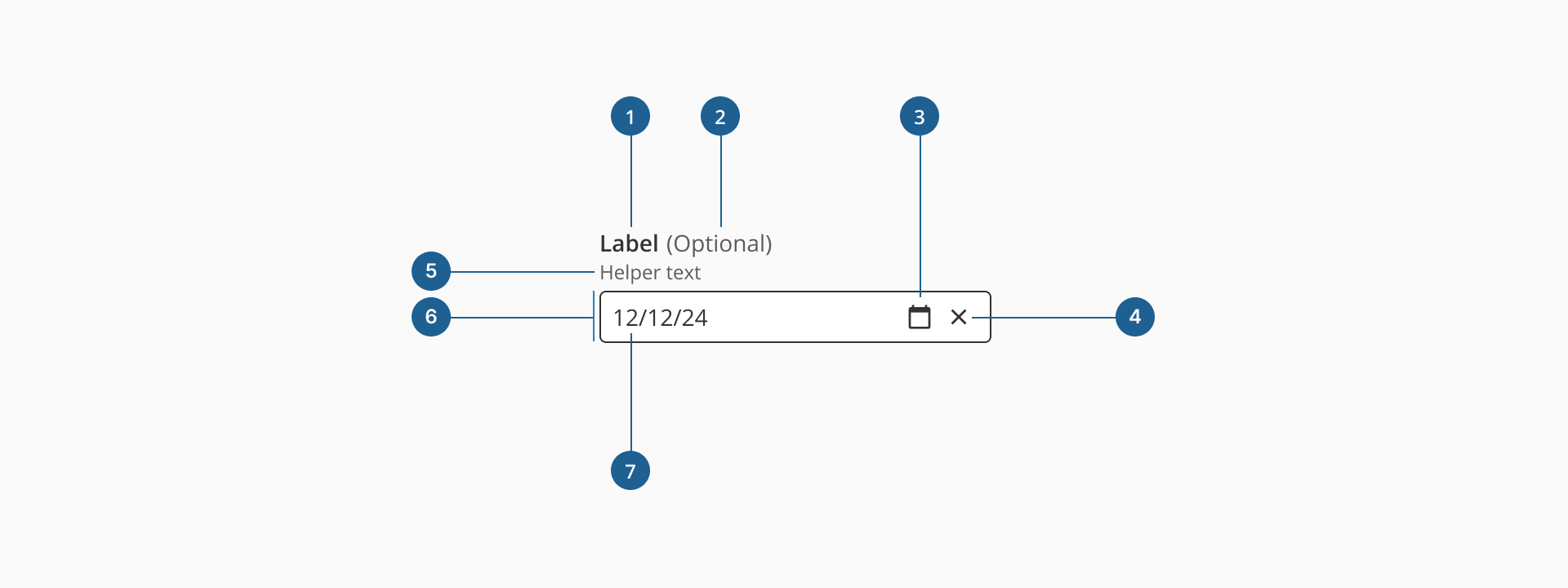
- 1.Label (Optional): a descriptive text that helps users understand what information is expected in the input field. It should be clear, concise, and placed near the input for better readability.
- 2.Optional indicator (Optional): a small indicator that signals the input field is not mandatory. It helps users know they can leave the field empty without causing validation errors.
- 3.Date button: an interactive element inside the input field that triggers the date picker of the component, where the user can select a date based on the day, month and year.
- 4.Clear action (Optional): a small button, usually represented by an "X" icon, that allows users to clear the date selected or introduced quickly without manually deleting it.
- 5.Helper text (Optional): additional text placed below the input field that provides guidance, examples, or explanations to assist users in filling out the field correctly.
- 6.Container: the visual wrapper around the input field that provides structure, ensures accessibility, and helps differentiate the input from other UI elements.
- 7.Value: displays the selected or manually entered date in the input field, following the specified format.
Form inputs are essential UI elements that allow users to interact with digital products by entering or selecting data. Choosing the right input type and structure is key to designing efficient, user-friendly forms that support task completion and data accuracy.
A form input (also known as a form field) is used to capture user data. Common input types include text fields, date pickers, number fields, radio buttons, checkboxes, toggles, and dropdowns. Forms should always include a submission method, such as a submit button, link, or keyboard trigger, to complete the interaction.
Although input fields vary in type and purpose, they often share a common set of features:
- Placeholder: a short hint displayed inside the input field that describes its expected value or purpose.
- Helper text: additional information displayed below the field to guide the user in providing the correct input.
- Optional label: inputs that are not mandatory can be marked with an "Optional" tag to set clear expectations.
Most inputs can also present standard interactive or informative states:
- Disabled: This state prevents users from interacting with the field. It's typically used when a value is not applicable or editable under certain conditions or roles.
- Error: When a user enters invalid or incomplete data, the input shows an error state, often accompanied by a helpful message to guide corrections.
- Read-only: The input is visible, focusable, and hoverable, but not editable. This is ideal for fields with auto-calculated values. Unlike disabled fields, read-only inputs can still be submitted with the form and are part of the form data.
Date inputs are designed to help users provide valid, well-formatted dates with minimal friction. Unlike standard text fields, they combine manual input with an interactive date picker, making them ideal for scenarios like bookings, forms, or scheduling events. They are particularly useful for reducing input errors and ensuring consistent formatting across different regions and use cases.
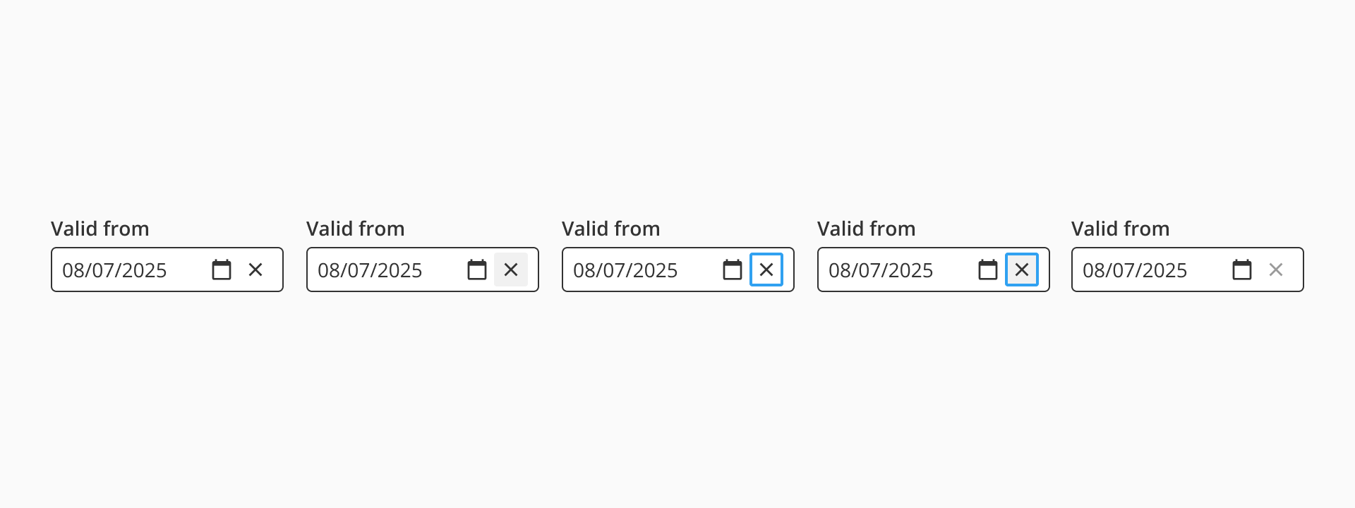
As most of our form inputs, the date input includes a clear (close) icon that allows users to quickly remove the selected or typed date with a single click. This is especially helpful when correcting mistakes or resetting the field during form completion. The icon is only visible when a value is present, keeping the interface clean and focused.
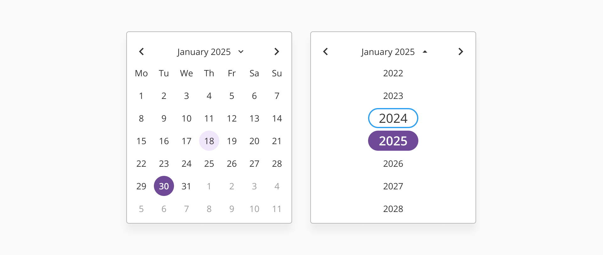
The component features a built-in date picker dialog that can be opened via the calendar icon. This dialog allows users to select a date visually from a calendar, reducing the likelihood of formatting errors. The picker includes navigational controls to switch between months and years, ensuring users can easily access both past and future dates.
Our date input supports internationalization by adapting to locale-specific formats (e.g., DD/MM/YYYY vs. MM/DD/YYYY) and calendar language. This ensures that users across different regions understand the input format and interact with the component comfortably. It's especially important to align the expected format with the user's regional settings or provide format guidance with placeholders and helper text.
- Always use the date input when a valid date format is required. This helps ensure consistency and prevents user error.
- Display date formats clearly and consistently across your application, especially if users from multiple locales are expected.
- Include a clear label that describes the context or purpose of the date (e.g., "Date of birth" or "Start date").
- Avoid setting default dates unless the context explicitly calls for it, such as pre-filling today's date for quick scheduling.
- Match the date format to the user’s regional settings (DD/MM/YYYY or MM/DD/YYYY), and consider using placeholder text to guide formatting.
- Provide clear feedback if the user types an invalid date manually.
- Avoid using text inputs with custom formatting masks in place of the date input component—this can confuse users and complicate validation.
- Include the date picker to reduce formatting errors and speed up date selection, especially for less tech-savvy users or on mobile.
- For workflows that involve selecting a wide range of dates (e.g., historical records), make sure the date picker supports quick navigation between months and years.