Sidenav
The sidenav component provides a vertical navigation structure placed on the left side of the interface.
The sidenav is part of the application layout, so it can only be used inside of it. Please check the DxcApplicationLayout documentation.
The sidenav component is designed to support efficient and intuitive navigation across the main sections of an application. Its vertical layout provides persistent access to navigation links, improving discoverability and reducing the steps needed to move between pages. It supports nested groups, collapsible sections, and the ability to highlight the active route, making it especially useful for applications with deep or complex navigation structures.
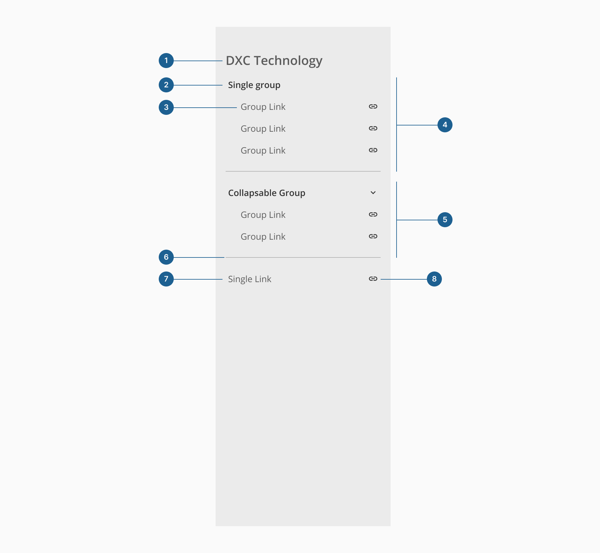
- 1.Title: the main label displayed at the top of the sidenav, typically used to indicate the name of the product or section.
- 2.Group title: a label that groups related links together, providing visual structure and context within the navigation.
- 3.Page or section link: the navigational element that redirects users to a specific view or section of the application.
- 4.Single group: a container that holds a set of related links that are always visible and not collapsible.
- 5.Collapsible group: a group of links that can be expanded or collapsed, helping reduce visual noise and support progressive disclosure.
- 6.Divider: a horizontal line used to visually separate groups or sections within the sidenav for better readability.
- 7.Single link: an individual navigational item not grouped with others, typically used for stand-alone destinations.
- 8.Icon: an optional visual element placed before the link label, used to reinforce meaning or improve scannability.
The sidenav supports hierarchical structures, organizing navigation links into nested groups. Though it only supports one level of nesting, this helps users quickly understand the content structure and navigate between related pages or sections more efficiently.
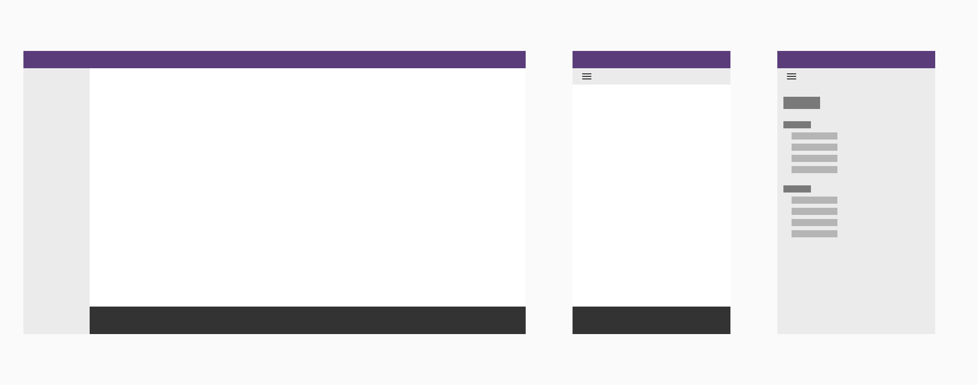
On mobile and tablet screens, the sidenav becomes an overlay panel that can be toggled open or closed. This responsive version ensures that navigation remains accessible without occupying valuable screen space. Users can open the sidenav using a dedicated menu icon, and close it either by interacting with the backdrop or selecting a navigation option. This enhances usability and maintains focus on content in smaller viewports.
- Use the sidenav component to improve discoverability: make navigation links easy to find and access, helping users understand the structure of the application.
- Keep in mind the type of devices you're developing for: ensure the sidenav behaves in a way that doesn't block or reduce the space available for the main content, especially on smaller screens.
- Follow a clear structure and hierarchy: organize the content using group titles, dividers, and indentation to visually differentiate between sections, titles, and individual links.
- Use clear and concise labels: navigation items should use simple, intuitive wording that clearly describes their destination or action.
- Organize links into logical groups: related navigation items should be grouped together under meaningful group titles for easier scanning.
- Use icons to reinforce meaning: include icons where relevant to improve visual recognition and support faster navigation.
- Use collapsible groups for long menus: when there are many links, collapsible groups help keep the sidenav organized and reduce visual clutter.
- Use dividers to separate sections: visual separators make different content areas more distinct and improve readability.