Cards are versatile UI components used to group related content and actions within a contained layout. They help organize information into digestible sections, making it easier for users to scan, compare, and interact with individual items. Cards enhance readability and visual hierarchy and are commonly used in dashboards, product listings, user profiles, and content previews to support structured and engaging user experiences.
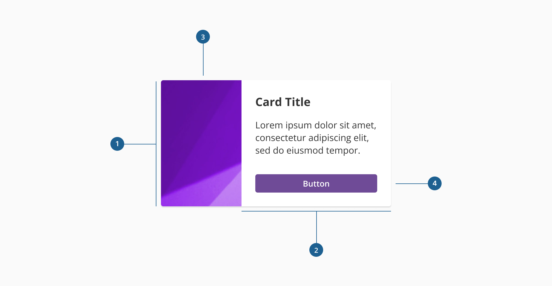
- 1.Container: the main structural wrapper that ensures padding, spacing, and alignment across all card elements.
- 2.Custom content area: flexible space where text, icons, buttons, and other UI elements can be placed. It adapts to different use cases while maintaining visual consistency.
- 3.Image (Optional): visual element that enhances the card's content. By default it can be placed either on the left or right side of the card depending on layout needs.
- 4.Interactive elements (Optional): components such as buttons or icons that allow users to take actions related to the card's content.
** Please note that while these elements are not included by default in the component's configuration, they are the common components in a card. While cards support optional elements like images and actions, it's essential that the overall composition remains visually balanced and aligned with the design system's structure.
Cards are designed to accommodate flexible layouts and diverse content types. You can include any combination of media and interactive elements, but it's important to follow consistent design patterns for usability and clarity.
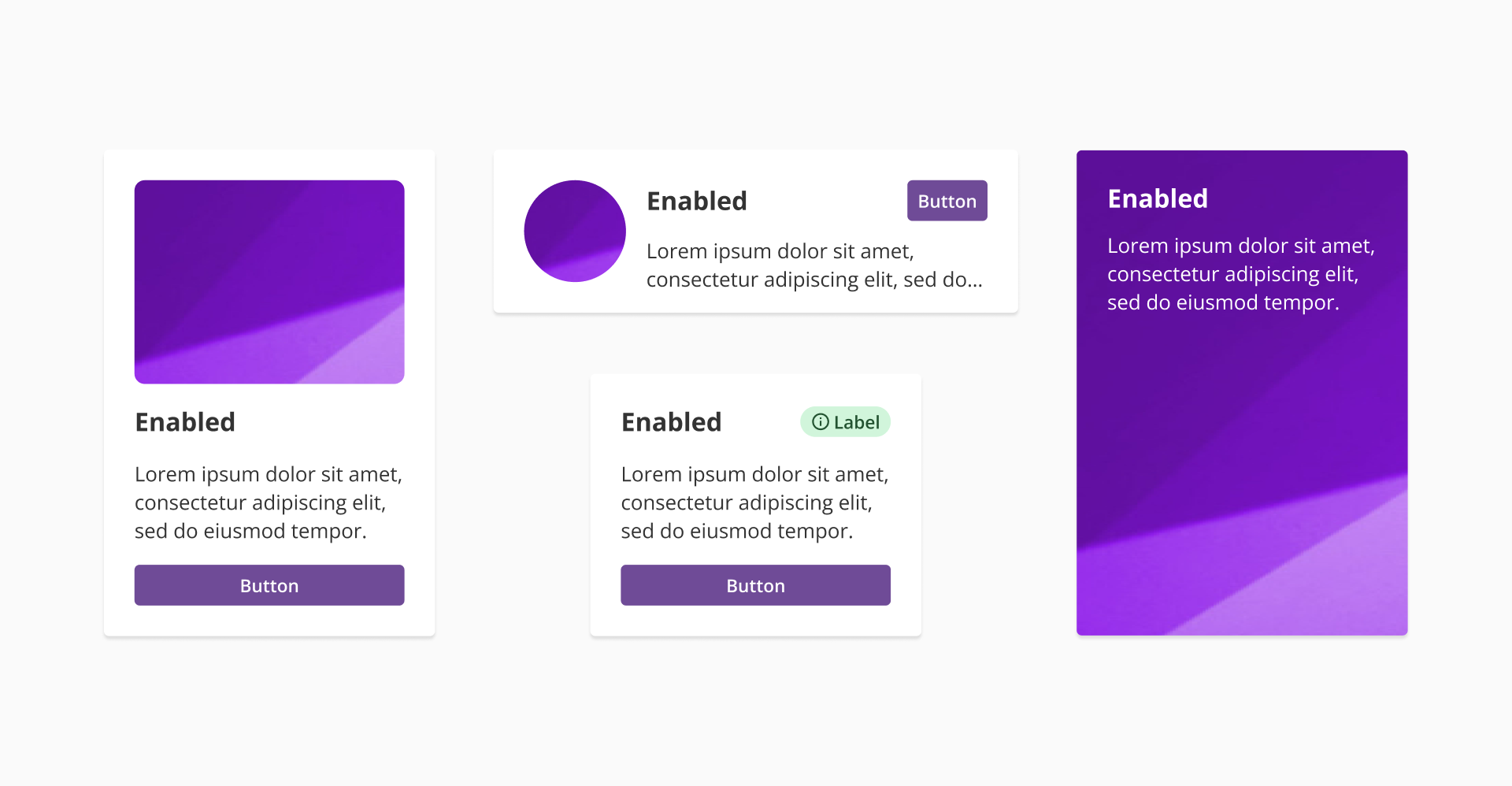
- Image placement: cards support placing the image either on the left or the right side of the layout. The image should maintain a fixed ratio and size for visual harmony. By default, the component provides layout options where the image can appear on the left or right side of the content. However, alternative layouts —such as vertical image placements — can be achieved by placing the image directly within the custom content area. This allows for more flexibility while still adhering to spacing and alignment guidelines.
- Text content: titles, descriptions, metadata, or status labels are typically placed in the content area with a clear hierarchy — starting with a bold title, followed by supporting text.
- Interactive elements: place buttons, links, or icons in the lower section of the content area or aligned to the end of the card to support related user actions.
- Avoid overloading: keep the content concise to prevent visual clutter. A well-structured card should be easy to scan and act upon.
- Use a consistent layout: when displaying a collection of cards, maintain the same layout and style across all instances. Avoid mixing card variants within the same set.
- Support scanning: structure content so users can quickly identify what the card is about — use visual hierarchy, spacing, and clear typography.
- Use cards as independent units: each card should contain all the relevant information and actions within it. It should make sense on its own, even if removed from the rest of the collection.
- Minimize interaction complexity: don't overload the card with too many clickable areas. Define clear action zones, and prioritize the most important interactions.
- Respect spacing: ensure consistent padding and margins within and between cards to maintain visual rhythm in the layout.
- Use of white space: avoid cramming content. White space improves readability and prevents cards from feeling cluttered.
- Avoid over-design: too many effects, decorations, or inconsistent imagery can reduce clarity and hurt the overall user experience.
- Responsiveness: cards should adapt gracefully to different screen sizes and grid layouts, maintaining structure and readability.