Header
A horizontal bar located at the top of the application, providing branding, primary navigation, and user account controls.
The header is part of the application layout, so it can only be used inside of it. Please check the DxcApplicationLayout documentation.
The Header serves as the primary navigation and identity element for an application. It includes branding, quick access to key sections via navigation links, and a user account menu. Its consistent presence reinforces brand recognition and improves usability by offering easy navigation and access to user-related actions.
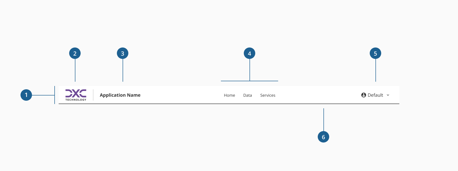
- 1.Container: a layout structure that wraps all Header elements, ensuring consistent alignment, spacing, and maximum width limits. The container helps keep the header properly aligned across different screen sizes.
- 2.Brand Image: a clear, balanced logo that fits well within the header without overpowering other elements.
- 3.Application Name (Optional): a short, recognizable application name placed next to the logo to reinforce brand identity.
- 4.Navigation Links (Optional): key links to main sections of the application.
- 5.Header Dropdown (Optional): a dropdown menu for user-specific actions such as profile, settings, or logout, triggered by click or keyboard focus.
- 6.Divider (Optional): horizontal line that visually separates the Header from the page content below, enhancing layout clarity.
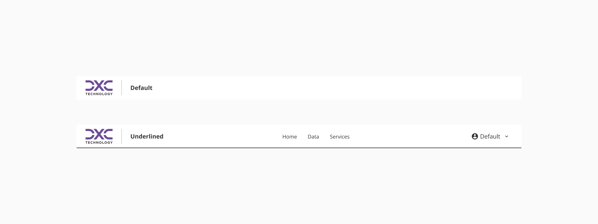
To maintain consistency with the way variants are structured across components, the Header offers two primary styles: default and underlined.
- The default variant features a clean header without a visual separation from the page content, ideal for minimalistic or immersive layouts.
- The underlined variant includes a subtle bottom divider, creating a clear visual boundary between the header and the rest of the page content, enhancing structure and clarity.
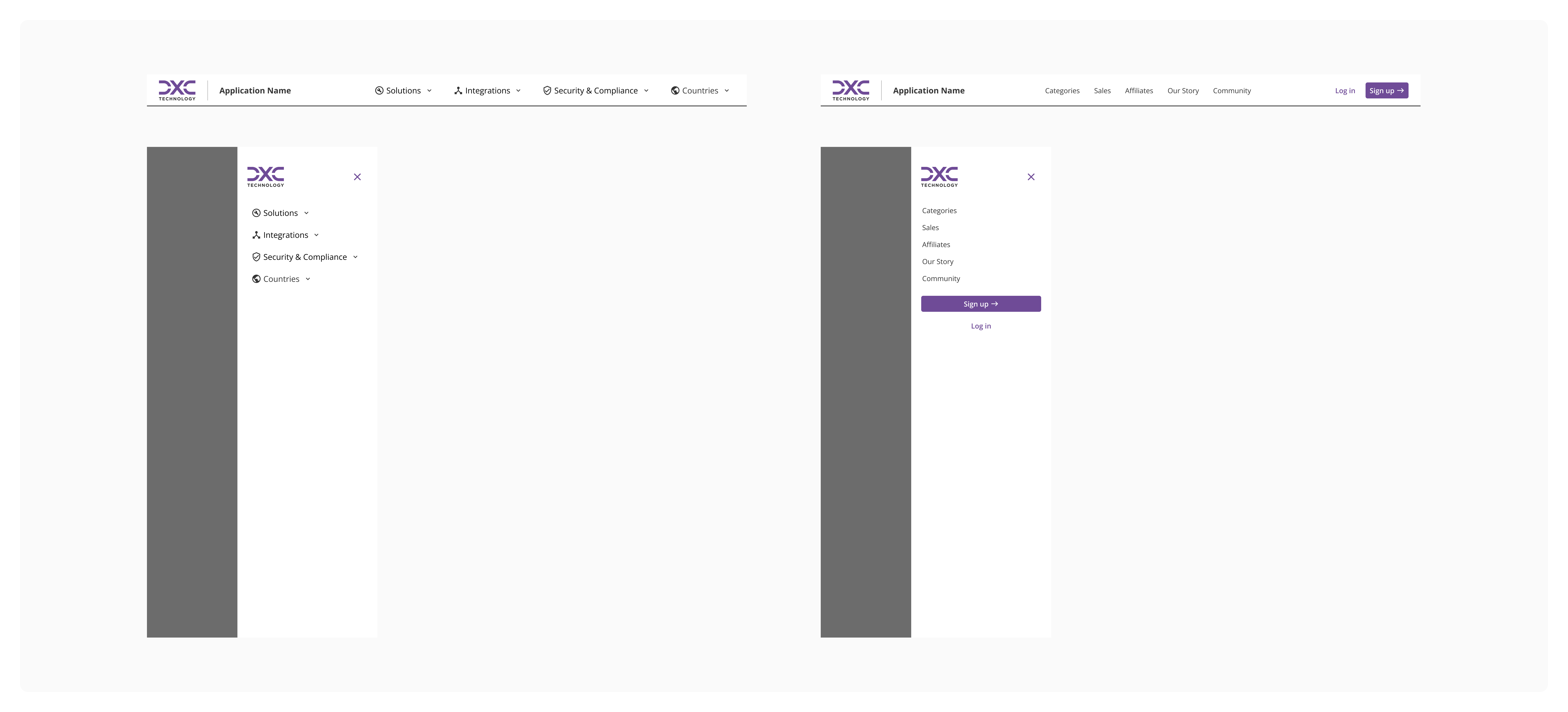
Since applications are accessed from a variety of devices, including laptops, tablets, and smartphones, it's essential to design a Header that adapts fluidly to different screen sizes. The responsive Header should maintain the core structure and visual hierarchy of the desktop version, ensuring a consistent and intuitive user experience across all devices.
- Keep the Header minimal and functional: include only essential elements.
- Select the correct variant according to visual needs: Use the default variant for simple pages and underlined variant to visually separate the Header from the content when necessary.
- Use dropdowns correctly for complex navigation: Only use Header dropdowns when necessary to organize multiple links logically without overwhelming the top navigation.
- Avoid overcrowding the Header: Limit the number of top-level navigation links. Group secondary links inside dropdowns if needed to maintain a clean and user-friendly interface.
- Display the application name clearly and concisely: The application name should be readable, short, and not overpower the brand logo. It reinforces brand identity and provides immediate context to users.
- Design the Header to respond gracefully to smaller screens: When adapting the Header to mobile or tablet layouts, restructure the content to preserve both visual clarity and functional hierarchy.