Alert
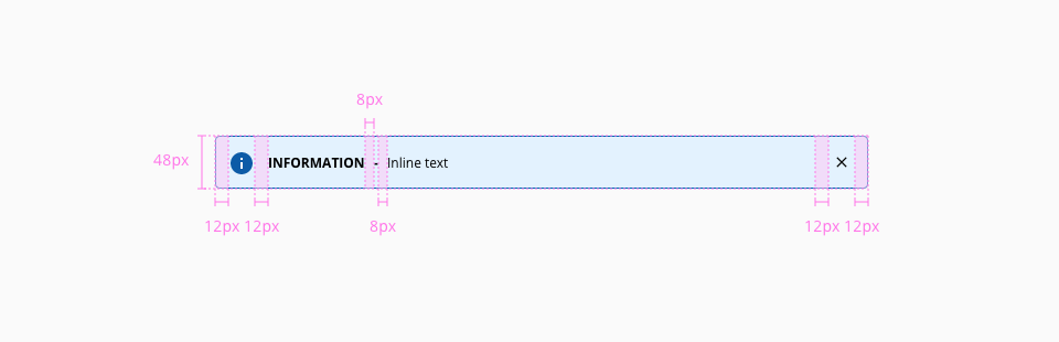
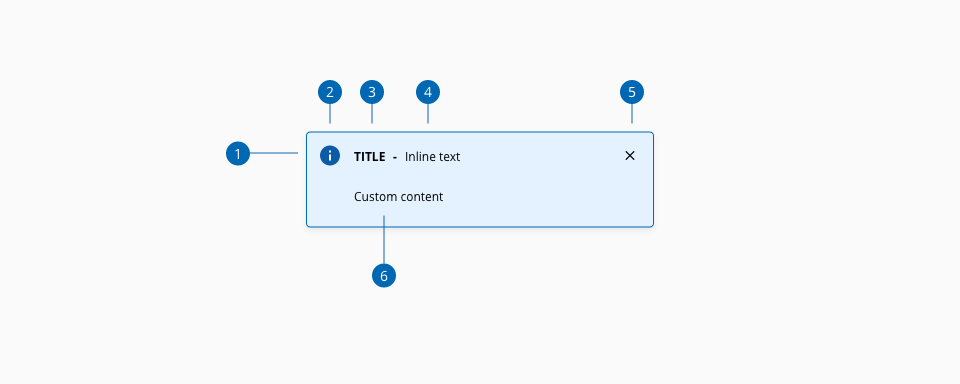
Alert messages are meant to provide contextual feedback about important changes in the interface.
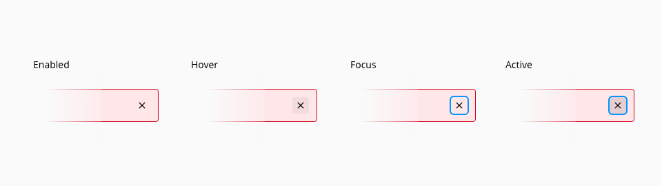
States for the close action of the alert component: enabled, hover, focus, and active.
| Component token | Element | Core token | Value |
|---|---|---|---|
infoIconColor | Icon | color-blue-800 | #0067b3 |
successIconColor | Icon | color-green-700 | #24a148 |
warningIconColor | Icon | color-yellow-700 | #c59f07 |
errorIconColor | Icon | color-red-700 | #d0011b |
infoBackgroundColor | Container background | color-blue-100 | #e6f4ff |
successBackgroundColor | Container background | color-green-100 | #eafaef |
warningBackgroundColor | Container background | color-yellow-100 | #fef9e6 |
errorBackgroundColor | Container background | color-red-100 | #ffe6e9 |
infoBorderColor | Container border | color-blue-800 | #0067b3 |
successBorderColor | Container border | color-green-700 | #24a148 |
warningBorderColor | Container border | color-yellow-700 | #c59f07 |
errorBorderColor | Container border | color-red-700 | #d0011b |
titleFontColor | Title | color-black | #000000 |
inlineTextFontColor | Inline text | color-black | #000000 |
hoverActionBackgroundColor | Action:hover | color-grey-100-a | #0000000d |
activeActionBackgroundColor | Action:active | color-grey-200-a | #0000001a |
focusActionBorderColor | Action:focus | color-blue-600 | #0095ff |
overlayColor | Overlay | color-grey-800-a | #000000b3 |
| Component token | Element | Core token | Value |
|---|---|---|---|
titleFontFamily | Title | font-family-sans | 'Open Sans', sans-serif; |
titleFontSize | Title | font-scale-01 | 0.75rem / 12px |
titleFontWeight | Title | font-bold | 600 |
inlineTextFontFamily | Inline text | font-family-sans | 'Open Sans', sans-serif; |
inlineTextFontSize | Inline text | font-scale-01 | 0.75rem / 12px |
inlineTextFontWeight | Inline text | font-regular | 400 |
The alert component has a property that is customizable depending on the context and the scenario where the component is used. This property defines the size of the alert and it can get multiple values according to the needs of the application.
| Width | Value |
|---|---|
small | 280px |
medium | 480px |
large | 820px |
fillParent | - |
fitContent | - |
- Understanding WCAG 2.2 - SC 4.1.3 Status Messages
- WAI-ARIA Authoring practices 1.2 - 3.2 Alert
- WAI-ARIA Authoring practices 1.2 - 3.3 Alert and Message dialogs
- WAI-ARIA Authoring practices 1.2 - Alert design pattern
- WAI-ARIA Authoring practices 1.2 - Alert Dialog design pattern