Badge
The badge component enables users to categorize content effectively and uniformly across their interfaces. It offers a quick overview of a category or status and is frequently used to display numerical or status data.
- Use a notification badge to display counts, such as the number of unread messages or missed notifications.
- Showcase the completion or status of tasks by using the contextual badge. Its different colors can help the user to identify quickly the status of a task and can improve significantly the overall user experience in data visualization screens with high cognitive load.
- Categorize pieces of information using the contextual label and its colors. It can provide additional context or information. For example, a badge can indicate the type or category of content (e.g., names of the teams involved in the task, repositories, folders…).
- Keep it concise: comprehensively use badges, only displaying essential information that adds value to the user experience.
- The label of the badge component should never contain more than three words. Keeping it simple is the key to ensuring users understand the categorization quickly.
- Establish clear design guidelines within the interface for badges, specially when deciding its placement. Consistent use of badges enhances visual coherence and aids user comprehension.
- Use both semantic and non-semantic contextual badges in the same data visualization format.
- Overuse badges, as an excessive use can saturate the interface and fail to communicate important information.
- Place badges in locations that may obstruct essential content or user interactions.
- Use excessively long sentences in labels. Remember to keep it simple, with a maximum of 3 words.
- Place the negative symbol (-) in badges, whether they are notification or contextual. Notification badges should typically indicate counts or statuses that are positive or neutral to insure clarity and comprehension.
The Badge component has two distinct variants, each serving specific purposes within our interface.
The notification badge is a non-interactive component that serves as an informative indicator, typically used to display counts or alerts, such as the number of unread messages or missed notifications.
This notification badge allows label, though it is not not mandatory to use it. You may want to use the label to display the number of notifications missed, or just the empty badge to show that some changes have been made to a certain section of the interface.
Only one color is allowed for this badge, which is red, and cannot be changed by all means.
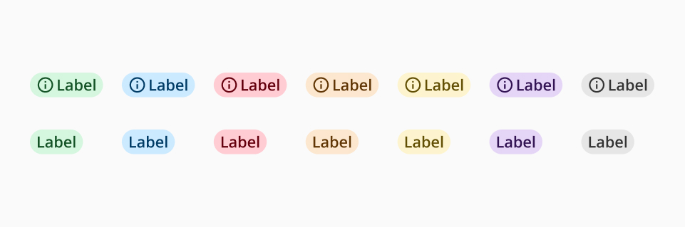
Designed mainly for data visualization interfaces, the contextual variant of the Badge component’s main advantage lies in its ability to categorize content and represent specific information. It is intentionally non-interactive and may contain icons strategically chosen to enhance the conveyed information.
The contextual badge is available in 8 different colors from the Halstack palette. This flexibility allows the user to adapt the tag smoothly to diverse contexts:
- Non-semantic categorization: used in instances where the badge does not carry semantic meaning, it can be employed in any color from the available palette.
- Semantic categorization: when the badge conveys semantic information, spacific semantic colors are available:
- Green: positive actions, such as approved, completed, success…
- Blue: informative actions, such as published, in use...
- Red: negative actions, such as error, rejection, incomplete...
- Orange: alert actions, such as pending or paused actions...