Card

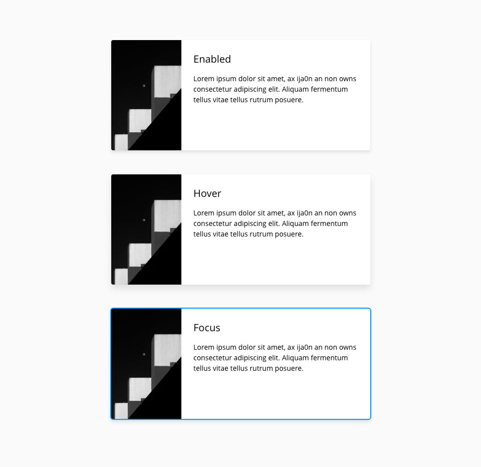
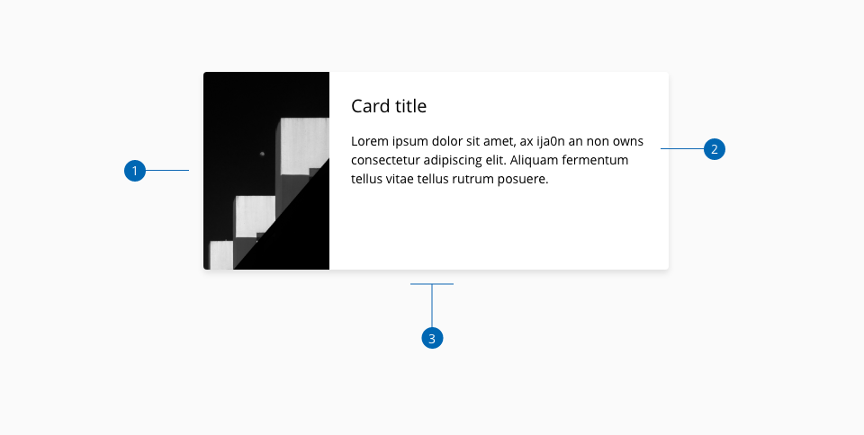
Cards are a container of information, actions and data with a hierarchy to make easy scanning the content. A card can be defined as a unit, so it has all the information within it, making the component useful to show images, text, and interactive elements. The structure of the card can be seen as blocks, each block is optional to be displayed but the overall element should make a cohesive design, even if it includes text, images or other elements.
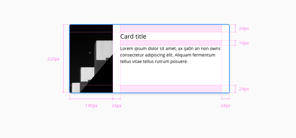
Specifications

Card design specifications

States

Component states: enabled, hover and focus.

Card states
Card states

Anatomy

Card anatomy
  1. 1.
    Card image
  2. 2.
    Custom content
  3. 3.
    Container

Design tokens

Color

Component tokenElementCore tokenValue
backgroundColor*Containercolor-white#ffffff
focusColor*Container:focuscolor-blue-600#0095ff

The background-color token belongs to the box component, changes made on that component will affect the card element.

Border

PropertyElementCore tokenValue
border-widthContainerborder-width-00
border-styleContainerborder-style-nonenone
border-radiusContainerborder-radius-medium0.25rem / 4px

Spacing

PropertyElementCore tokenValue
margin-topCustom content - subtitlespacing-40.25rem / 4px
margin-bottomCustom content - titlespacing-161rem / 16px
padding-leftCustom contentspacing-241.5rem / 24px
padding-topCustom contentspacing-241.5rem / 24px
padding-bottomCustom contentspacing-241.5rem / 24px
padding-rightContainerspacing-241.5rem / 24px

Size

Component tokenElementCore tokenValue
heightContainer height-220px
widthContainer width-400px
PropertyElementValue
max-widthImage140px

Margin

Margin properties can be applied independently to top, right, bottom and left sides of the card container.

MarginValue
xxsmall6px
xsmall16px
small24px
medium36px
large48px
xlarge64px
xxlarge100px