Checkbox
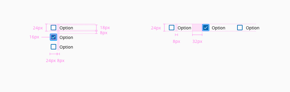
Checkboxes are inputs that offer to the user the possibility to select one or more options from a range of attributes.
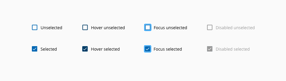
The following states are defined in the life cycle of the component: unselected enabled, unselected hover, unselected focus, unselected disabled, selected enabled, selected hover, selected focus and selected disabled.

| Component token | Element | Core token | Value |
|---|---|---|---|
backgroundColorChecked | Fill | color-blue-800 | #0067b3 |
hoverBackgroundColorChecked | Fill:hover | color-blue-900 | #003c66 |
disabledBackgroundColorChecked | Fill:disabled | color-grey-500 | #999999 |
readOnlyBackgroundColorChecked | Fill:readonly | color-grey-500 | #999999 |
hoverReadOnlyBackgroundColorChecked | Fill:readonly:hover | color-grey-600 | #808080 |
borderColor | Border | color-blue-800 | #0067b3 |
hoverBorderColor | Border:hover | color-blue-900 | #003c66 |
disabledBorderColor | Border:disabled | color-grey-500 | #999999 |
readOnlyBorderColor | Border:readonly | color-grey-500 | #999999 |
hoverReadOnlyBorderColor | Border:readonly:hover | color-grey-600 | #808080 |
checkColor | Check mark | color-white | #ffffff |
disabledCheckColor | Check mark:disabled | color-white | #ffffff |
readOnlyCheckColor | Check mark:readonly | color-white | #ffffff |
fontColor | Label | color-black | #000000 |
disabledFontColor | Label:disabled | color-grey-500 | #999999 |
focusColor | Outline:focus | color-blue-600 | #0095ff |
| Property | Element | Core token | Value |
|---|---|---|---|
border-width | Checkbox input | border-width-2 | 2px |
border-style | Checkbox input | border-style-solid | solid |
border-radius | Checkbox input | border-radius-small | 0.125rem / 2px |
border-width | Focus border | border-width-2 | 2px |
border-style | Focus border | border-style-solid | solid |
border-radius | Focus border | border-radius-medium | 0.25rem / 4px |
- Understanding WCAG 2.2 - SC 1.3.1: Info and Relationships
- Understanding WCAG 2.2 - SC 4.1.2: Name, Role, Value
- WAI-ARIA Authoring Practices 1.2 - 3.7 Checkbox