Chip
Chips are elements that represent status, complementary information, or association between elements.

The chip component container states are enabled and disabled:

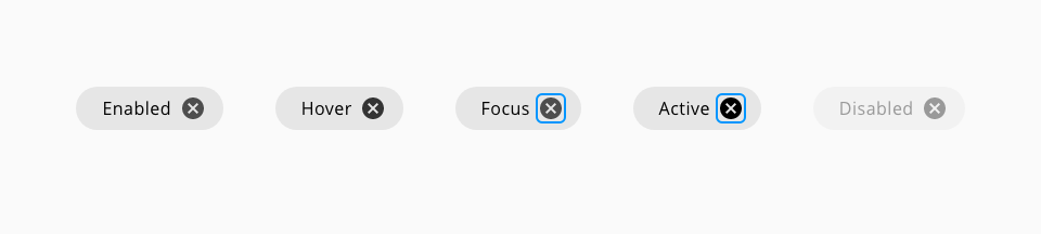
The chip action item has the following states: enabled, hover, focus, active and disabled:

| Component token | Element | Core token | Value |
|---|---|---|---|
activeIconColor | Container:active | color-black | #000000 |
backgroundColor | Container | color-grey-200 | #e6e6e6 |
borderColor | Container:border | color-transparent | transparent |
disabledBackgroundColor | Container:disabled | color-grey-100 | #f2f2f2 |
disabledFontcolor | Label:disabled | color-grey-500 | #999999 |
disabledIconColor | Icon:disabled | color-grey-500 | #999999 |
focusColor | Focus outline | color-blue-600 | #0095ff |
fontColor | Label | color-black | #000000 |
hoverIconColor | Container:hover | color-grey-900 | #333333 |
iconColor | Icon | color-grey-800 | #4d4d4d |
| Property | Element | Core token | Value |
|---|---|---|---|
border-width | Chip container | border-width-0 | 0 |
border-style | Chip container | border-style-none | none |
border-radius | Chip container | border-radius-full | 9999px |
border-width | Focus border | border-width-2 | 2px |
border-style | Focus border | border-style-solid | solid |
border-radius | Focus border | border-radius-medium | 0.25rem / 4px |