Contextual Menu
The Contextual menu is a powerful component that improves user experience by allowing users to navigate through page-level content or choose from a list of actions while complementing the general disposition of the main content within the interface.
This component allows a wide range of possibilities when it comes to placing content cohesively and comprehensively. To achieve this, it's important to understand how the items in our Contextual menu behave and interact with each other.
- Choose icons based on their relevance to the items they represent, ensuring accurate and clear descriptions.
- Place the Contextual menu aligned to the left or right, but never in the center of the interface. This component is a complement to navigate within the page, but it should never obstruct the main content.
- Use different navigation levels to structure the elements logically.
- Use our Badge component as a complement to the menu items to show the status of any navigable section.
- We strongly recommend only selecting by default the first option of the menu. Any other option may become unintuitive for the user.
- Use icons on items that don't belong to the first level of navigation. Keep in mind that icons are limited to the first level of navigation, as having icons in the subsequent elements can interfere with the user's reading of the content.
- Use an excessive amount of icons. While they can enhance the visual appeal and usability of a menu, overusing them can lead to confusion and clutter.
- Use more than three levels of navigation, as excessive indentation can be confusing and distracting for the user.
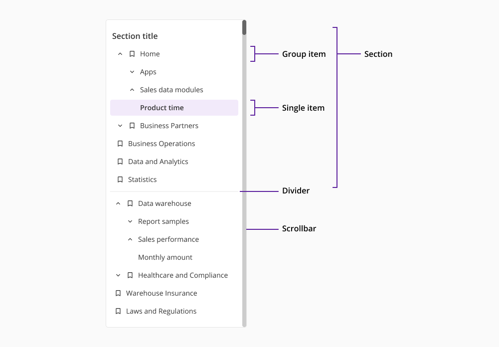
The Contextual menu is composed of different elements that allow the user to navigate through the interface. Each of these elements has a different criteria and behaviour, and they are as follows:
- Sections: they have a title and are a collection of group and single items within the menu that share a certain relationship.
- Group items: they are nests of other group items or individual items that are related to each other and show indentation as they are unfolded.
- Single items: they are items that carry on a specific change to the interface and don't contain any type of nesting.
- Divider: its purpose is to separate sections within the Contextual menu. They only appear at the end of one section and right before the following one.
- Scrollbar: only present when the scrollable function is available.
Although visually similar, the Sidenav component and the Contextual menu differ significantly in functionality. Our Sidenav is designed to provide a consistent and persistent navigation structure throughout the application, allowing users to easily switch between different sections or pages within the app.
On the other hand, the Contextual menu is more context-sensitive, and appears in response to specific user actions, offering a set of relevant options or actions that can be performed on the current page. This means that it operates on a page level, so the component may appear or not depending on the specific needs and requirements for each screen or interaction.