Dropdown
The use of dropdowns has its advantages but it depends on the screen support. Dropdowns are a standard widget, so the users know how to interact with them. The options available in a dropdown component are static, preventing erroneous data entered by the user since it only shows a range of correct values for that input.
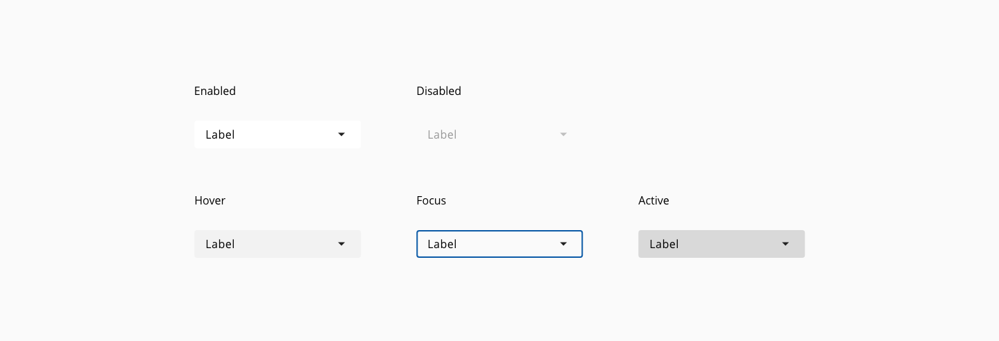
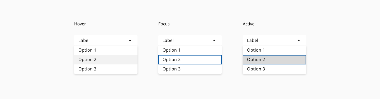
States: enabled, hover, focus, active and disabled.
| Component Token | Element | Core token | Value |
|---|---|---|---|
buttonBackgroundColor | Button | color-white | #ffffff |
buttonFontColor | Button | color-black | #000000 |
hoverButtonBackgroundColor | Button:hover | color-grey-100 | #f2f2f2 |
activeButtonBackgroundColor | Button:active | color-grey-300 | #cccccc |
buttonIconColor | Icon | color-black | #000000 |
disabledColor | Button font:disabled | color-grey-500 | #999999 |
disabledButtonBackgroundColor | Button:disabled | color-transparent | transparent |
optionBackgroundColor | Option | color-white | #ffffff |
hoverOptionBackgroundColor | Option:hover | color-grey-100 | #f2f2f2 |
activeOptionBackgroundColor | Option:active | color-grey-300 | #cccccc |
scrollBarThumbColor | Scroll thumb | color-grey-700 | #666666 |
scrollBarTrackColor | Scroll track | color-grey-300 | #cccccc |
focusColor | Focus | color-blue-600 | #0095ff |
| Property | Element | Core token | Value |
|---|---|---|---|
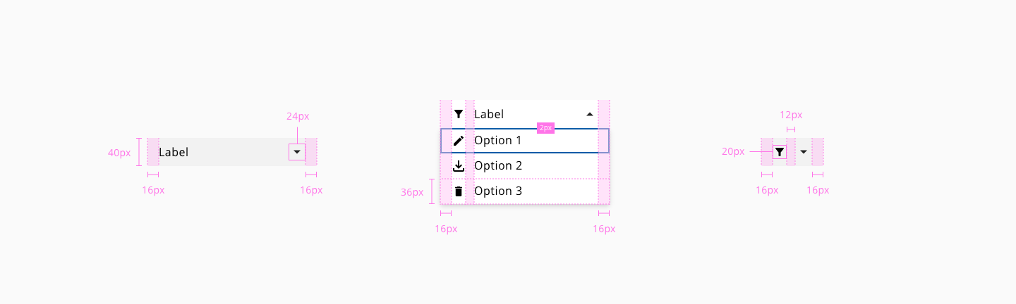
border-width | Dropdown button | border-width-0 | 0 |
border-style | Dropdown button | border-style-none | none |
border-radius | Dropdown button | border-radius-medium | 0.25rem / 4px |
border-width | Options list | border-width-0 | 0 |
border-style | Options list | border-style-none | none |
border-radius | Options list | border-radius-medium | 0.25rem / 4px |
border-width | Focus outline | border-width-2 | 2px |
border-style | Focus outline | border-style-solid | solid |
border-radius | Focus outline | border-radius-medium | 0.25rem / 4px |
- Understanding WCAG 2.2 - SC 1.4.13: Content on Hover or Focus
- Understanding WCAG 2.2 - SC 3.2.2: On Input
- WAI-ARIA Authoring Practices 1.2 - 3.16 Menu button