File Input
The file input component is used to choose files from any location in the local machine and update those files to the server where the application is hosted. It is a common procedure in applications where files are required, like documents, images, or other information in digital formats.
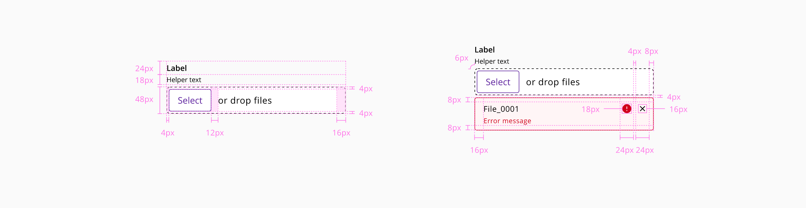
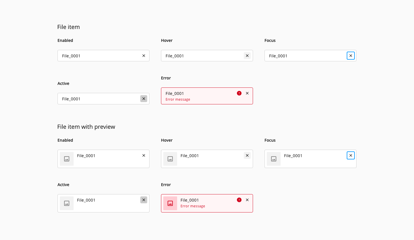
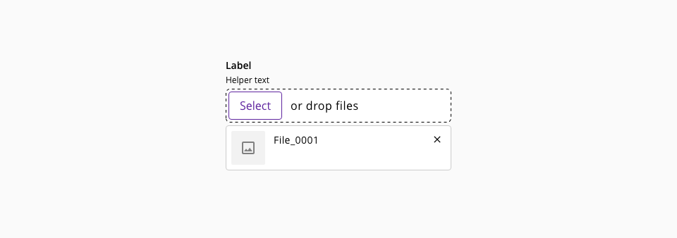
The component file input is made-up of an input (type: file) and a file-item(s).
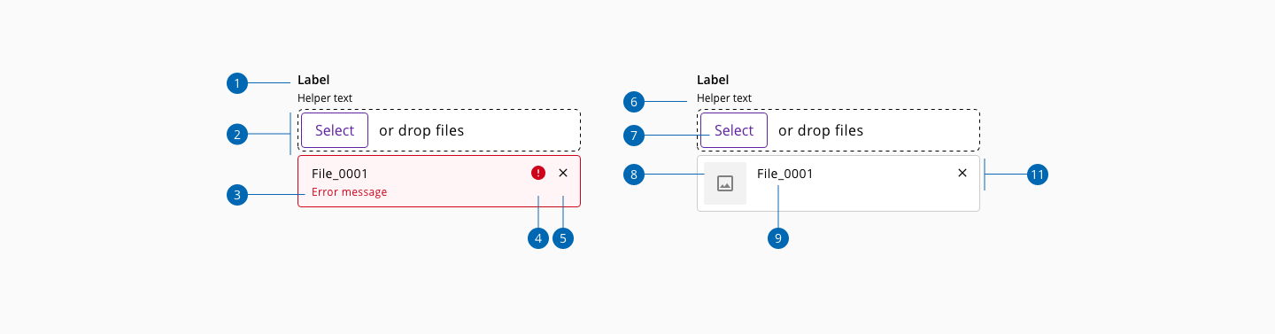
- 1.Label
- 2.Drag and drop area
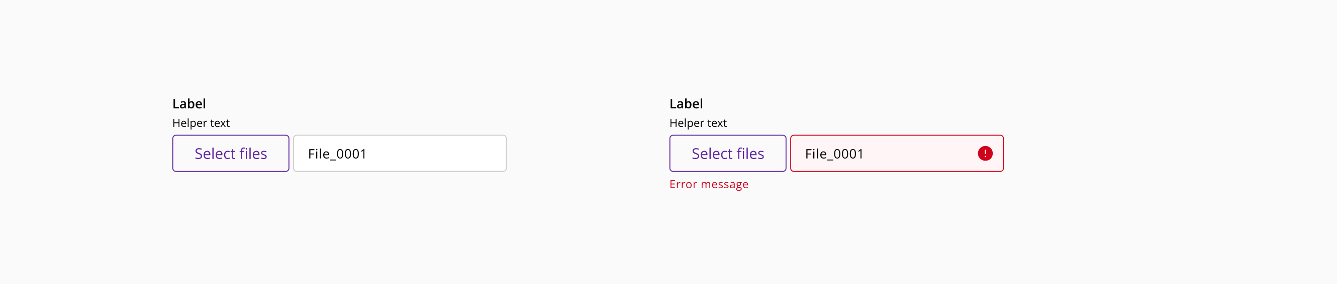
- 3.Error message
- 4.Error indicator
- 5.Action - Remove file
- 6.Helper text
- 7.file input button
- 8.File preview
- 9.File name
- 10.File item container
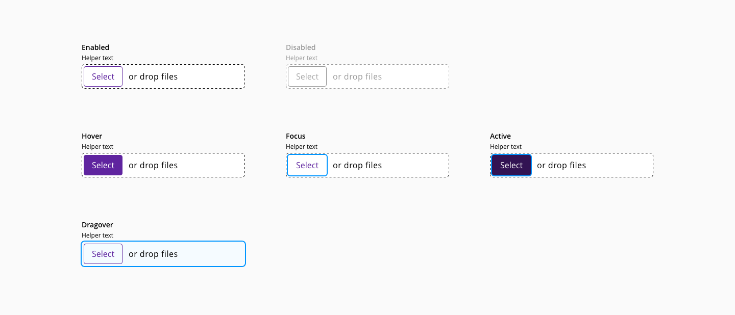
When the files to upload are mainly images, the preview can provide more feedback to the user rather than the name of the file, preventing errors loading content.
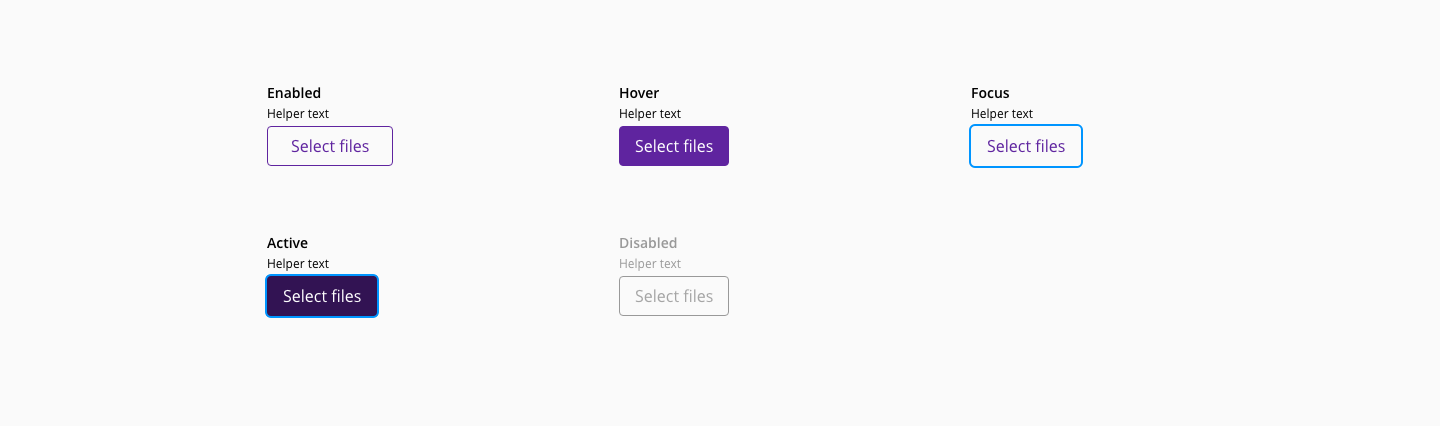
In order to provide a compact version of the file input component to accommodate any layout restriction, the variant file displays the file name in the same row instead of growing vertically.
| Component token | Element | Core token | Value |
|---|---|---|---|
dropBorderColor | Drag and drop area | color-black | #000000 |
fileItemBorderColor | File item | color-grey-300 | #cccccc |
deleteFileItemColor | File item | color-black | #000000 |
fileNameFontColor | File name | color-black | #000000 |
filePreviewBackgroundColor | File preview | color-grey-100 | #f2f2f2 |
filePreviewIconColor | File preview icon | color-black | #000000 |
labelFontColor | Label | color-black | #000000 |
helperTextFontColor | Helper text | color-black | #000000 |
dropLabelFontColor | Drop label | color-black | #000000 |
| Component token | Element | Core token | Value |
|---|---|---|---|
disabledLabelFontColor | Label:disabled | color-grey-500 | #999999 |
disabledHelperTextFontColor | Helper text:disabled | color-grey-500 | #999999 |
disabledDropLabelFontColor | Drop label:disabled | color-grey-500 | #999999 |
focusDropBorderColor | Dnd border:focus | color-blue-600 | #0095ff |
disabledDropBorderColor | Dnd border:disabled | color-grey-500 | #999999 |
dragoverDropBackgroundColor | Dnd fill:dragover | color-blue-50 | #f5fbff |
hoverDeleteFileItemBackgroundColor | File item icon:hover | color-grey-100-a | #0000000d |
focusDeleteFileItemBorderColor | File item icon:focus | color-blue-600 | #0095ff |
activeDeleteFileItemBackgroundColor | File item icon:active | color-grey-300-a | #00000033 |
errorFileItemBorderColor | File item container:error | color-red-700 | #d0011b |
errorFileItemBackgroundColor | File item container:error | color-red-50 | #fff5f6 |
errorFilePreviewBackgroundColor | File item preview:error | color-red-200 | #ffccd3 |
errorFilePreviewIconColor | File item preview icon:error | color-red-700 | #d0011b |
errorMessageFontColor | File item:error | color-red-700 | #d0011b |
| Property | Element | Core token | Value |
|---|---|---|---|
font-family | Label | font-family-sans | Open Sans |
font-size | Label | font-scale-02 | 0.875rem / 14px |
font-weight | Label | font-bold | 600 |
line-height | Label | font-leading-loose-01 | 1.75em |
font-family | File item | font-family-sans | Open Sans |
font-size | File item | font-scale-02 | 0.875rem / 14px |
font-weight | File item | font-regular | 400 |
line-height | File item | font-leading-normal | 1.5em |
font-family | Helper text | font-family-sans | Open Sans |
font-size | Helper text | font-scale-01 | 12px |
font-weight | Helper text | font-regular | 400 |
line-height | Helper text | font-leading-normal | 1.5em |
font-family | Drop label | font-family-sans | Open Sans |
font-size | Drop label | font-scale-03 | 1rem / 16px |
font-weight | Drop label | font-regular | 400 |
font-family | Error message | font-family-sans | Open Sans |
font-size | Error message | font-scale-01 | 0.75rem / 12px |
font-weight | Error message | font-regular | 400 |
line-height | Error message | font-leading-normal | 1.5em |
| Property | Element | Core token | Value |
|---|---|---|---|
border-style | Drag and drop area | border-style-dashed | dashed |
border-width | Drag and drop area | border-width-1 | 1px |
border-radius | Drag and drop area | border-radius-large | 0.375rem / 6px |
border-style | File item | border-style-solid | solid |
border-width | File item | border-width-1 | 1px |
border-radius | File item | border-radius-medium | 0.25rem / 4px |
box-shadow | File item icon:focus | - | 0 0 0 2px |
box-shadow | Drag and drop area:dragover | - | 0 0 0 2px |