Footer
Footers are a secondary element in a web page because they usually appear at the bottom and it is the last thing that the user interacts with. But the presence of the footer must be designed in every application and be part of it (consumer or back-office) as it is a key layout element to the overall experience. It is a choice of the designer to either leave the footer visible by default or push it down, depending on the use case.
The footer is part of the application layout, so it can only be used inside of it. Please check the DxcApplicationLayout documentation.
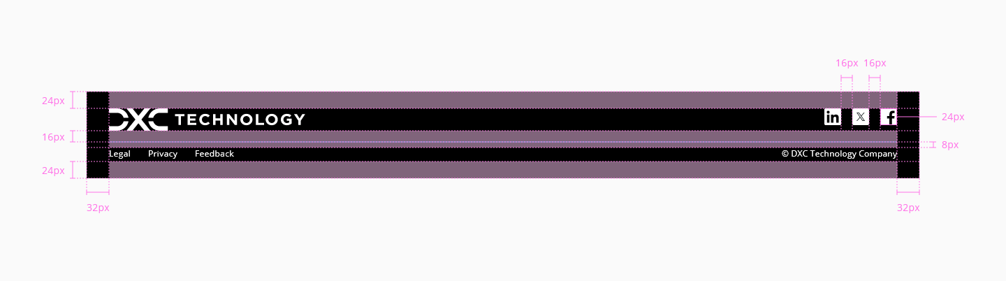
| Component token | Element | Core token | Value |
|---|---|---|---|
bottomLinksFontFamily | Bottom links | font-family-sans | 'Open Sans', sans-serif |
bottomLinksFontSize | Bottom links | font-scale-01 | 0.75rem / 12px |
bottomLinksFontWeight | Bottom links | font-weight-regular | 400 |
bottomLinksFontStyle | Bottom links | font-style-normal | normal |
bottomLinksTextDecoration | Bottom links | font-style-no-line | none |
copyrightFontFamily | Copyright | font-family-sans | 'Open Sans', sans-serif |
copyrightFontSize | Copyright | font-scale-01 | 0.75rem / 12px |
copyrightFontWeight | Copyright | font-weight-regular | 400 |
copyrightFontStyle | Copyright | font-style-normal | normal |
The same content in the footer will be displayed for the responsive versions and the only modification will be the width of it. With less space available to display the content, some of the items will be relocated to fit well in the screen.
Regarding his behavior, the footer must be pushed down always so it is not visible by default after page load, even when the content is smaller than the device screen size. This includes the splash screen, which must push the footer down. Of course, if the content is larger than the device screen size, the footer will be pushed down anyway.
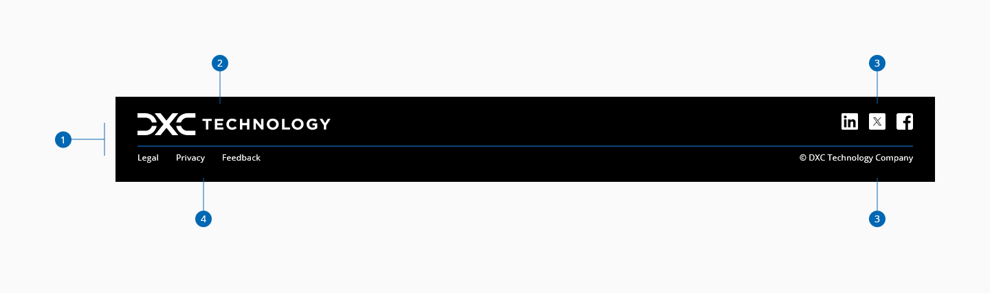
On the mobile version, first we have the logo. Below it the links to privacy and terms to let a space for custom component and at the bottom the copyright terms, centered. At this stage, the custom content and the disposition is responsability of the user, the same way as it is in the desktop and tablet version.