Header
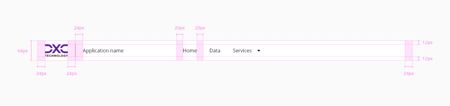
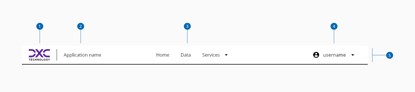
The header is an important component in the interface, it is the area dedicated for the navigation across the application and helps users understand what the content of the page is about. They appear at the top of a page, above the main content.
The header is part of the application layout, so it can only be used inside of it. Please check the DxcApplicationLayout documentation.
| Component token | Element | Core token | Value |
|---|---|---|---|
backgroundColor | Container | color-white | #ffffff |
contentColor | Content | color-black | #000000 |
underlinedColor | Container | color-black | #000000 |
hamburguerHoverColor | Menu:hover | color-grey-200 | #e6e6e6 |
hamburguerFocusColor | Menu:focus | color-blue-600 | #0095ff |
hamburguerFontColor | Menu label | color-black | #000000 |
hamburguerIconColor | Menu icon | color-black | #000000 |
menuBackgroundColor | Menu | color-white | #ffffff |
overlayColor | Overlay | color-grey-800-a | #000000b3 |