Link
Links are used as navigational elements. They may appear isolated, inside a sentence or paragraph or following the content.

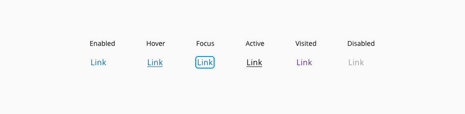
| Component token | Element | Core token | Value |
|---|---|---|---|
fontColor | Label | color-blue-800 | #0067b3 |
hoverFontColor | Label:hover | color-blue-800 | #0067b3 |
activeFontColor | Label:active | color-black | #000000 |
disabledFontColor | Label:disabled | color-grey-500 | #999999 |
visitedFontColor | Label:visited | color-purple-700 | #5f249f |
hoverUnderlineColor | Underline:hover | color-blue-800 | #0067b3 |
activeUnderlineColor | Underline:active | color-black | #000000 |
visitedUnderlineColor | Underline:visited | color-purple-700 | #5f249f |
focusColor | Outline:focus | color-blue-600 | #0095ff |
- Understanding WCAG 2.2 - 2.4.9: Link Purpose (Link Only)
- Understanding WCAG 2.2 - 2.4.4: Link Purpose (In Context)
- WAI-ARIA authoring practices 1.2 - 3.13 Link