Paginator
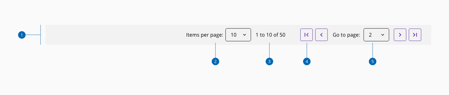
The paginator component allows dividing large amounts of content into multiple pages.
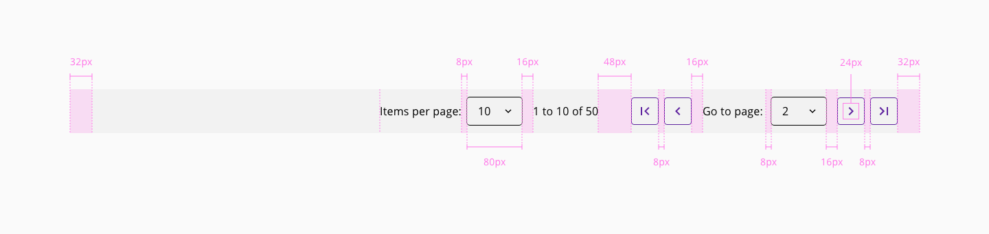
| Component token | Element | Core token | Value |
|---|---|---|---|
marginRight | Content | spacing-32 | 2rem / 32px |
marginLeft | Content | spacing-32 | 2rem / 32px |
itemsPerPageSelectorMarginLeft | Items per page | spacing-0 | 0rem / 0px |
itemsPerPageSelectorMarginRight | Items per page | spacing-16 | 1rem / 16px |
pageSelectorMarginRight | Page selector | spacing-16 | 1rem / 16px |
pageSelectorMarginLeft | Page selector | spacing-0 | 0rem / 0px |
totalItemsContainerMarginRight | Items indicator | spacing-48 | 3rem / 48px |
totalItemsContainerMarginLeft | Items indicator | spacing-0 | 0rem / 0px |