Progress Bar
Progress indicators offer visibility of system status to the user, giving feedback to indicate that the application is taking some time to processing data. The main aim of these components is to reduce the user's uncertainty about offering something to look at while the user is waiting for the end. A progress bar should be used in any scenario that will take more than 1 second in performing the action, for anything that takes less than that time, it will be distracting for the user.

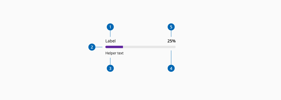
- 1.Label (Optional)
- 2.Progress track line
- 3.Helper text (Optional)
- 4.Progress total line
- 5.Progress indicator (Optional)
| Component token | Element | Core token | Value |
|---|---|---|---|
trackLineColor | Track line | color-purple-700 | #5f249f |
totalLineColor | Total line | color-grey-200 | #e6e6e6 |
labelFontColor | Label | color-black | #000000 |
labelFontColor | Label | color-black | #000000 |
indicatorFontColor | Indicator | color-black | #000000 |
helperFontColor | Helper text | color-black | #000000 |
overlayColor | Overlay | color-grey-800-a | #000000b3 |
overlayFontColor | Overlay font color | color-white | #ffffff |