Quick Nav

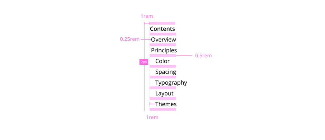
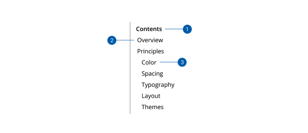
The quick nav component allows navigation inside a page. It renders the links according to the headings of the content in order to navigate to each section. The navigation is done using the link label or the link label plus sublink label when it is a sublink. If there is any space, it will be replaced by '-'.

Specifications

Quicknav design specifications
Quick nav design specifications

Anatomy

Quick nav anatomy
  1. 1.
    Title (Optional)
  2. 2.
    Links
  3. 3.
    Sublinks (Optional)

Design tokens

Color

Component tokenElementCore tokenValue
fontColorLinkcolor-grey-700#666666
hoverFontColorLinkcolor-purple-600#7d2fd0
dividerBorderColorDividercolor-grey-400#bfbfbf

Typography

PropertyElementCore tokenValue
fontFamilyLinkfont-family-sansOpen Sans, sans-serif
fontSizeLinkfont-scale-020.875rem
fontStyleLinkfont-normalnormal
fontWeightLinkfont-regular400

Spacing

PropertyElementCore tokenValue
paddingTopContentspacing-30.5rem / 8px
paddingBottomContentspacing-30.5rem / 8px
paddingLeftContentspacing-51rem / 16px
paddingRightContentspacing-51rem / 16px

Border

PropertyElementCore tokenValue
focusBorderColorLinkcolor-blue-600#0095ff
focusBorderStyleLinkborder-style-solidsolid
focusBorderThicknessLinkborder-radius-small0.125rem / 2px
focusBorderRadiusLinkborder-radius-small0.125rem / 2px