Radio Group
A radio group let the user make a mutually exclusive selection from a group of options.
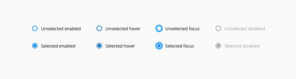
The following states are defined in the life cycle of the component: unselected enabled, unselected hover, unselected focus, unselected disabled, selected enabled, selected hover, selected focus and selected disabled.
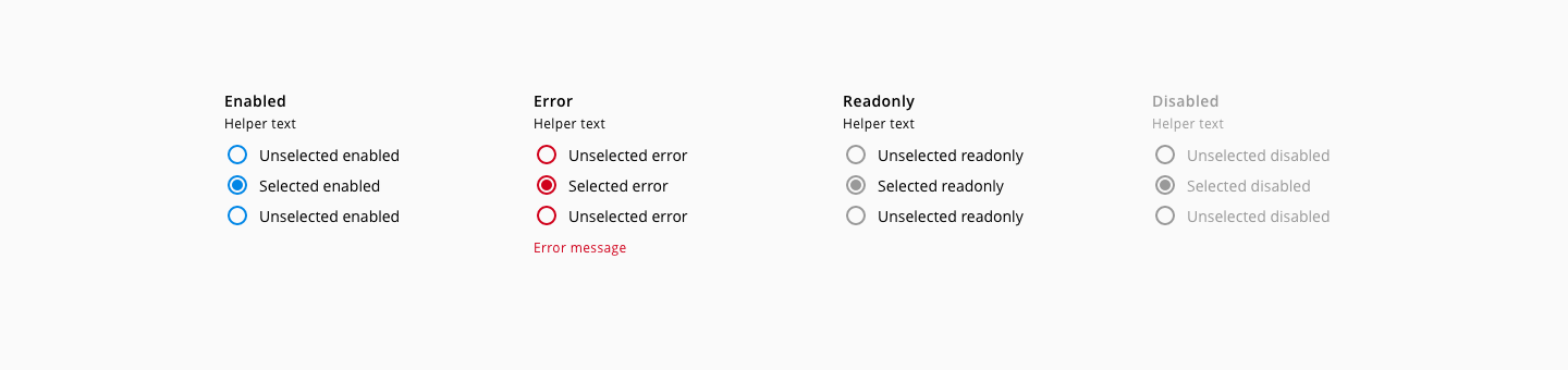
The following states are defined in the life cycle of the component: enabled, error, readOnly and disabled.
| Component token | Element | Core token | Value |
|---|---|---|---|
radioInputColor | Radio input | color-blue-700 | #0086e6 |
hoverRadioInputColor | Radio input:hover | color-blue-800 | #0067b3 |
focusBorderColor | Radio input:focus | color-blue-600 | #0095ff |
activeRadioInputColor | Radio input:active | color-blue-900 | #003c66 |
errorRadioInputColor | Radio input:error | color-red-700 | #d0011b |
hoverErrorRadioInputColor | Radio input:error:hover | color-red-800 | #980115 |
activeErrorRadioInputColor | Radio input:error:active | color-red-900 | #65010e |
disabledRadioInputColor | Radio input:disabled | color-grey-500 | #999999 |
readOnlyRadioInputColor | Radio input:readonly | color-grey-500 | #999999 |
hoverReadOnlyRadioInputColor | Radio input:readonly:hover | color-grey-600 | #808080 |
activeReadOnlyRadioInputColor | Radio input:readonly:active | color-grey-700 | #666666 |
labelFontColor | Label | color-black | #000000 |
disabledLabelFontColor | Label:disabled | color-grey-500 | #999999 |
helperTextFontColor | Helper text | color-black | #000000 |
disabledHelperTextFontColor | Helper text:disabled | color-grey-500 | #999999 |
radioInputLabelFontColor | Input label | color-black | #000000 |
disabledRadioInputLabelFontColor | Input label:disabled | color-grey-500 | #999999 |
errorMessageColor | Error message | color-red-700 | #d0011b |
| Component token | Element | Core token | Value |
|---|---|---|---|
fontFamily | Label | font-family-sans | 'Open Sans', sans-serif |
labelFontSize | Label | font-scale-02 | 0.875rem / 14px |
labelFontWeight | Label | font-weight-semibold | 600 |
labelLineHeight | Label | font-leading-loose-01 | 1.715em |
labelFontStyle | Label | font-style-normal | normal |
helperTextFontSize | Helper text | font-scale-01 | 0.75rem / 12px |
helperTextFontWeight | Helper text | font-weight-regular | 400 |
helperTextFontStyle | Helper text | font-style-normal | normal |
helperTextLineHeight | Helper text | font-leading-normal | 1.5em |
radioInputLabelFontSize | Input label | font-scale-02 | 0.875rem / 14px |
radioInputLabelFontWeight | Input label | font-weight-regular | 400 |
radioInputLabelFontStyle | Input label | font-style-normal | normal |
radioInputLabelLineHeight | Helper text | font-leading-loose-01 | 1.715em |
| Property | Element | Core token | Value |
|---|---|---|---|
font-size | Error message | font-scale-01 | 0.75rem / 12px |
font-weight | Error message | font-weight-regular | 400 |
line-height | Error message | font-leading-normal | 1.5em |
- Understanding WCAG 2.2 - SC 1.3.1: Info and Relationships
- Understanding WCAG 2.2 - SC 3.3.2: Labels or Instructions
- Understanding WCAG 2.2 - SC 2.4.6: Headings and Labels
- WAI-ARIA Authoring Practices 1.2 - 3.12 Radio group