Slider
Slider control allows users to select a specific value or a range of values from a set. Usually, slider presents a relatively large dataset and the way that the user interacts with it is helpful to explore the multiple options swiftly.
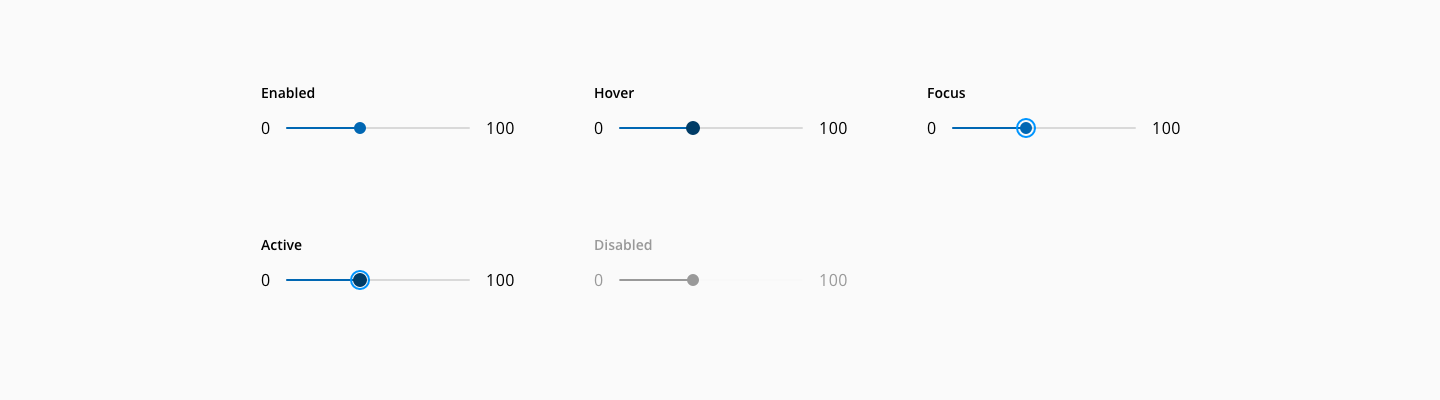
The slider component has the following states: enabled, hover, focus, active and disabled.
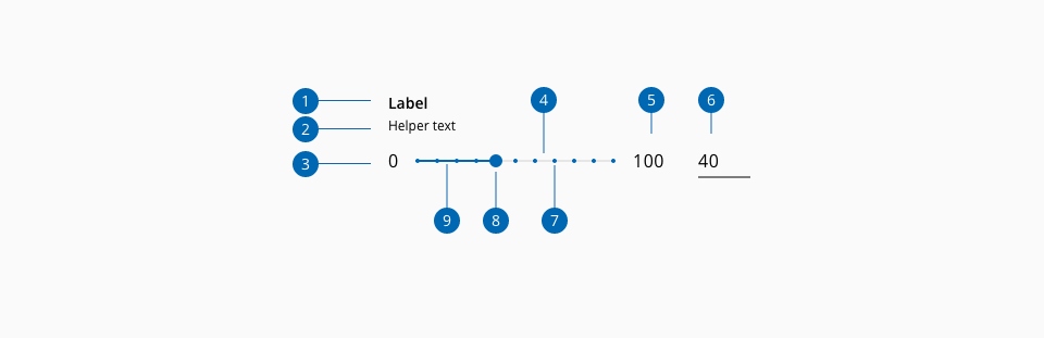
- 1.Label
- 2.Helper text
- 3.Floor label (Optional)
- 4.Total line
- 5.Ceil label (Optional)
- 6.Value input (Optional)
- 7.Tick
- 8.Thumb
- 9.Track line
| Component token | Element | Core token | Value |
|---|---|---|---|
labelFontColor | Label | color-black | #000000 |
disabledLabelFontColor | Label:disabled | color-grey-500 | #999999 |
helperTextFontColor | Helper text | color-black | #000000 |
disabledhelperTextFontColor | Helper text:disabled | color-grey-500 | #999999 |
thumbBackgroundColor | Thumb | color-blue-800 | #0067b3 |
hoverThumbBackgroundColor | Thumb:hover | color-blue-900 | #003c66 |
focusThumbBackgroundColor | Thumb:focus | color-blue-600 | #0095ff |
activeThumbBackgroundColor | Thumb:active | color-blue-900 | #003c66 |
disabledThumbBackgroundColor | Thumb:disabled | color-grey-500 | #999999 |
tickBackgroundColor | Tick | color-blue-800 | #0067b3 |
disabledTickBackgroundColor | Tick:disabled | color-grey-500 | #999999 |
trackLineColor | Track line | color-blue-800 | #0067b3 |
disabledTrackLineColor | Track line:disabled | color-blue-500 | #999999 |
totalLineColor | Total line | color-grey-200 | #e6e6e6 |
disabledTotalLineColor | Total line:disabled | color-grey-100 | #f2f2f2 |
limitValuesFontColor | Ceil/Floor label | color-black | #000000 |
disabledLimitValuesFontColor | Ceil/Floor label | color-grey-500 | #999999 |
focusColor | Focus indicator | color-blue-600 | #0095ff |
| Component token | Element | Core token | Value |
|---|---|---|---|
fontFamily | Label | font-family | 'Open Sans', sans-serif |
fontSize | Label | font-scale-02 | 0.875rem / 14px |
fontStyle | Label | font-style-normal | normal |
fontWeight | Label | font-weight-semibold | 600 |
lineHeight | Label | font-leading-loose-01 | 1.715em |
fontFamily | Helper text | font-family | 'Open Sans', sans-serif |
fontSize | Helper text | font-scale-01 | 0.75rem / 12px |
fontStyle | Helper text | font-style-normal | normal |
fontWeight | Helper text | font-weight-regular | 400 |
lineHeight | Helper text | font-leading-normal | 1.5em |
limitValuesFontFamily | Ceil/Floor label | font-family | 'Open Sans', sans-serif |
limitValuesFontSize | Ceil/Floor label | font-scale-03 | 1rem / 16px |
limitValuesFontStyle | Ceil/Floor label | font-style-normal | normal |
limitValuesFontWeight | Ceil/Floor label | font-weight-regular | 400 |
fontFamily | Floor/Ceil label | font-family-sans | 'Open Sans', sans-serif |
fontSize | Floor/Ceil label | font-scale-03 | 1rem / 16px |
fontWeight | Floor/Ceil label | font-weight-regular | 400 |
fontStyle | Floor/Ceil label | font-style-normal | normal |
| Property | Element | Core token | Value |
|---|---|---|---|
border-width | Track line | border-width-0 | 0 |
border-style | Track line | border-style-none | none |
border-radius | Track line | border-radius-full | 9999px |
border-width | Thumb | border-width-0 | 0 |
border-style | Thumb | border-style-none | none |
border-radius | Thumb | border-radius-full | 9999px |
outline | Focus indicator | - | auto 1px |
outline-offset | Focus indicator | - | 2px |
- Understanding WCAG 2.2 - SC 1.3.1 Info and Relationships
- Understanding WCAG 2.2 - SC 1.3.2 Meaningful Sequence
- Understanding WCAG 2.2 - SC 2.1.1 Keyboard
- Understanding WCAG 2.2 - SC 2.4.3 Focus Order
- Understanding WCAG 2.2 - SC 2.4.6 Headings and Labels
- Understanding WCAG 2.2 - SC 2.4.7 Focus Visible
- Understanding WCAG 2.2 - SC 4.1.2 Name, Role, Value
- WAI-ARIA Authoring practices 1.2 - 3.19 Slider
- WAI-ARIA Authoring practices 1.2 - Slider example