Switch
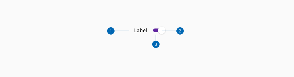
Switch toggles are elements that can get two simple states, each of them has an impact on the system and it can be switched on or off, there are no more options. If the switch toggle is on one state, the action to change it will modify to value of the element to the contrary.
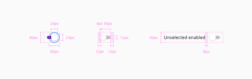
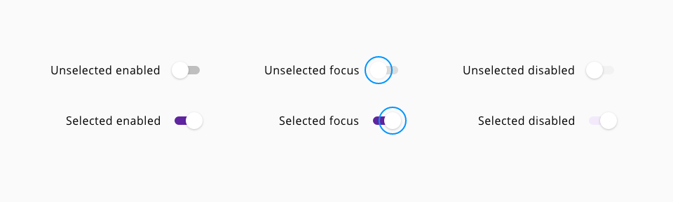
Five different states are defined in the life cycle of the component: unselected enabled, unselected focus, unselected disabled, selected enabled, selected focus and selected disabled.
| Component token | Element | Core token | Value |
|---|---|---|---|
labelFontColor | Label | color-black | #000000 |
disabledLabelFontColor | Label:disabled | color-grey-500 | #999999 |
checkedThumbBackgroundColor | Thumb checked | color-white | #ffffff |
checkedTrackBackgroundColor | Track checked | color-purple-700 | #5f249f |
uncheckedTrackBackgroundColor | Track unchecked | color-grey-400 | #bfbfbf |
uncheckedThumbBackgroundColor | Thumb unchecked | color-white | #ffffff |
disabledCheckedTrackBackgroundColor | Track:disabled checked | color-purple-100 | #f2eafa |
disabledUncheckedTrackBackgroundColor | Track:disabled unchecked | color-grey-100 | #f2f2f2 |
disabledCheckedThumbBackgroundColor | Thumb:disabled checked | color-white | #ffffff |
disabledUncheckedTrackBackgroundColor | Track:disabled unchecked | color-grey-100 | #f2f2f2 |
disabledUncheckedThumbBackgroundColor | Thumb:disabled unchecked | color-white | #ffffff |
thumbFocusColor | Thumb:focus | color-blue-600 | #0095ff |
| Property | Element | Core token | Value |
|---|---|---|---|
border-width | Track | border-width-0 | 0 |
border-style | Track | border-style-none | none |
border-radius | Track | border-radius-full | 9999px |
border-width | Thumb | border-width-0 | 0 |
border-style | Thumb | border-style-none | none |
border-radius | Thumb | border-radius-full | 9999px |
border-width | Focus border | border-width-2 | 2px |
border-style | Focus border | border-style-solid | solid |
border-radius | Focus border | border-radius-full | 9999px |