Tag
The Tag represents resources and global terms to identify and linked with a text section to provide to the user more context and information regarding a topic. It usually appears in the top or bottom of the section and multiple tags can be concatenated to generate a series of resources displayed with a visual hierarchy that calls the user's attention.

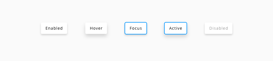
Also, this component is static, which means that there is only one difference between the default and hover state, changing the cursor from the default to the pointer cursor. The tag is merely a link to other resource or a place to display some information, so it is not intended that the flow of the component consider all the different states.

| Component token | Element | Core token | Value |
|---|---|---|---|
fontColor | Label | color-black | #000000 |
iconColor | Icon | color-white | #ffffff |
focusColor | Container | color-blue-600 | #0095ff |
*The tag component is using the box underneath, the values for the background are inherited from the definition in the component. By default, the background color is white and not themable, so it will be the same for both components.