Text Input
Text inputs are input fields typically used in forms that allow the user to enter text data in a structured format.
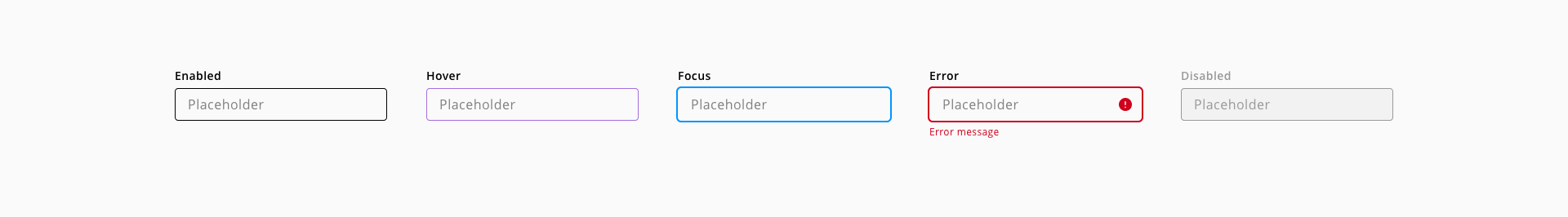
Text input states: enabled, hover, focus, error and disabled.
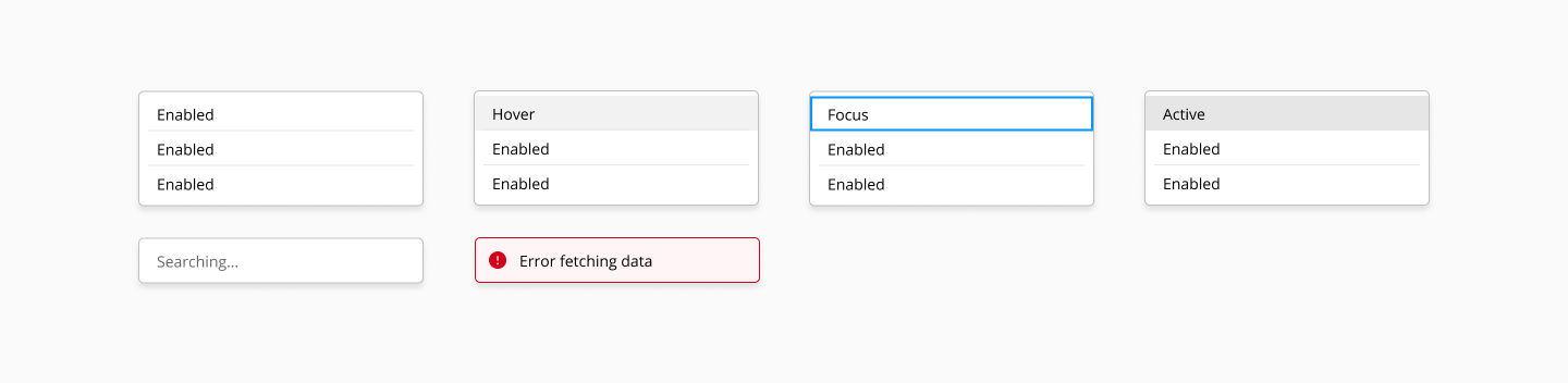
List option states: enabled, hover, active and system.
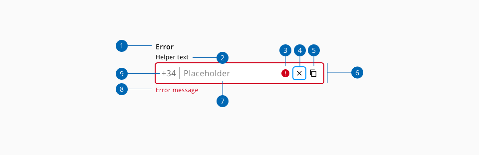
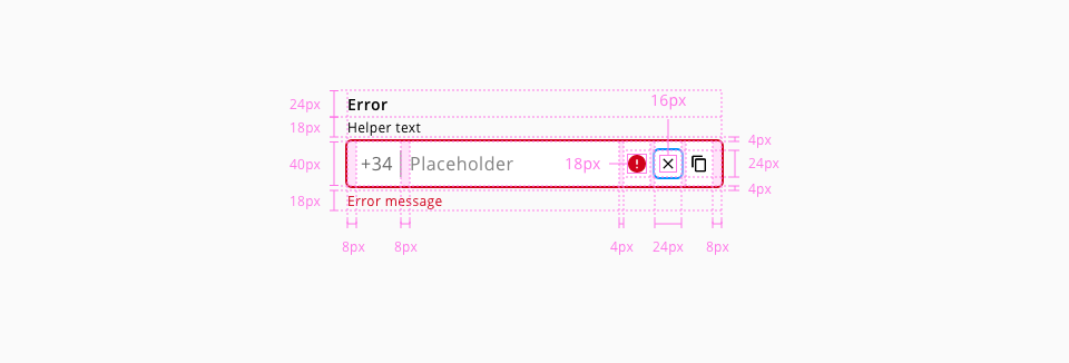
- 1.Label text
- 2.Helper text (Optional)
- 3.Error indicator
- 4.Clear action (Optional)
- 5.Input action (Optional)
- 6.Input container
- 7.Placeholder text
- 8.Error message
- 9.Prefix
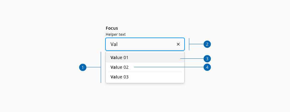
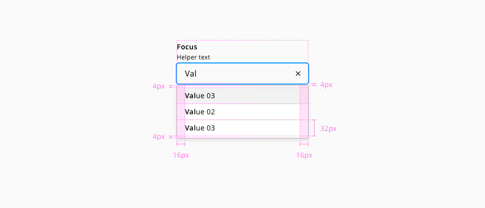
- 1.List dialog
- 2.Text input
- 3.List option
- 4.List option value
| Component token | Element | Core token | Value |
|---|---|---|---|
labelFontColor | Label | color-black | #000000 |
valueFontColor | Value | color-black | #000000 |
helperTextFontColor | Helper text | color-black | #000000 |
placeholderFontColor | Placeholder | color-grey-600 | #808080 |
enabledBorderColor | Border:enabled | color-black | #000000 |
actionIconColor | Action icon | color-black | #000000 |
actionBackgroundColor | Action | color-transparent | transparent |
suffixColor | Suffix | color-grey-700 | #666666 |
prefixColor | Prefix | color-grey-700 | #666666 |
listOptionFontColor | List option value | color-black | #000000 |
listOptionDividerColor | List option divider | color-grey-200 | #e6e6e6 |
listDialogBorderColor | List dialog | color-grey-400 | #bfbfbf |
listDialogBackgroundColor | List dialog | color-white | #ffffff |
systemMessageFontColor | System message | color-grey-700 | #666666 |
| Component token | Element | Core token | Value |
|---|---|---|---|
hoverBorderColor | Border:hover | color-purple-500 | #a46ede |
focusBorderColor | Border:focus | color-blue-600 | #0095ff |
errorBorderColor | Border:error | color-red-700 | #d0011b |
hoverErrorBorderColor | Border:error:hover | color-red-600 | #fe0123 |
disabledBorderColor | Border:disabled | color-grey-500 | #999999 |
readOnlyBorderColor | Border:readonly | color-grey-500 | #999999 |
hoverReadOnlyBorderColor | Border:readonly:hover | color-grey-600 | #808080 |
errorMessageColor | Error message | color-red-700 | #d0011b |
disabledContainerFillColor | Input container:disabled | color-grey-100 | #f2f2f2 |
disabledLabelFontColor | Label:disabled | color-grey-500 | #999999 |
disabledValueFontColor | Value:disabled | color-grey-500 | #999999 |
disabledHelperTextFontColor | Helper text:disabled | color-grey-500 | #999999 |
disabledPlaceholderFontColor | Placeholder:disabled | color-grey-500 | #999999 |
hoverActionBackgroundColor | Action:hover | color-grey-100 | #f2f2f2 |
focusActionBorderColor | Action:focus | color-blue-600 | #0095ff |
activeActionBackgroundColor | Action:active | color-grey-300 | #cccccc |
disabledActionBackgroundColor | Action:disabled | color-transparent | transparent |
hoverActionIconColor | Action icon:hover | color-black | #000000 |
focusActionIconColor | Action icon:focus | color-black | #000000 |
activeActionIconColor | Action icon:active | color-black | #000000 |
disabledActionIconColor | Action icon:disabled | color-grey-500 | #999999 |
disabledSuffixColor | Suffix:disabled | color-grey-400 | #bfbfbf |
disabledPrefixColor | Prefix:disabled | color-grey-400 | #bfbfbf |
hoverListOptionBackgroundColor | List option:hover | color-grey-100 | #f2f2f2 |
focusListOptionBorderColor | List option:focus | color-blue-600 | #0095ff |
activeListOptionBackgroundColor | List option:active | color-grey-200 | #e6e6e6 |
errorListDialogFontColor | List dialog error | color-black | #000000 |
errorListDialogBackgroundColor | List dialog error | color-red-50 | #fff5f6 |
errorListDialogBorderColor | List dialog error | color-red-700 | #d0011b |
| Component token | Element | Core token | Value |
|---|---|---|---|
fontFamily | All | font-family-sans | Open Sans |
labelFontSize | Label | font-scale-02 | 0.875rem / 14px |
labelFontWeight | Label | font-weight-bold | 600 |
labelFontStyle | Label | font-style-normal | normal |
labelLineHeight | Label | font-leading-loose-01 | 1.715em |
valueFontSize | Value | font-scale-03 | 1rem / 16px |
valueFontWeight | Value | font-weight-regular | 400 |
valueFontStyle | Value | font-style-normal | normal |
helperTextFontSize | Helper text | font-scale-01 | 12px |
helperTextFontWeight | Helper text | font-weight-regular | 400 |
helperTextFontStyle | Helper text | font-style-normal | normal |
helperTextLineHeight | Helper text | font-leading-normal | 1.5em |
optionalLabelFontWeight | Optional indicator | font-weight-regular | 400 |
listOptionFontSize | List option | font-scale-02 | 0.875rem / 14px |
listOptionFontWeight | List option | font-weight-regular | 400 |
listOptionFontStyle | List option | font-style-normal | normal |
| Property | Element | Core token | Value |
|---|---|---|---|
font-size | Error message | font-scale-01 | 0.75rem / 12px |
font-weight | Error message | font-weight-regular | 400 |
line-height | Value | font-leading-normal | 1.5em |
line-height | Error message | font-leading-normal | 1.5em |
font-size | Placeholder | font-scale-03 | 1rem / 16px |
font-weight | Placeholder | font-regular | 400 |
font-weight | List option typed | font-bold | 600 |
font-size | System message | font-scale-02 | 0.875 / 14px |
font-weight | System message | font-regular | 400 |
| Component token | Element | Core token | Value |
|---|---|---|---|
inputMarginTop | Input container | spacing-4 | 0.25rem / 4px |
inputMarginBottom | Input container | spacing-4 | 0.25rem / 4px |
| Property | Element | Core token | Value |
|---|---|---|---|
margin-left | Error icon | spacing-4 | 0.25rem / 4px |
margin-left | Action | spacing-4 | 0.25rem / 4px |
margin-left | Prefix | spacing-4 | 0.25rem / 4px |
padding-right | Prefix | spacing-8 | 0.5rem / 8px |
padding-left | Suffix | spacing-8 | 0.5rem / 8px |
margin-left | Suffix | spacing-4 | 0.25rem / 4px |
margin-right | Suffix | spacing-4 | 0.25rem / 4px |
padding-left | Input | spacing-8 | 0.5rem / 8px |
padding-right | Input | spacing-8 | 0.5rem / 8px |
padding-left | Input container | spacing-8 | 0.5rem / 8px |
padding-right | Input container | spacing-8 | 0.5rem / 8px |
padding-top | List dialog | spacing-4 | 0.25rem / 4px |
padding-bottom | List dialog | spacing-4 | 0.25rem / 4px |
padding-left | List option | spacing-8 | 0.5rem / 8px |
padding-right | List option | spacing-8 | 0.5rem / 8px |
padding-top | List option | spacing-2 | 0.125rem / 2px |
padding-bottom | List option | spacing-2 | 0.125rem / 2px |
padding-left | List option value | spacing-8 | 0.5rem / 8px |
padding-right | List option value | spacing-8 | 0.5rem / 8px |
| Property | Element | Core token | Value |
|---|---|---|---|
border | Input container | border-width-1 | 1px |
border | Input container | border-style-solid | solid |
border | Input container:focus | border-width-1 | 1px |
border | Input container:focus | border-style-solid | solid |
box-shadow | Input container:focus | - | 0 0 0 2px |
box-shadow | Input container:error | - | 0 0 0 2px |
border | List dialog | border-width-1 | 1px |
border | List dialog | border-style-solid | solid |
border | List dialog | border-radius-medium | 0.25rem / 4px |
border | List option divider | border-width-1 | 1px |
border | List option divider | border-style-solid | solid |
box-shadow | List dialog | shadow-default | 0 8px 14px -2px rgba(0,0,0,0.1) |
- Understanding WCAG 2.2 - 1.3.1: Information and Relationships
- Understanding WCAG 2.2 - 3.3.1: Error Identification
- Understanding WCAG 2.2 - 3.3.2: Labels and Instructions
- Understanding WCAG 2.2 - 3.3.3: Error Suggestion
- Understanding WCAG 2.2 - 4.1.2: Name, Role, Value