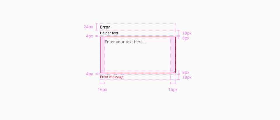
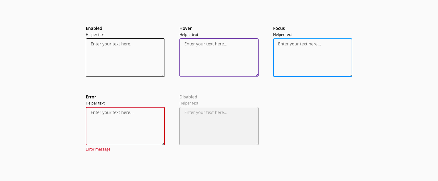
The textarea color, typography, border, width and margin specifications are inherited from the text input, for reference check the text input component documentation.
The textarea doesn't have the following text-input elements, therefore, their listed styles don't apply:
- Action
- Prefix / Suffix
- Error indicator
- Understanding WCAG 2.2 - 1.3.1: Information and Relationships
- Understanding WCAG 2.2 - 3.3.1: Error Identification
- Understanding WCAG 2.2 - 3.3.2: Labels and Instructions
- Understanding WCAG 2.2 - 3.3.3: Error Suggestion
- Understanding WCAG 2.2 - 4.1.2: Name, Role, Value
- WAI-ARIA Accessible Rich Internet Applications 1.2 - textbox role