Toggle Group
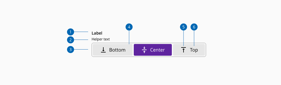
Toggle buttons can be used to put together related options that share a common attribute modification. It allows the user to switch from one selected option to another in the same control, having one option selected at a time. Also, there can be another variation that allows selecting multiple options from the current toggle group.
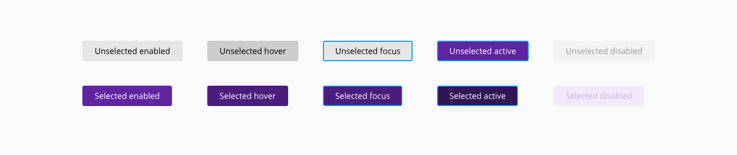
Different states are defined in the life cycle of the component: unselected enabled, unselected hover, unselected focus, unselected active, unselected disabled, selected enabled, selected hover, selected focus, selected active and selected disabled
| Component token | Element | Core token | Value |
|---|---|---|---|
labelFontColor | Label | color-black | #000000 |
disabledLabelFontColor | Label:disabled | color-grey-500 | #999999 |
helperTextFontColor | Helper text | color-black | #000000 |
disabledHelperTextFontColor | Helper text:disabled | color-grey-500 | #999999 |
containerBackgroundColor | Container | color-grey-50 | #fafafa |
containerBorderColor | Container | color-grey-500 | #999999 |
unselectedBackgroundColor | Button fill:enabled | color-grey-200 | #e6e6e6 |
unselectedHoverBackgroundColor | Button fill:hover | color-grey-300 | #cccccc |
unselectedActiveBackgroundColor | Button fill:active | color-purple-700 | #5f249f |
unselectedDisabledBackgroundColor | Button fill:disabled | color-grey-100 | #f2f2f2 |
unselectedFontColor | Button label | color-black | #000000 |
unselectedDisabledFontColor | Button label:disabled | color-grey-500 | #999999 |
selectedBackgroundColor | Button fill:enabled | color-purple-700 | #5f249f |
selectedHoverBackgroundColor | Button fill:hover | color-purple-800 | #4b1c7d |
selectedActiveBackgroundColor | Button fill:active | color-purple-900 | #321353 |
selectedDisabledBackgroundColor | Button fill:disabled | color-purple-100 | #f2eafa |
selectedFontColor | Button label | color-white | #ffffff |
selectedDisabledFontColor | Button label:disabled | color-purple-300 | #cbacec |
focusColor | Focus indicator | color-blue-600 | #0095ff |
| Component token | Element | Core token | Value |
|---|---|---|---|
labelFontFamily | Label | font-family | 'Open Sans', sans-serif |
labelFontSize | Label | font-scale-02 | 0.875rem / 14px |
labelFontStyle | Label | font-style-normal | normal |
labelFontWeight | Label | font-weight-semibold | 600 |
labelLineHeight | Label | font-leading-loose-01 | 1.715em |
helperTextFontFamily | Helper text | font-family | 'Open Sans', sans-serif |
helperTextFontSize | Helper text | font-scale-01 | 0.75rem / 12px |
helperTextFontStyle | Helper text | font-style-normal | normal |
helperTextFontWeight | Helper text | font-weight-regular | 400 |
helperTextLineHeight | Helper text | font-leading-normal | 1.5em |
optionLabelFontFamily | Button label | font-family | 'Open Sans', sans-serif |
optionLabelFontSize | Button label | font-scale-03 | 1rem / 16px |
optionLabelFontStyle | Button label | font-style-normal | normal |
optionLabelFontWeight | Button label | font-weight-regular | 400 |
| Component token | Element | Core token | Value |
|---|---|---|---|
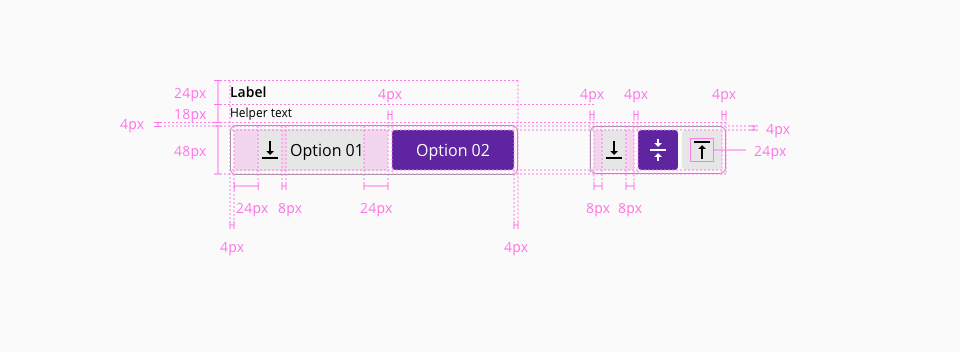
iconPaddingRight | Icon | spacing-8 | 0.5rem / 8px |
iconPaddingLeft | Icon | spacing-8 | 0.5rem / 8px |
labelPaddingLeft | Label (Label + icon) | spacing-24 | 1.5rem / 24px |
labelPaddingRight | Label (Label + icon) | spacing-24 | 1.5rem / 24px |
iconMarginRight | Icon (Label + icon) | spacing-8 | 0.5rem / 8px |
containerMarginTop | Container | spacing-4 | 0.25rem / 4px |
| Property | Element | Core token | Value |
|---|---|---|---|
border-width | Button | border-width-0 | 0 |
border-style | Button | border-style-none | none |
border-radius | Button | border-radius-medium | 0.25rem / 4px |
border-width | Container | border-width-1 | 1px |
border-style | Container | border-style-solid | solid |
border-radius | Container | - | 0.375rem / 6px |
border-width | Focus border | border-width-2 | 2 |
border-style | Focus border | border-style-solid | solid |
border-radius | Focus border | border-radius-medium | 0.25rem / 4px |