Wizard
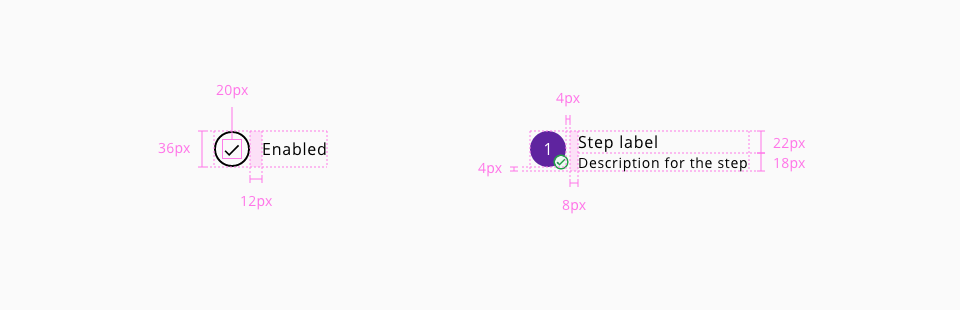
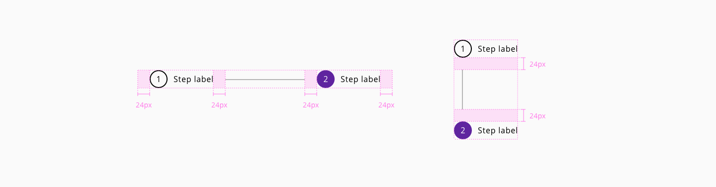
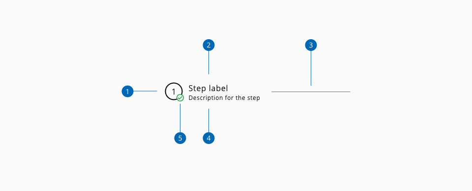
Wizard represents a stepped workflow as a form of linear and mandatory progression through a defined process with several bullet points where the user need to interact with the content of each step during the workflow.

| Component token | Element | Core token | Value |
|---|---|---|---|
visitedStepFontColor | Step:visited text | color-black | #000000 |
selectedStepFontColor | Step:selected text | color-white | #ffffff |
unvisitedStepFontColor | Step:unvisited text | color-grey-700 | #666666 |
disabledStepFontColor | Step:disabled text | color-grey-500 | #999999 |
visitedStepBackgroundColor | Step:visited | color-white | #ffffff |
selectedStepBackgroundColor | Step:selected background | color-purple-700 | #5f249f |
unvisitedStepBackgroundColor | Step:unvisited background | color-transparent | transparent |
disabledStepBackgroundColor | Step:disabled background | color-grey-100 | #f2f2f2 |
visitedStepBorderColor | Step:visited border | color-black | #000000 |
selectedStepBorderColor | Step:selected border | color-purple-700 | #5f249f |
unvisitedStepBorderColor | Step:unvisited border | color-grey-700 | #666666 |
disabledStepBorderColor | Step:disabled border | color-grey-100 | #f2f2f2 |
visitedLabelFontColor | Label:visited | color-black | #000000 |
selectedLabelFontColor | Label:selected | color-black | #000000 |
disabledLabelFontColor | Label:disabled | color-grey-500 | #999999 |
visitedHelperTextFontColor | Helper text:visited | color-black | #000000 |
selectedHelperTextFontColor | Helper text:selected | color-black | #000000 |
separatorColor | Separator | color-grey-700 | #666666 |
focusColor | Focus outline | color-blue-600 | #0095ff |
| Component token | Element | Core token | Value |
|---|---|---|---|
stepFontSize | Step text | font-scale-03 | 1rem / 16px |
stepFontFamily | Step text | font-family-sans | Open Sans |
stepFontStyle | Step text | font-style-normal | normal |
stepFontWeight | Step text | font-style-regular | 400 |
stepFontTracking | Step text | font-tracking-wide-02 | 0.05em |
labelFontSize | Label | font-scale-03 | 1rem / 16px |
labelFontFamily | Label | font-family-sans | Open Sans |
labelFontStyle | Label | font-style-normal | normal |
labelFontWeight | Label | font-style-regular | 400 |
labelFontTracking | Label | font-tracking-normal | 0em |
helperTextFontSize | Helper text | font-scale-02 | 0.875rem / 14px |
helperTextFontFamily | Helper text | font-family-sans | Open Sans |
helperTextFontStyle | Helper text | font-style-normal | normal |
helperTextFontWeight | Helper text | font-style-regular | 400 |
helperTextFontTracking | Helper text | font-tracking-normal | 0em |
| Component token | Element | Core token | Value |
|---|---|---|---|
stepBorderStyle | Step border | border-style-solid | solid |
stepBorderWidth | Step border | border-width-2 | 2px |
selectedStepBorderWidth | Step border:selected | border-width-2 | 2px |
disabledStepBorderWidth | Step border:disabled | border-width-2 | 2px |
stepBorderWidth | Step border-radius | border-radius-full | 9999px |
separatorBorderWidth | Separator | border-width-1 | 1px |
separatorBorderStyle | Separator | border-style-solid | solid |
- Understanding WCAG 2.2 - SC 1.3.1: Info and Relationships
- Understanding WCAG 2.2 - SC 2.2.1: Timing Adjustable
- Understanding WCAG 2.2 - SC 2.2.2: Pause, Stop, Hide
- Understanding WCAG 2.2 - SC 3.3.2: Labels or Instructions
- Web accessibility tutorials - Multi-page forms