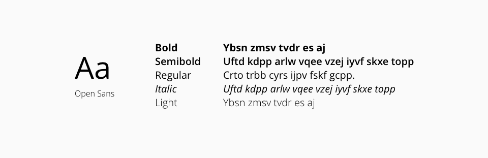
Our selected typography helps in structuring our user's experience based on the visual impact that it has on the user interface content. It defines what is the first noticeable piece of information or data based on the font shape, size, color, or type and it highlights some pieces of text over the rest. Some typographic elements used in Halstack Design System include headers, body, taglines, captions, and labels.
Make sure you include all the different typographic variants in order to enhance the application's content structure, including the Heading component which defines different levels of page and section titles.
When defining the different typographic variants included in the Halstack Design System, we use a system of layers:
A first, lower level layer in which we have the DxcTypography component, with which any typographic combination contemplated within the values defined in the tables shown in the 'Code' tab can be created. It is important to note that this lowest level component should only be considered as an option once the rest of the components, with more specific context for certain use cases, have been discarded.
Above this first layer we have a second layer that provides a more specific context in which we have three components: DxcParagraph, DxcBulletedList and DxcHeading; these components, that are more focused on covering a specific use case in turn, use the first level component DxcTypography.
DxcParagraphcomponent is intended to display text in paragraph format, separating it from the other components by a line break.DxcBulletedListcomponent is intended to display an enumeration of certain elements. It is not a substitute for native HTML tags <ul> and <ol>.DxcHeadingcomponent is intended to define the hierarchy of content within the application.