Accordion
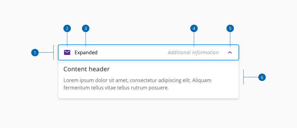
Accordions are used to group similar content and hide or show it depending on user needs or preferences. Accordions give users more granular control over the interface and help digest content in stages, rather than all at once.
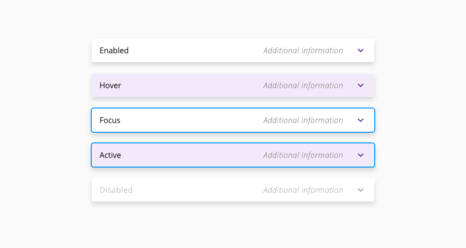
The accordion header can get four different states based on user interaction. States: enabled, hover, focus and disabled.
| Component token | Element | Core token | Value |
|---|---|---|---|
titleLabelFontColor | Title | color-black | #000000 |
disabledTitleLabelFontColor | Title:disabled | color-grey-500 | #999999 |
arrowColor | Caret icon | color-purple-700 | #5f249f |
disabledArrowColor | Title:disabled | color-grey-500 | #999999 |
iconColor | Custom icon | color-purple-700 | #5f249f |
disabledIconColor | Custom icon:disabled | color-grey-500 | #999999 |
assistiveTextFontColor | Helper text | color-grey-700 | #666666 |
disabledAssistiveTextFontColor | Helper text:disabled | color-grey-500 | #999999 |
hoverBackgroundColor | Header background:hover | color-purple-100 | #f2eafa |
focusBorderColor | Header outline:focus | color-blue-600 | #0095ff |
backgroundColor | Container background | color-white | #ffffff |
boxShadowColor | Container shadow | - | #0000001a |
accordionGroupSeparatorBorderColor | Separator | - | #0000001a |
| Component token | Element | Core token | Value |
|---|---|---|---|
titleLabelFontFamily | Title | font-family-sans | 'Open Sans', sans-serif; |
titleLabelFontSize | Title | font-scale-03 | 16px |
titleLabelFontWeight | Title | font-regular | 400 |
titleLabelFontStyle | Title | font-normal | normal |
assistiveTextFontFamily | Helper text | font-sans | 'Open Sans', sans-serif; |
assistiveTextFontSize | Helper text | font-scale-03 | 16px |
assistiveTextFontWeight | Helper text | font-light | 300 |
assistiveTextFontStyle | Helper text | font-regular | italic |
assistiveTextLetterSpacing | Helper text | font-tracking-wide-01 | 0.025em |
| Component token | Element | Core token | Value |
|---|---|---|---|
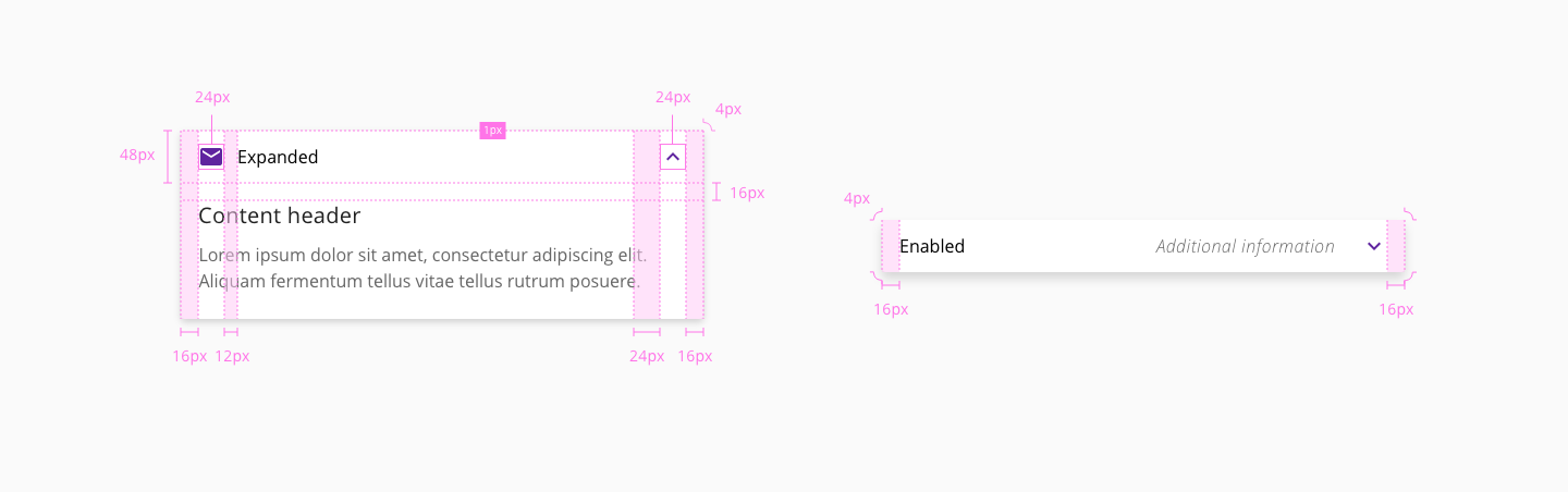
titleLabelPaddingRight | Title | spacing-16 | 1rem / 16px |
titleLabelPaddingLeft | Title | spacing-0 | 0rem / 0px |
titleLabelPaddingTop | Title | spacing-0 | 0rem / 0px |
titleLabelPaddingBottom | Title | spacing-0 | 0rem / 0px |
| Property | Element | Core token | Value |
|---|---|---|---|
padding-left | Header | spacing-16 | 16px |
padding-right | Header | spacing-16 | 16px |
padding-right | Helper text | spacing-24 | 24px |
padding | Caret icon | spacing-12 | 12px |
margin-right | Custom icon | spacing-12 | 12px |
- Understanding WCAG 2.2 - SC 2.1.1 Keyboard
- Understanding WCAG 2.2 - SC 4.1.2 Name, Role, Value
- WAI-ARIA Authoring Practices 1.2 - 3.1 Accordion (Sections With Show/Hide Functionality)
- WAI-ARIA Authoring Practices 1.2 - Accordion Design Pattern