Accordion
Accordions are used to group similar content and hide or show it depending on user needs or preferences. Accordions give users more granular control over the interface and help digest content in stages, rather than all at once.
The accordion component delivers large amounts of content in a small space through progressive disclosure.
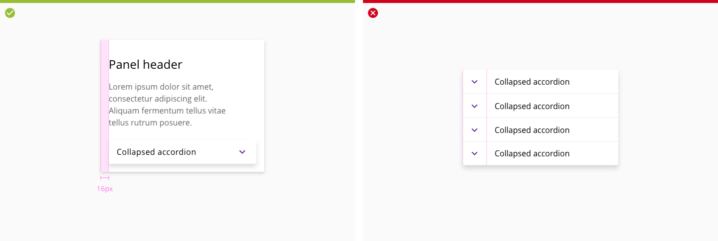
The accordion component has two main states: collapsed and expanded. The chevron icon at the end of the accordion indicates which state the accordion is in. Accordions begin by default in the collapsed state with all content panels closed. Starting in a collapsed state gives the user a high level overview of the available information.
- Trigger collapsed and expanded states when clicking on either the header or icon.
- Use icons and animation to easily reflect collapsed and expanded states.
- Use a chevron icon to indicate the expand/collapse behavior.
- When the panel expands, the chevron icon rotates 180 degrees counterclockwise.
- When the panel collapses, the chevron icon rotates 180 degrees clockwise.
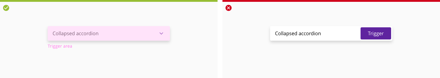
Left. Trigger collapsed and expanded states when clicking on either the header or icon.
Right. Leave the header without caret or use a button to trigger the expand/collapse action.
Accordion headers are stacked vertically and different hierarchy levels are allowed.
The expandable section of an accordion group can contain different types of plain information or clickable components.
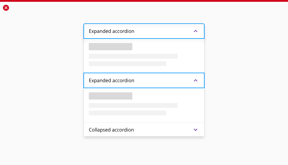
When one accordion panel is expanded, the rest of the group should be collapsed.
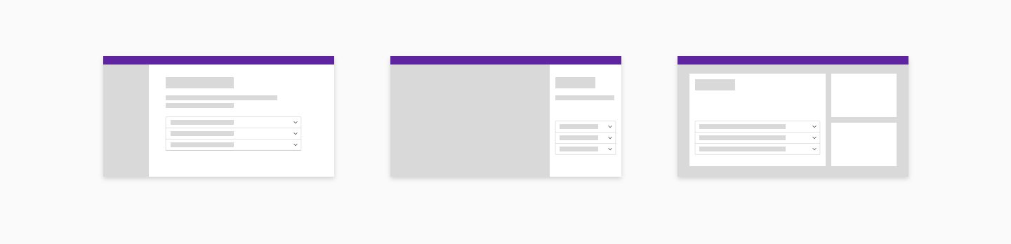
The accordion component can contain other components, images, tables, and every custom feature that can be supported inside the element container.
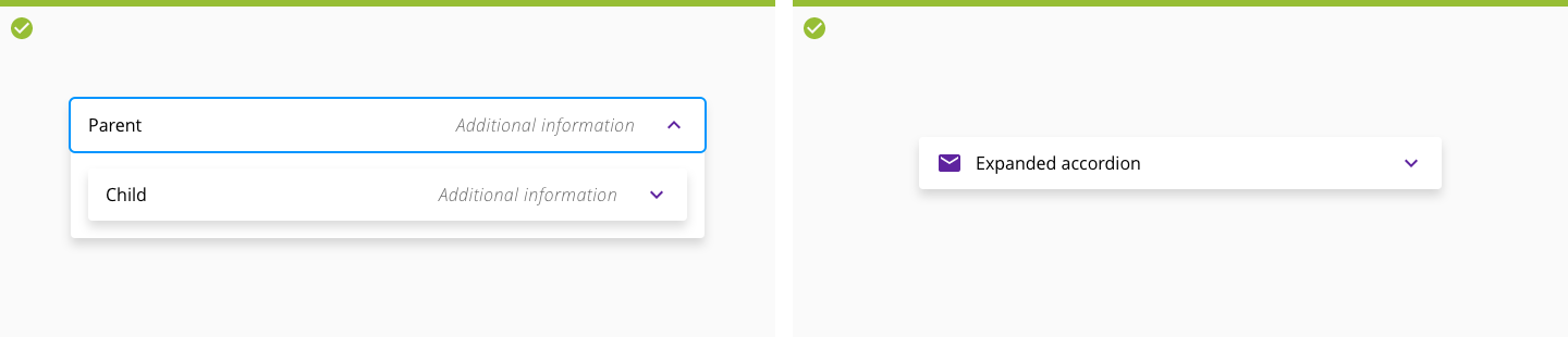
Left. Nesting is allowed. Use in parent accordion Open Sans Semibold.
Right. Icons can be used as a complement to the header label.
Assistive text can be shown at the end of the accordion header when needed.
- Icons and images can not be used.
- Only add a assistive text when there is plenty space in the accordion header, in mobile devices is not displayed.
- Try always to use a descriptive header so is no necessity to add extra information.
- Assistive text content will be truncated 48px before reaching the accordion title. Title display has priority when space is limited.