Application Layout
The application layout provides a base UI wrapper for any application built with Halstack.
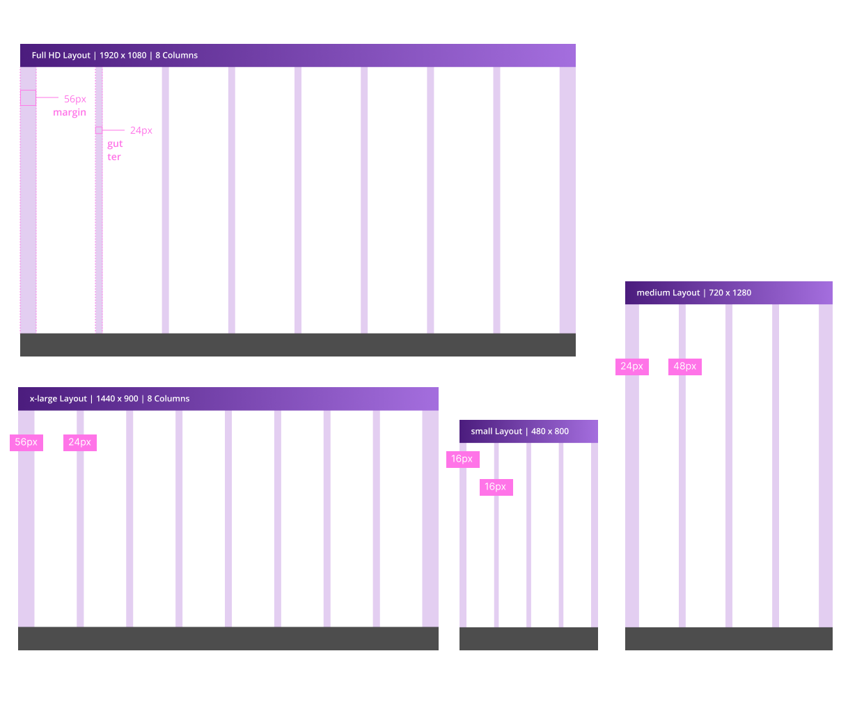
Columns, gutters, and margins make up the responsive layout grid following these breakpoints. Depending on resolution and screen size of a device, column numbers and the values of the margins and gutters adjust to accommodate all screen elements in the most optimal manner.
- Columns are the areas of the screen where content is placed.
- A gutter is the space between columns used to separate content.
- Margins are the space between the edges of the screen and content.
The following table describes the columns, margins, and gutter at each of the different breakpoints:
| Breakpoint | Columns | Gutter (recommended) 1 | Margin (min)2 |
|---|---|---|---|
xsmall | 4 | 16 / small | 24 |
small | 4 | 16 / small | 24 |
medium | 4 | 24 / medium | 48 |
large | 8 | 16 / small | 56 |
xlarge | 8 | 24/medium | 56 |
- 1.Any value provided by the gutter prop in the layout components can be used (ideally multiples of 8) although we recommend to stick to the values provided.
- 2.The margin value provided are the minimun recommended, any value from our spacing scale can be used or even an auto value.