Application Layout
The application layout provides a base UI wrapper for any application built with Halstack.
The application layout is the base component that wraps any application built with Halstack. In addition to this, all of the components listed below can be used within each other to create a wide variety of standard layouts:
- Flex
- Bleed
- Inset
The grid provides the foundation for consistently positioning elements onscreen. The 8px Grid is the geometric foundation of all the visual elements of Halstack Design System components and spacing. It provides structure and guidance for all creative decision-making.
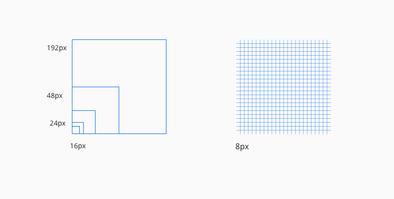
- Use multiples of 8px when defining measurements, spacing, and positioning elements.
- When necessary use 4px to make more fine tuned adjustments.
- Whenever possible, make sure that objects line up, both vertically and horizontally.
- Align your bounding box to the grid, not the baseline of your text.
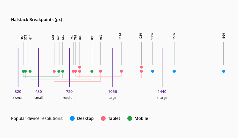
Breakpoints define resolutions at which screen components adjust to offer an optimal user experience across screen sizes and devices. We've defined five different breakpoints to accommodate multiple web, tablet, and mobile screen resolutions:
| Breakpoint | px | rem |
|---|---|---|
xsmall | 320 | 20 |
small | 480 | 30 |
medium | 720 | 45 |
large | 1056 | 66 |
xlarge | 1440 | 90 |
The image below illustrates how we've used data on the most popular screen resolutions by device over the past few years to help define each breakpoint.