Dialog
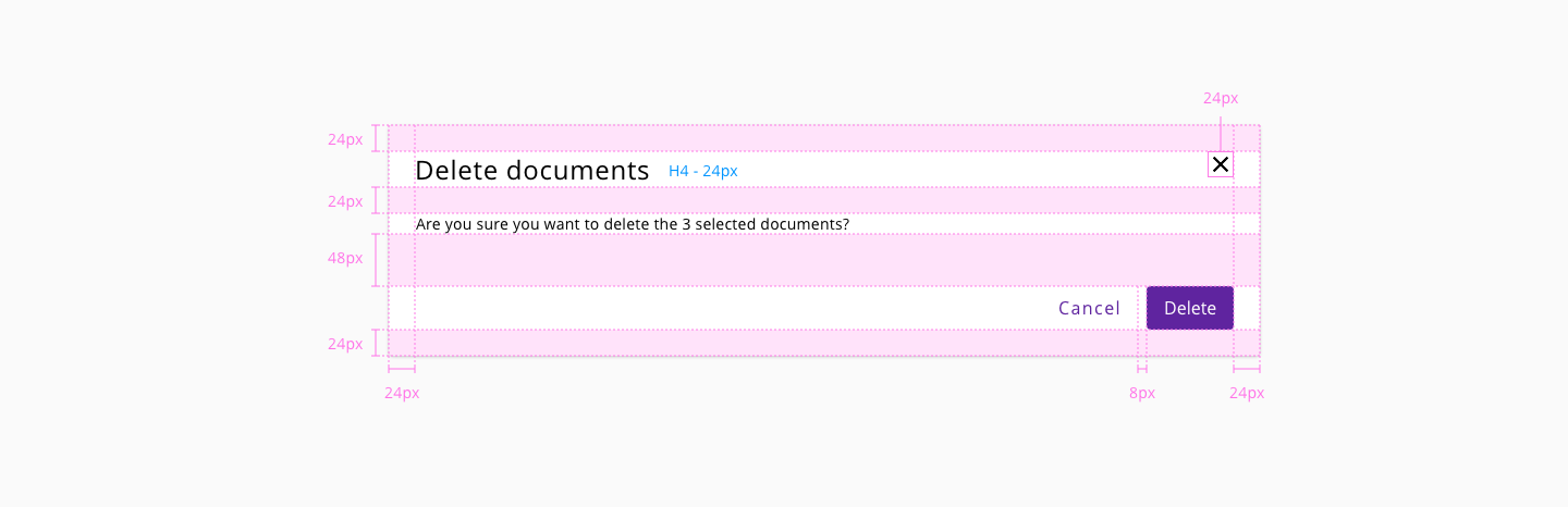
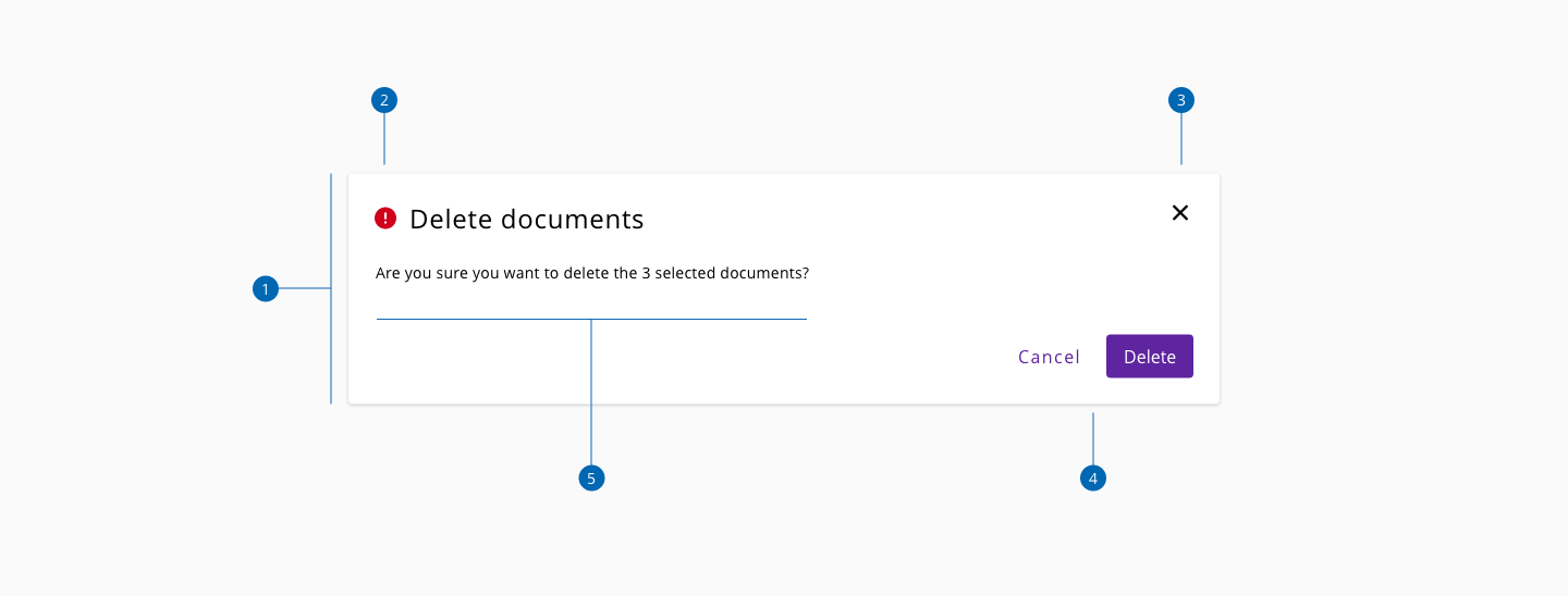
A modal dialog is a message box or child window that requires user interaction before returning to the parent window. These boxes appear on top of the open parent window that is currently displayed on the screen.
| Component token | Element | Core token | Value |
|---|---|---|---|
overlayColor | Overlay | color-grey-800-a | #000000b3 |
backgroundColor | Container | color-white | #ffffff |
boxShadowColor | Container shadow | color-grey-300-a | #00000033 |
closeIconColor | Icon close | color-black | #000000 |
closeIconBackgroundColor | Icon close | color-transparent | transparent |
closeIconBorderColor | Icon close | - | - |
| Component token | Element | Core token | Value |
|---|---|---|---|
closeIconBorderThickness | Icon close | border-width-0 | 0px |
closeIconBorderStyle | Icon close | border-style-solid | solid |
closeIconBorderRadius | Icon close | border-radius-small | 0.125rem / 2px |
| Property | Element | Core token | Value |
|---|---|---|---|
border-width | Container | border-width-0 | 0 |
border-style | Container | border-style-none | none |
border-radius | Container | border-radius-medium | 0.25rem / 4px |
- Understanding WCAG 2.2 - 2.1.2 No Keyboard Trap
- Understanding WCAG 2.2 - 2.4.3 Focus Order
- WAI-ARIA Authoring practices 1.2 - 3.9 Dialog (Modal)
- WAI-ARIA Authoring practices 1.2 - Modal Dialog Example