Dialog
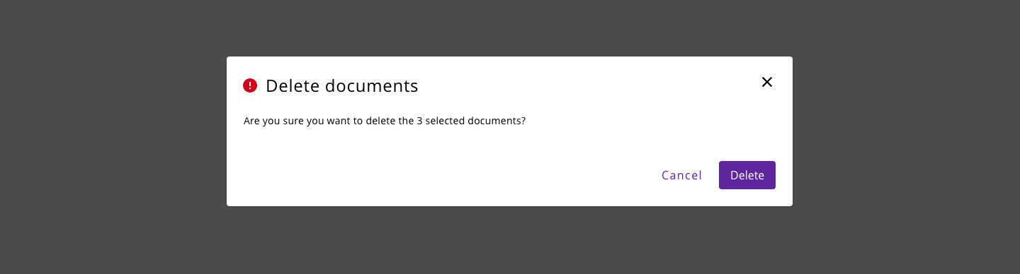
A modal dialog is a message box or child window that requires user interaction before returning to the parent window. These boxes appear on top of the open parent window that is currently displayed on the screen.
- The dialog always should have a title to introduce the actions or information that will get displayed on the screen.
- Can contain a descriptive text or a phrase related to the action that triggered the dialog.
- Can have some combinations of actions, like buttons to accept/cancel the action. There can be one, two or more buttons.
- If the dialog is not including a cancel action, provide a way to close it.
- Modal dialog boxes should overlay only a portion of the underlying page to keep the user oriented within the workflow.
- In a dialog, the focus should remain within the modal box until the user completes the required action (if any) or closes it. In addition, and as a general rule, the focus should appear on the first focusable child when the dialog is opened.
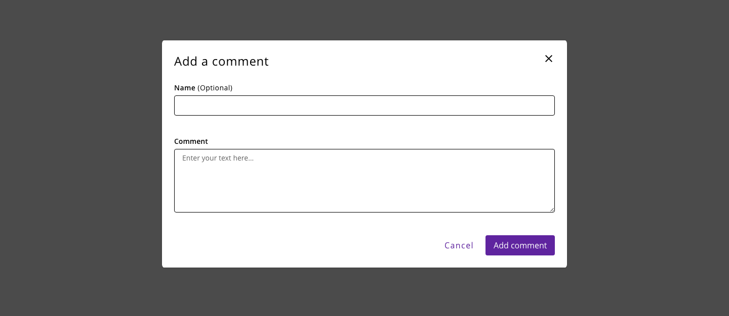
Any content (Halstack components or custom) can be placed inside the dialog component. Dialog tasks should be direct and easy to complete.
- Do not use to display complex or large amounts of data.
- Do not recreate a full app or page in a dialog.
- Try always to avoid scrolling.