Number Input
The number input is a text input component that only allows numerical values and it has controls for incrementing or decrementing them.
The number input color, typography, border, spacing, width and margin specifications are inherited from the text input, for reference check the text input component documentation.
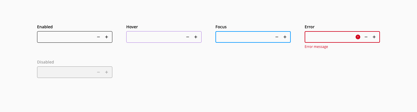
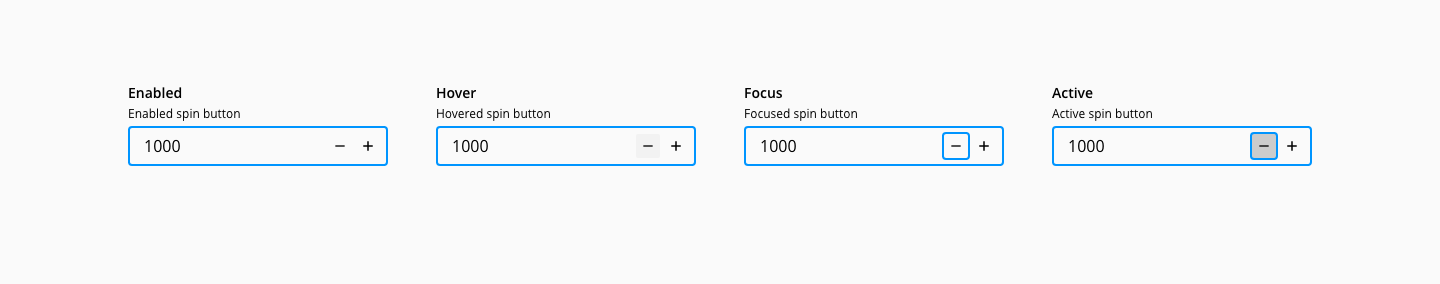
States: enabled, hover, focus, active and disabled.
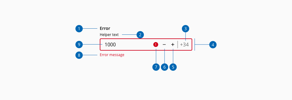
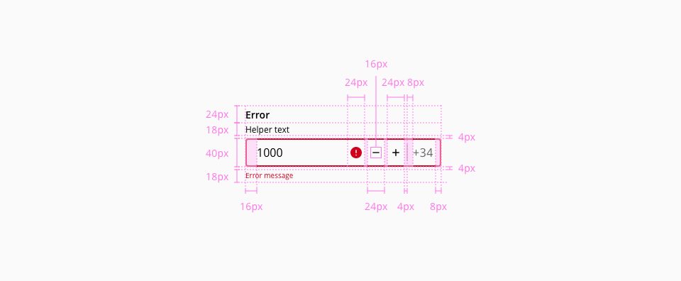
- 1.Label
- 2.Helper text (Optional)
- 3.Suffix (Optional)
- 4.Container
- 5.Spin button increase
- 6.Spin button decrease
- 7.Error indicator
- 8.Error message
- 9.Value
- WAI-ARIA Authoring practices 1.2 - 3.21 Spinbutton
- WAI-ARIA Authoring practices 1.2 - "Date Picker Spin Button" design pattern