Password Input
The password input component is very much like the text input, with the difference that their value is obscured by default (by replacing its characters with dot symbol ("•"), and the mask can be toggled on/off using the show and hide component action.
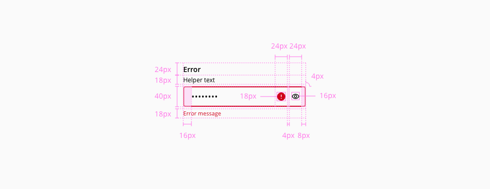
The password input color, typography, border, spacing, width and margin specifications are inherited from the text input, for reference check the text input component documentation.
The password input doesn't have the following text input elements, therefore their listed styles don't apply:
- Placeholder
- Prefix / Suffix
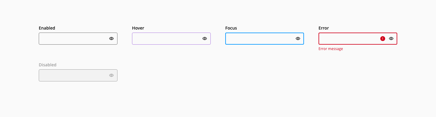
The component password has the following states:
States: enabled, hover, focus, error and disabled.
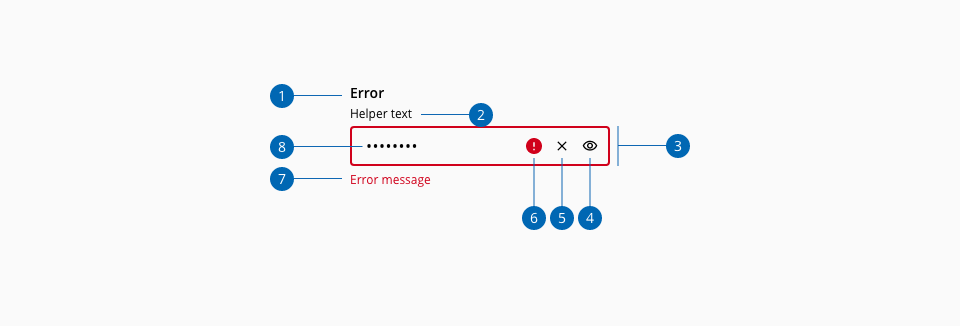
- 1.Label
- 2.Helper text (Optional)
- 3.Input container
- 4.Show/Hide action
- 5.Clear action
- 6.Error icon
- 7.Error message
- 8.Input value
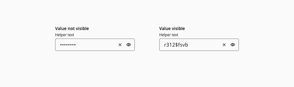
The value of the input can be toggled on or off using the default action the component provides. The password input can also be clearable.
- The toggle indicates the action that will be performed when clicked, tapped, or pressing keyboard
Enterkey. - The toggle has a
titlewith a textual cue for the resulting action.
- Understanding WCAG 2.2 - SC 1.3.5 Identify Input Purpose
- Understanding WCAG 2.2 - SC 3.3.3 Error Suggestion
- Understanding WCAG 2.2 - SC 3.3.7 Accessible Authentication
- Forms - Full Password Example