Select
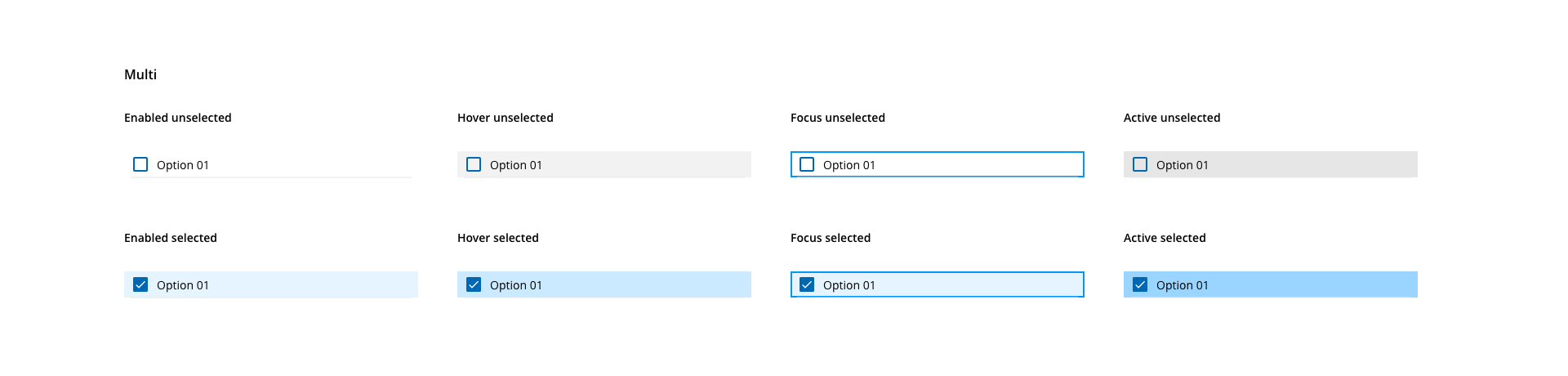
The select component allows users to make single or multiple selections from a pre-defined list of options.
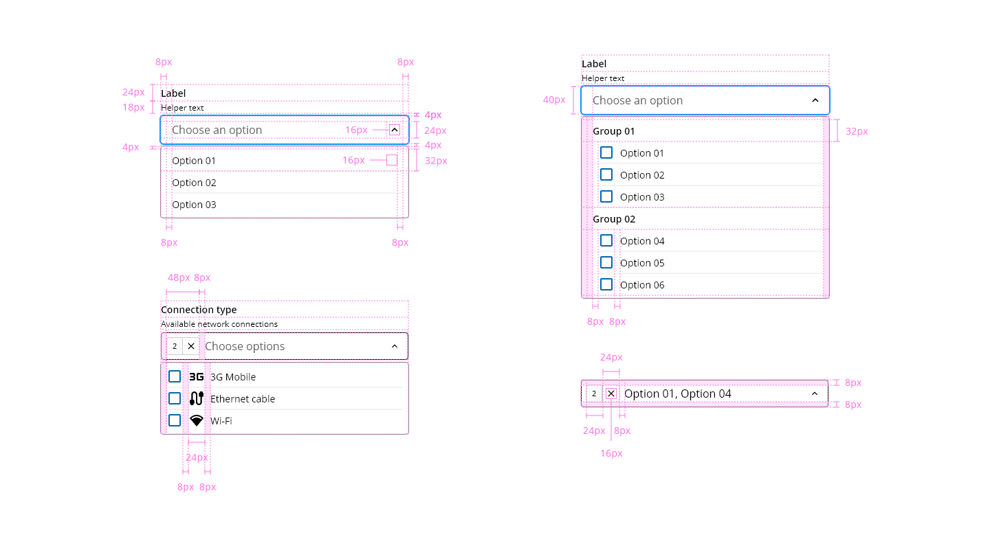
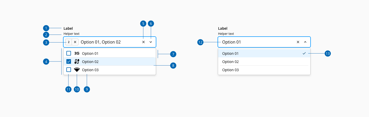
- 1.Label
- 2.Helper text
- 3.Selection indicator (multiple)
- 4.List dialog
- 5.Action - Clear
- 6.Collapse indicator
- 7.List option
- 8.Divider
- 9.List option label
- 10.List option icon
- 11.List option checkbox (multiple)
- 12.Select value
- 13.List item selected indicator
| Component token | Element | Core token | Value |
|---|---|---|---|
labelFontColor | Label | color-black | #000000 |
helperTextFontColor | Helper text | color-black | #000000 |
errorMessageColor | Error message | color-red-700 | #d0011b |
valueFontColor | Value | color-black | #000000 |
placeholderFontColor | Value | color-grey-800-a | #000000b3 |
disabledColor | All:disabled | color-grey-500 | #999999 |
listDialogBackgroundColor | List dialog | color-white | #ffffff |
listDialogBorderColor | List dialog | color-grey-400 | #bfbfbf |
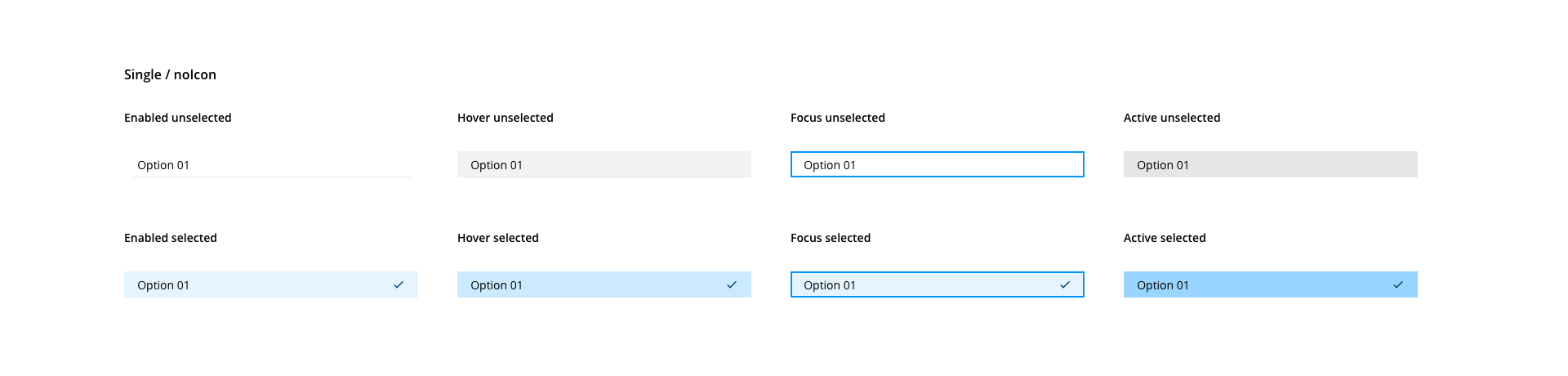
listOptionFontColor | List option | color-black | #000000 |
listOptionIconColor | List item icon | color-black | #000000 |
listOptionDividerColor | Divider | color-grey-200 | #e6e6e6 |
unselectedHoverListOptionBackgroundColor | List option:hover unselected | color-grey-100 | #f2f2f2 |
unselectedActiveListOptionBackgroundColor | List option:active unselected | color-grey-200 | #e6e6e6 |
selectedListOptionBackgroundColor | List option selected | color-blue-100 | #e6f4ff |
selectedHoverListOptionBackgroundColor | List option:hover selected | color-blue-200 | #cceaff |
selectedActiveListOptionBackgroundColor | List option:active selected | color-blue-300 | #99d5ff |
selectedListOptionIconColor | List option selected indicator | color-blue-900 | #003c66 |
focusListOptionBorderColor | List option:hover selected | color-blue-600 | #0095ff |
systemMessageFontColor | System message | color-grey-700 | #666666 |
| Component token | Element | Core token | Value |
|---|---|---|---|
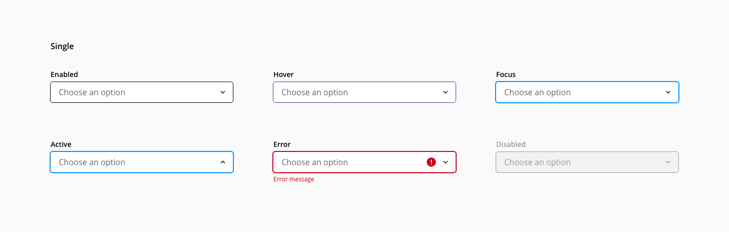
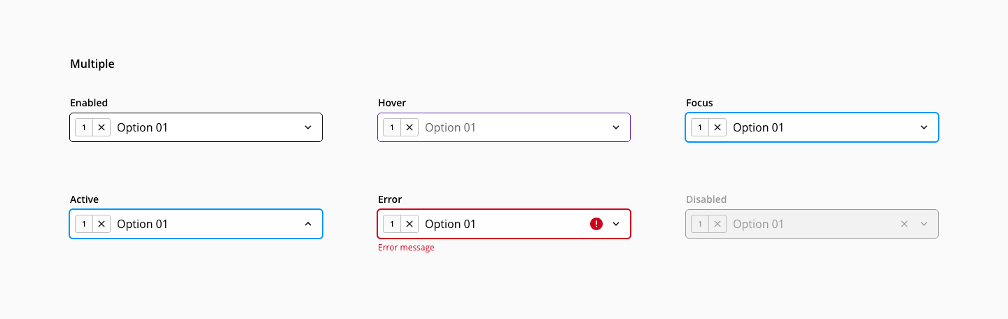
enabledInputBorderColor | Border:enabled | color-black | #000000 |
hoverInputBorderColor | Border:hover | color-purple-500 | #a46ede |
focusInputBorderColor | Border:focus | color-blue-600 | #0095ff |
errorInputBorderColor | Border:error | color-red-700 | #d0011b |
hoverInputErrorBorderColor | Border:hover on error | color-red-600 | #fe0123 |
disabledInputBorderColor | Border:disabled | color-grey-500 | #999999 |
disabledInputBackgroundColor | Background:disabled | color-grey-100 | #f2f2f2 |
errorIconColor | Error icon | color-red-700 | #d0011b |
collapseIndicatorColor | Collapse indicator | color-black | #000000 |
| Component token | Element | Core token | Value |
|---|---|---|---|
selectionIndicatorFontColor | Selection indicator value | color-black | #000000 |
selectionIndicatorBorderColor | Selection indicator | color-grey-400 | #bfbfbf |
selectionIndicatorBackgroundColor | Selection indicator | color-grey-50 | #fafafa |
enabledSelectionIndicatorActionBackgroundColor | Selection indicator | color-transparent | transparent |
hoverSelectionIndicatorActionBackgroundColor | Selection indicator:hover | color-grey-100 | #f2f2f2 |
activeSelectionIndicatorActionBackgroundColor | Selection indicator:active | color-grey-300 | #cccccc |
enabledSelectionIndicatorActionIconColor | Selection indicator icon | color-black | #000000 |
hoverSelectionIndicatorActionIconColor | Selection indicator icon:hover | color-black | #000000 |
activeSelectionIndicatorActionIconColor | Selection indicator icon:active | color-black | #000000 |
| Component token | Element | Core token | Value |
|---|---|---|---|
actionBackgroundColor | Action | color-transparent | transparent |
hoverActionBackgroundColor | Action:hover | color-grey-100 | #f2f2f2 |
activeActionBackgroundColor | Action:active | color-grey-300 | #cccccc |
actionIconColor | Action icon | color-black | #000000 |
hoverActionIconColor | Action icon:hover | color-black | #000000 |
activeActionIconColor | Action icon:active | color-black | #000000 |
| Component token | Element | Core token | Value |
|---|---|---|---|
fontFamily | All | font-family-sans | Open Sans |
labelFontSize | Label | font-scale-02 | 0.875rem / 14px |
labelFontWeight | Label | font-weight-semibold | 600 |
labelFontStyle | Label | font-style-normal | normal |
labelLineHeight | Label | font-leading-loose-01 | 1.715em |
optionalLabelFontWeight | Label optional | font-weight-regular | 400 |
valueFontSize | Value | font-scale-03 | 1rem / 16px |
valueFontWeight | Value | font-weight-regular | 400 |
valueFontStyle | Value | font-style-normal | normal |
valueLineHeight | Value | font-leading-normal | 1.5em |
helperTextFontSize | Helper text | font-scale-01 | 0.75rem / 12px |
helperTextFontWeight | Helper text | font-weight-regular | 400 |
helperTextFontStyle | Helper text | font-style-normal | normal |
helperTextLineHeight | Helper text | font-leading-normal | 1.5em |
listOptionFontSize | List option | font-scale-02 | 0.875rem / 14px |
listOptionFontWeight | List option | font-weight-regular | 400 |
listOptionFontStyle | List option | font-style-normal | normal |
listGroupLabelFontWeight | List group item | font-weight-semibold | 600 |
| Property | Element | Core token | Value |
|---|---|---|---|
border | Input container | border-width-1 | 1px |
border | Input container | border-style-solid | solid |
border | Input container:focus | border-width-1 | 1px |
border | Input container:focus | border-style-solid | solid |
box-shadow | Input container:focus | - | 0 0 0 2px |
box-shadow | Input container:error | - | 0 0 0 2px |
box-shadow | List dialog | shadow-default | 0 4px 6px -1px rgba(0,0,0,0.1) |
border-radius | Input | border-radius-medium | 0.25rem / 4px |
border-radius | Selection indicator / Clear action | border-radius-small | 0.125rem / 2px |
The select component input share the same spacing tokens as the text input.
| Property | Element | Core token | Value |
|---|---|---|---|
padding-left | List dialog | spacing-8 | 0.5rem / 8px |
padding-right | List dialog | spacing-8 | 0.5rem / 8px |
margin-top | List dialog content | spacing-4 | 0.25rem / 4px |
margin-bottom | List dialog content | spacing-4 | 0.25rem / 4px |
padding-top | List option | spacing-4 | 0.25rem / 4px |
padding-bottom | List option | spacing-4 | 0.25rem / 4px |
- Understanding WCAG 2.2 - SC 3.2.2: On Input
- WAI-ARIA practices 1.2 - 3.8 Combobox
- WAI-ARIA practices 1.2 - 3.14 Listbox
- WAI-ARIA examples 1.2 - Editable Combobox without Autocomplete Example