Tabs
Tabs allow the user to interact across the sections to switch from one set of content to another, making the transition easily from one peer to the other.
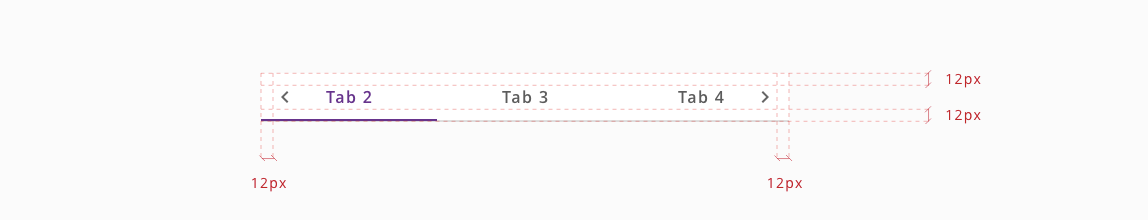
Tabs are horizontally scrollable when they are wider that screen, by using the scroll indicator.
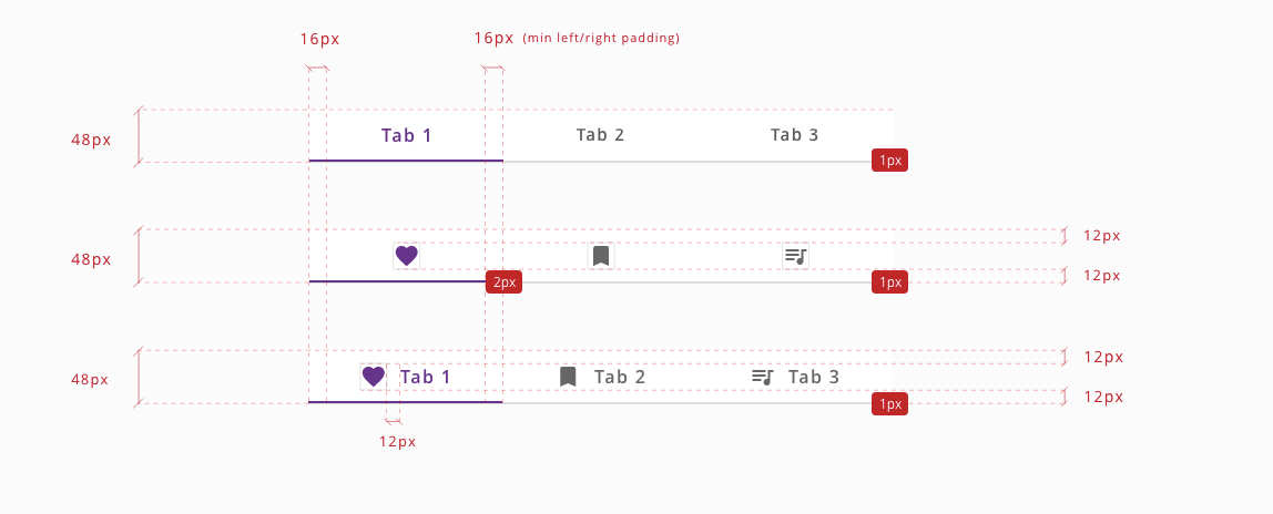
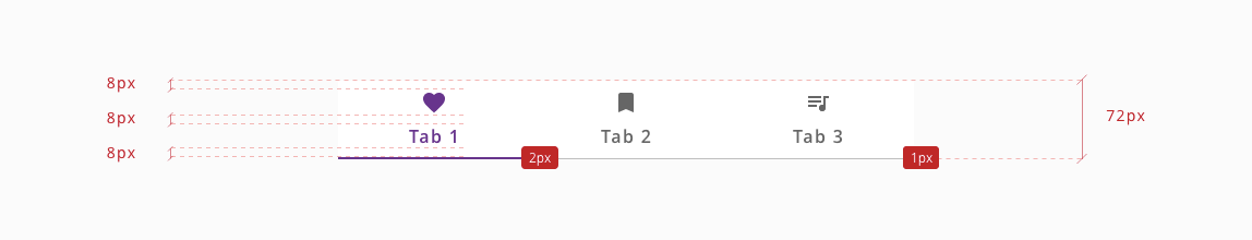
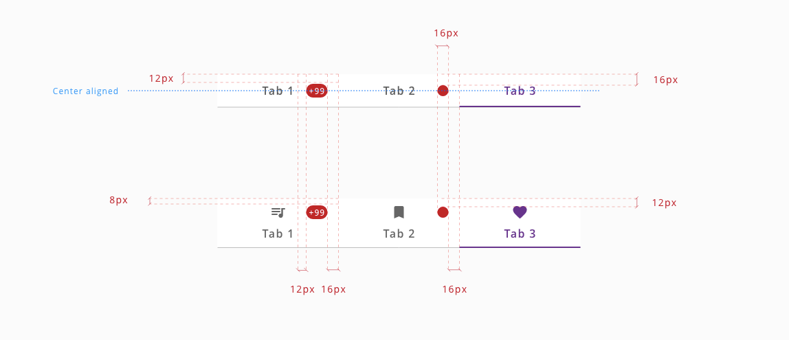
Notification badges are always positioned aligned with label or icon in 48px tab container and at top right of the 72px tab container.
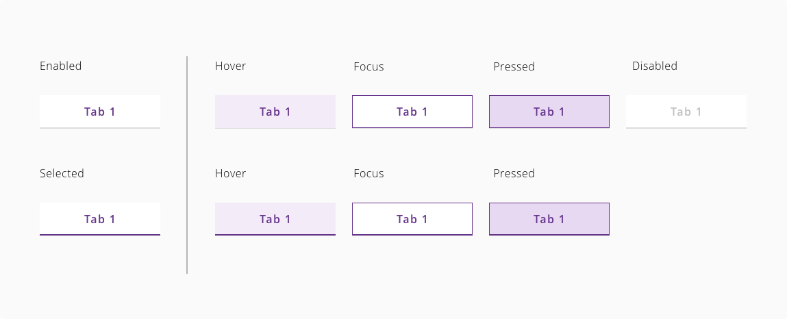
Tabs can get different states based on user interaction. These states are: inactive, enabled, hover, pressed, focus and disabled.
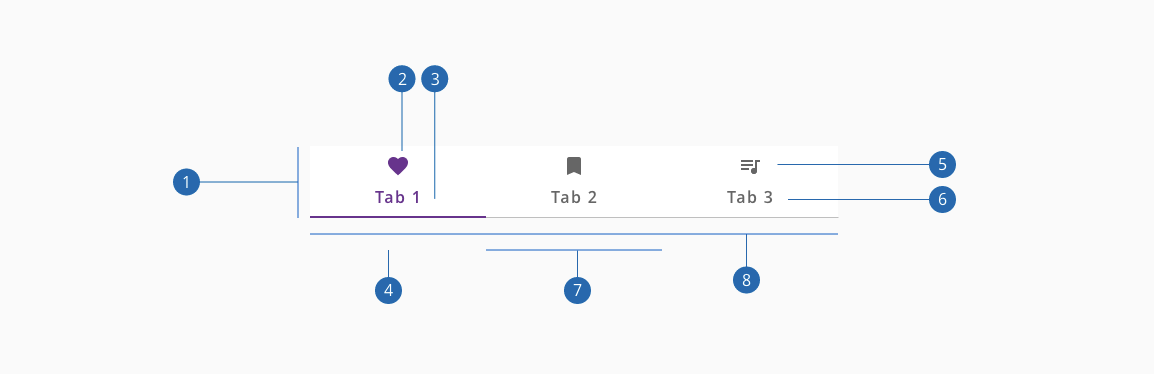
- 1.Container
- 2.Active icon (Optional if there's a label)
- 3.Active text label (Optional if there's an icon)
- 4.Active tab indicator
- 5.Inactive icon (Optional if there's a label)
- 6.Inactive text label (Optional if there's an icon)
- 7.Tab item
- 8.Divider
| Component token | Element | Core token | Value |
|---|---|---|---|
selectedBackgroundColor | Tab item | color-white | #ffffff |
unselectedBackgroundColor | Tab item:enabled | color-white | #ffffff |
hoverBackgroundColor | Tab item:hover | color-purple-100 | #f2eafa |
pressedBackgroundColor | Tab item:active | color-purple-200 | #e5d5f6 |
selectedFontColor | Label | color-purple-700 | #5f249f |
unselectedFontColor | Label | color-grey-700 | #666666 |
disabledFontColor | Label:disabled | color-grey-500 | #999999 |
selectedIconColor | Icon | color-purple-700 | #5f249f |
unselectedIconColor | Icon | color-grey-700 | #666666 |
disabledIconColor | Icon:disabled | color-grey-500 | #999999 |
focusOutline | Tab item outline | color-purple-700 | #5f249f |
selectedUnderlineColor | Tab item border botton | color-purple-700 | #5f249f |
dividerColor | Separator | color-grey-400 | #bfbfbf |
badgeBackgroundColor | Badge container | color-red-700 | #d0011b |
badgeFontColor | Label | color-white | #ffffff |
| Component token | Element | Core token | Value |
|---|---|---|---|
fontFamily | Title | font-family-sans | 'Open Sans', sans-serif; |
fontSize | Title | font-scale-03 | 1rem / 16px |
fontStyle | Title | font-style-normal | normal |
fontWeight | Title | font-weight-semibold | 600 |
Each tab must have a unique title that clearly describes tab panel content. This is particularly helpful for users of assistive technologies so they have the necessary information to efficiently navigate the content.
Content authors need to ensure the content that is added to the tab panel is accessible. For example, if you add an image to the panel you need to include alternative text to pass accessibility testing.
W3C WAI-ARIA Tab Design Pattern covers the usage of ARIA names.
| key | Description |
|---|---|
Enter or Space | Activates the tab if it was not activated automatically on focus. |
Tab | When focus moves into the tab list, places focus on the active tab element. When the tab list contains the focus, moves focus to the next element in the page tab sequence outside the tablist, which is typically either the first focusable element inside the tab panel or the tab panel itself. |
Left-arrow | Moves focus to the previous tab. If focus is on the first tab, moves focus to the last tab. Optionally, activates the newly focused tab. |
Right-arrow | Moves focus to the next tab. If focus is on the last tab element, moves focus to the first tab. Optionally, activates the newly focused tab. |