Tabs
Tabs allow the user to interact across the sections to switch from one set of content to another, making the transition easily from one peer to the other.
Tabs organize and allow navigation between groups of content that are related and at the same level of hierarchy.
- Use tabs for navigation when dividing content into different sections.
- The content should have the same level of hierarchy.
- Tabs can contain icons and text. Text labels should be short and have a clear relation to content.
- Do not use tabs to move through sequential content that needs to be read in a particular order.
- Avoid using tabs for comparing content across multiple tabs, such as different sizes of the same item.
There are two variations of tabs, default and container. They are hierarchically the same and should never be nested within each other. Tabs are usually placed above the content under the header o general navigation.
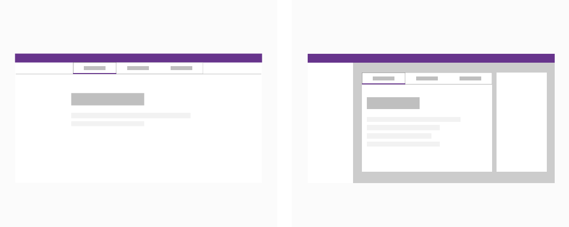
Left: A standalone tab that can also be nested within components.
Right: Emphasized tab always paired with an attached background container.
Default
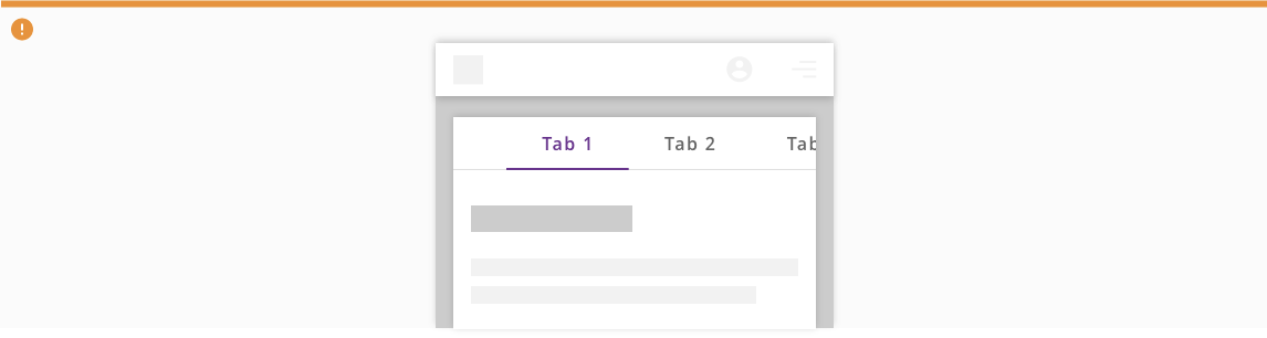
When used for main navigation place tabs above the header using 100% of the width of the screen.
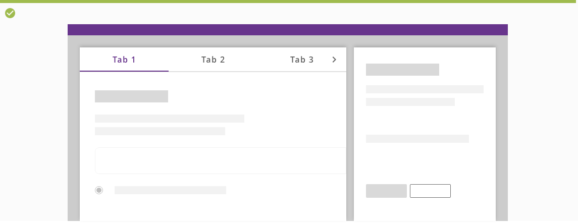
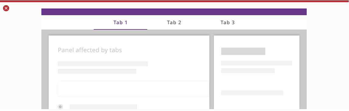
Container
When used for panel navigation place tabs in the top of the panel using all available width. Scrollable tabs are allowed when there is not enough space available.
Main navigation
When used for main navigation place tabs above the header using 100% of the width of the screen.
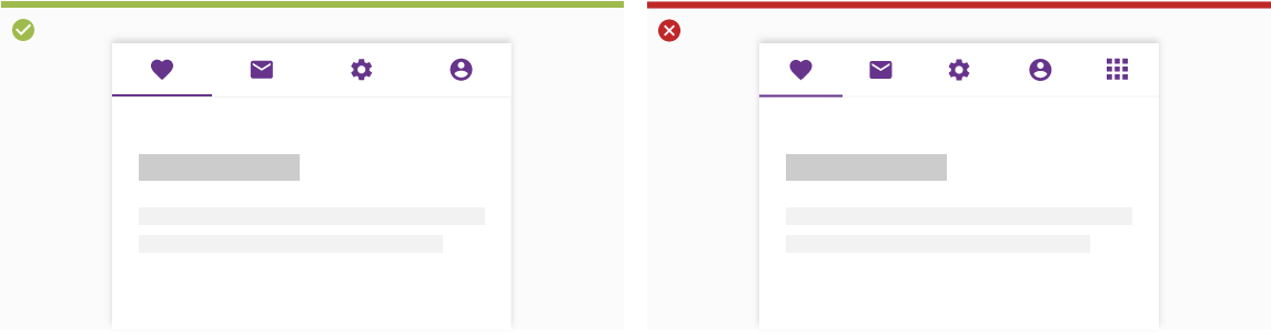
Left: Main navigation tabs are place above the content.
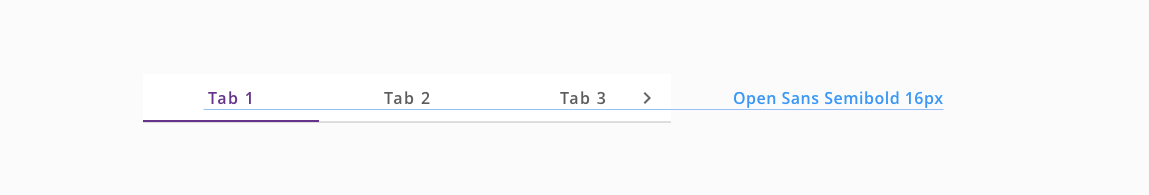
Right: Don't stack more than 4 fixed tabs.
Panel navigation

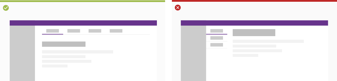
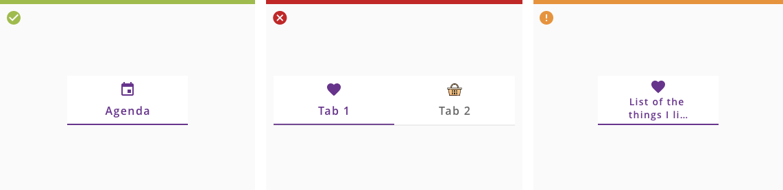
Left: Text labels should clearly and succinctly describe the content of the tab they represent.
Center: Tab content should contain a cohesive set of items that share a common characteristics.
Right: Tab labels should appear in a single row. They can use a second line if needed, with truncated text.
Users can navigate between tabs by tapping a tab, or by performing a swipe gesture over content in mobile devices.
Interacting with the tabs makes the content scrolls to the point that is associated with that specific tab, while the tabs keep fixed at the top of the container.
The use of scrollable tabs in panel navigation could cause swipe interferences with OS navigation.
Do not use main navigation if they only affect an specific panel.